ASO 2.0
Alpine Start Outfitters, December 2023

Brand
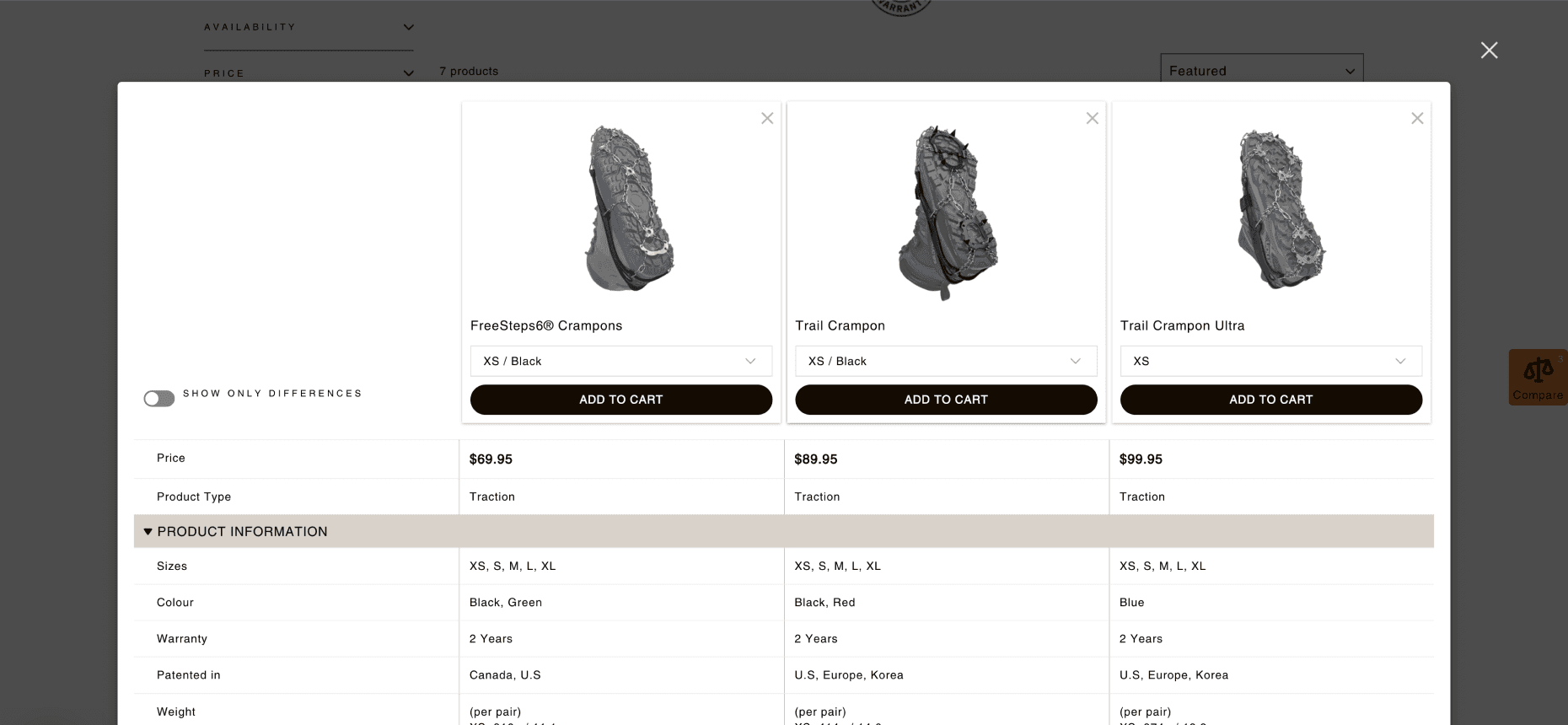
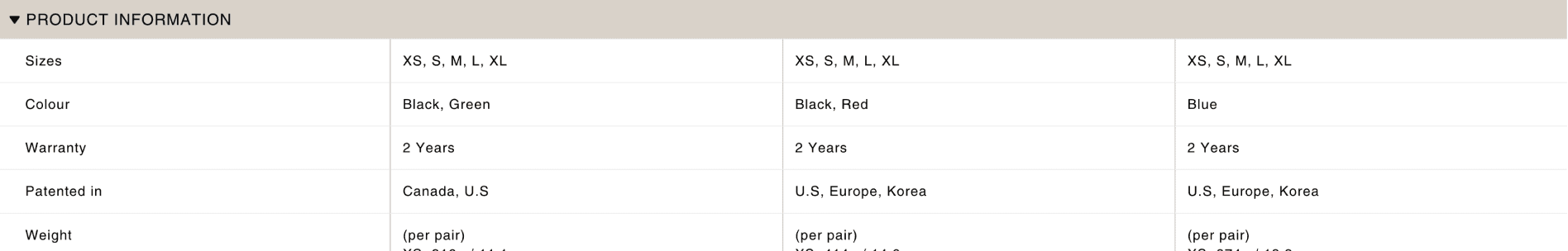
Key desktop version product comparison tables.

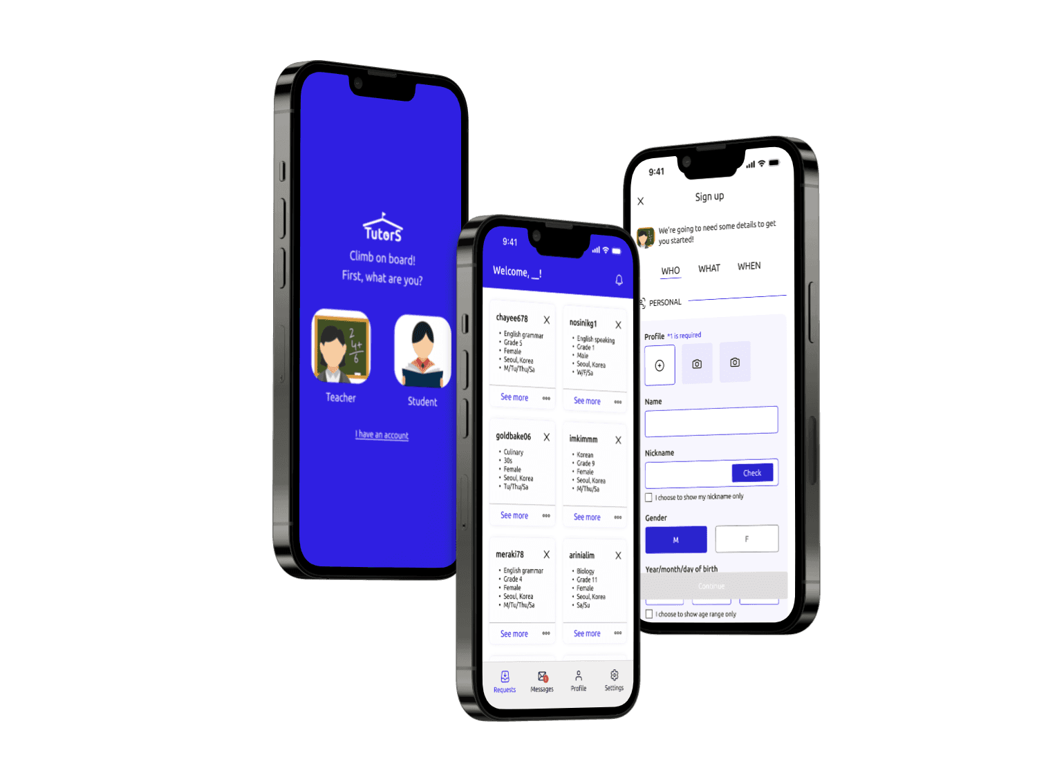
Key mobile version pages.
My Role
Solo UX/UI Designer - Problem-solving, UX Research(UXR), Information Architecture(IA), Cross-functional Communication
Worked with
E-commerce specialist
Customer Service Representative
Stakeholders (general managers)
Project duration Constraints
5 months (Jul 2023 - Dec 2023)
Constraints
No code sourcing: The buiness had a tight budget and wasn’t ale to outsource coding resources. Therefore, most of the UI elements were pre-made and I had to work around the layout constraints.
Shopify website: Catering to business goals and timelines, the redesigned website was done on a Shopify website.
Background
Planning to shift their business entirely online, Alpine Start Outfitters(ASO) needed a new look for the website. I offered to take a deeper look, focusing on usability, and visual design principles.
The Problem
Overall, there was an overarching problem of:
A lack of UI design consistency.
An unclear brand identity.
ASO’s Goals
A new look for their website.
A user-friendly e-commerce platform.
text
The audit: Cindy Choi
“I WONDER HOW MANY PEOPLE WORKED ON THIS.”
Design Inconsistency
I started with one of the most notable problem during the first meeting; design inconsistency. Indeed a lot was going on. It was as if the person who worked on the website forgot which colour, typeface, etc. they used and proceeded with another set the next time.
1
3
2
ASO’s previous landing page
Screenshots of ASO’s 1.0 website.
1
Inconsistent margins and paddings across all UI elements. Margin and padding around each container/element were all inconsistent.
2
Using image elements as buttons. Not only were the buttons part of the background image, but they also had inconsistent paddings.
3
Not following the best practices (e.g. all-caps font used as paragraph text). The previously used typeface, Amatic SC, does not have lowercase glyphs. Therefore, text in all caps made it especially hard to read.
4
Unclear brand voice. The categories, Description, Price, Reviews etc.,
The audit: Talking to the internal staff
“DIFFERENT AND OLD”
"Different and old"
I wanted to talk to one more group of people to validate my assumptions. Taking the tight schedule and budget into consideration, I talked to ASO’s staff members about the website.
I talked to 10 people about:
Their experiences with ASO’s previous website.
Their shopping habits and behaviour in shopping for outdoor gear and apparel.
In sum, the staff also acknowledged that the website had an unorganized and inconsistent design/brand guide used across the website.
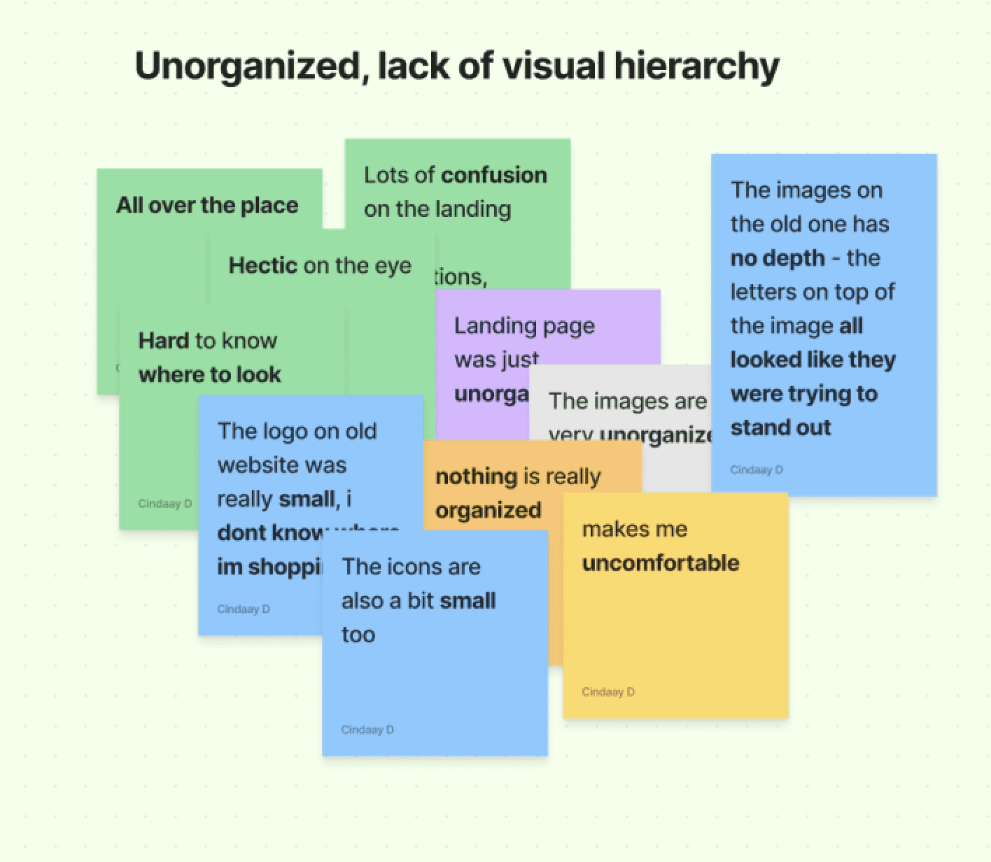
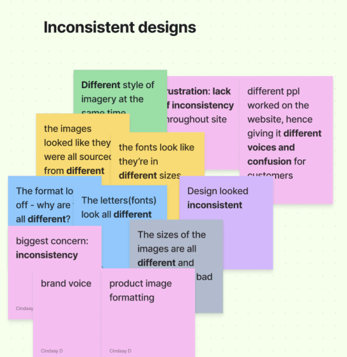
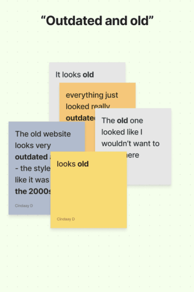
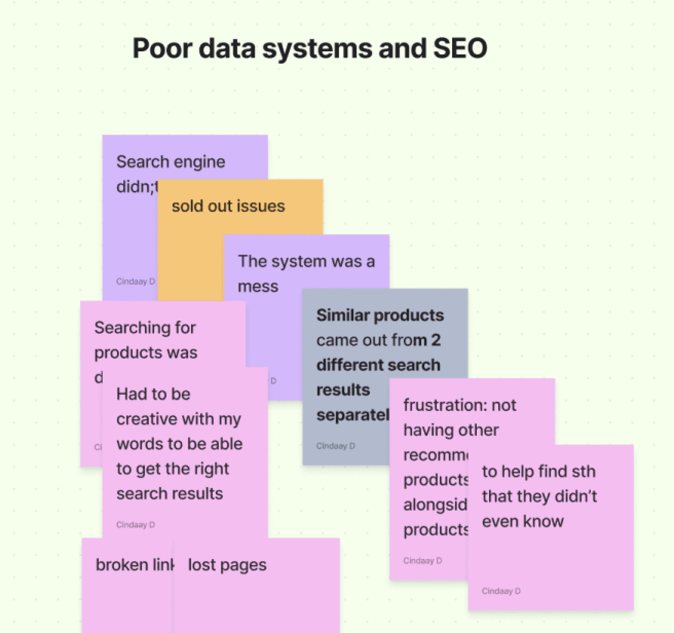
Grouped similar words, and drew keywords. 7 out of 10 people mentioned either mentioned, “unorganized” or “different”.
text
The Diagnosis
SUGGESTING ASO 2.0
The proposal.
I proposed the following to my clients with the information gathered above:
📌 Rebranding and redesigning the website
📌 Create a design guideline
📌 Restructure website IA
text
Figuring out ASO’s new style
APPROACHABLE BUT PROFESSIONAL
Research: ASO
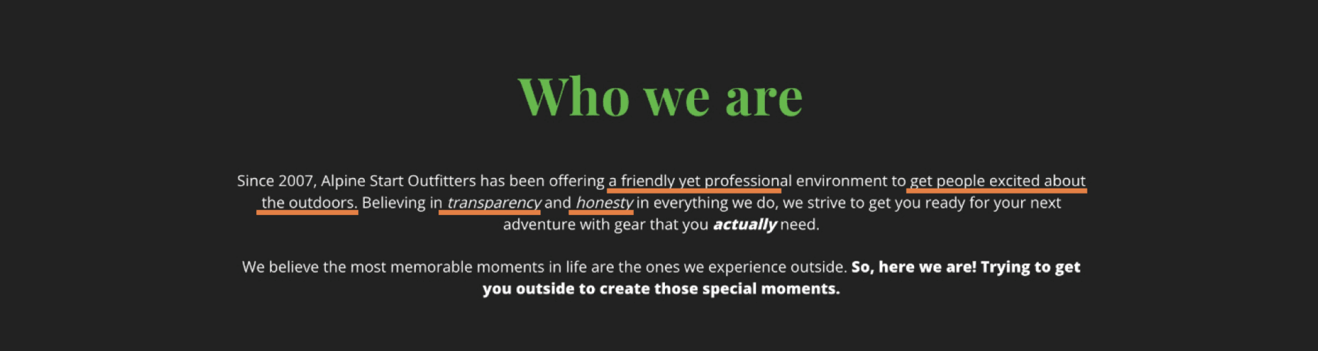
I needed more information. What kind of image represents ASO? What does “alpine” mean exactly? I asked the client, and the higher-ups more about their brand as well as studied the “About Us” page.
And here’s what I learned:
Professional
Devoted
Simple/straightforward
Honesty
Transparency
Friendly
Excitement
Helping
Outdoors
Snippets from ASO’s About Us page. Extracted keywords on the bottom.
Logo Colours
After consulting with the executives that there was no particular reason to the 2 different shades of green, I explored more options to the colour palette.
I started with the origin. What does “alpine start” really mean?
Turns out that alpine start meant “early dawn” “daybreak”, and I searched up further images listed colours from them to visualize. Here’s what I found.
94C83D
073F2E
ASO’s previous logo and colours


DC905D
01216C
093A61
FAD07B
43779F
0B6363
097288
Images of “alpine start” and colours
Images searched with “alpine start” and colours selected with colour pickers.
“Early dawn” or “Daybreak”. Alpine start would mean an early morning start, typically before dawn, often used in mountaineering or long hikes to allow for maximum daylight and favorable weather conditions. (Campnab)
Not so much green. Due to "alpine start" referring to a time before dawn, it was interesting to see more of sunrise and somewhat dusky colours in the sky rather than just pure green.
Revising the new brand with client
THE FINAL DECISIONS
Minimizing the revamp of branding.
Through market research, it seemed as though the trend was for brands to abandon their colours and elements. Seeing how this potentially gives a positive impact on the environment such as reducing the use of colour inks, the client was satisfied with this idea as this aligns with the brand's values.
Opted for a san-serif and simplified elements such as the lines and illustration (trees and landscape).
After

Before
The background colours and landscape were removed.
Examples of logo rebrands. Annotations of detailed analysis on the right in pink.
Minimizing the revamp of branding.
Through multiple meetings of revisions, we decided to keep the main mountain logo as well as the green hue in the colour palette to minimize confusion among customers.
Instead, the new logo will be refined with simplified strokes and elements, and a colour palette.
ASO 2.0 logo
previous logo
kept the mountain logo
reduced the boldness
but kept the signature tails/feet of font
minimized elements & colour
ASO’s previous logo (left), and the new logo (right).
Design style/guideline
REINFORCING THE ONENESS
ASO's new design guideline.
ASO’s website has been up for 5 years but as the website was run by multiple people, everyone had their own “voice” when working on the gr aphics and the UI.Basically, there was no guide.
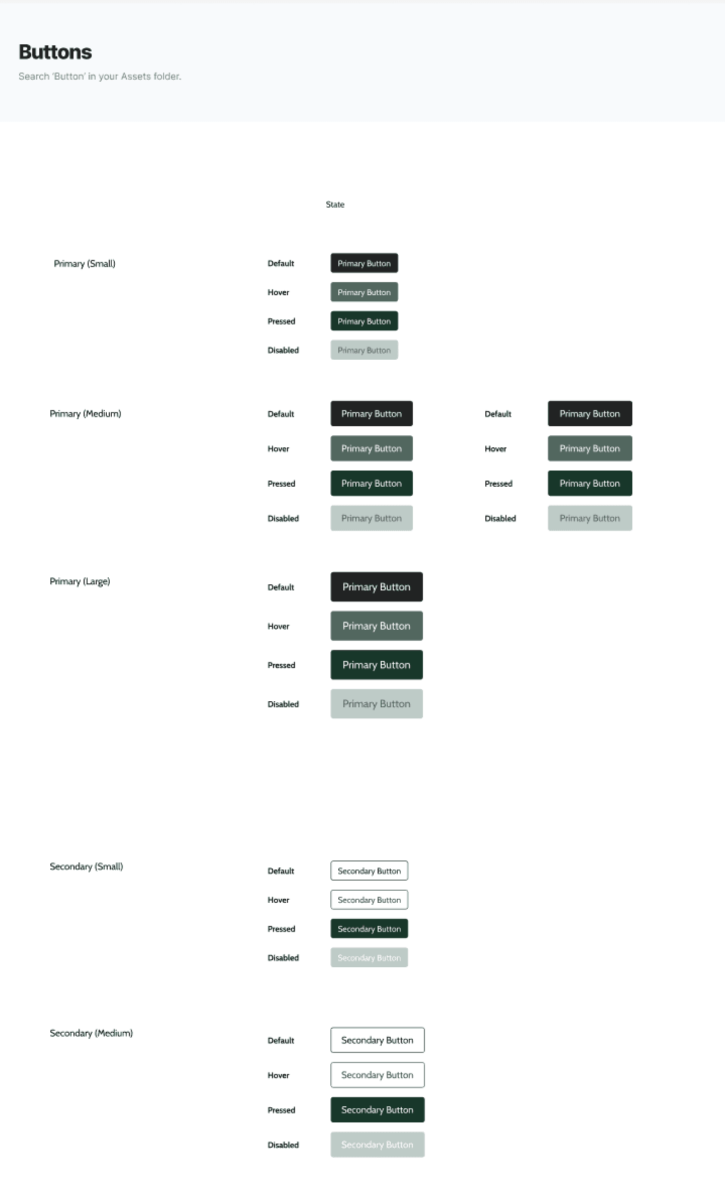
For organization and efficiency, I created a minimal design guide for the brand. Because of customization limitations on Shopify websites, I focused on creating the most crucial ones: button styles, colour palettes, and typefaces.
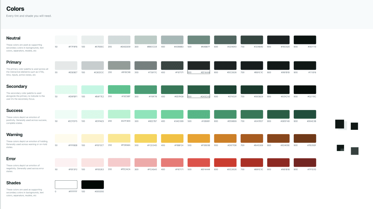
Design library “curated” from a template on Mizko’s Designership.
The Colour Palette. We started with a green shade (#09543D) and a black variant (#212523) which was derived from the green shade. I used a template from Mizko to create different shades of the two colours as well as the other essential colours to save time.
Buttons. Shopify doesn’t allow customization down to the pixel, but establishing a style guide for the different states of buttons such as default, pressed, hovered and disabled was essential to enhance cohesiveness.
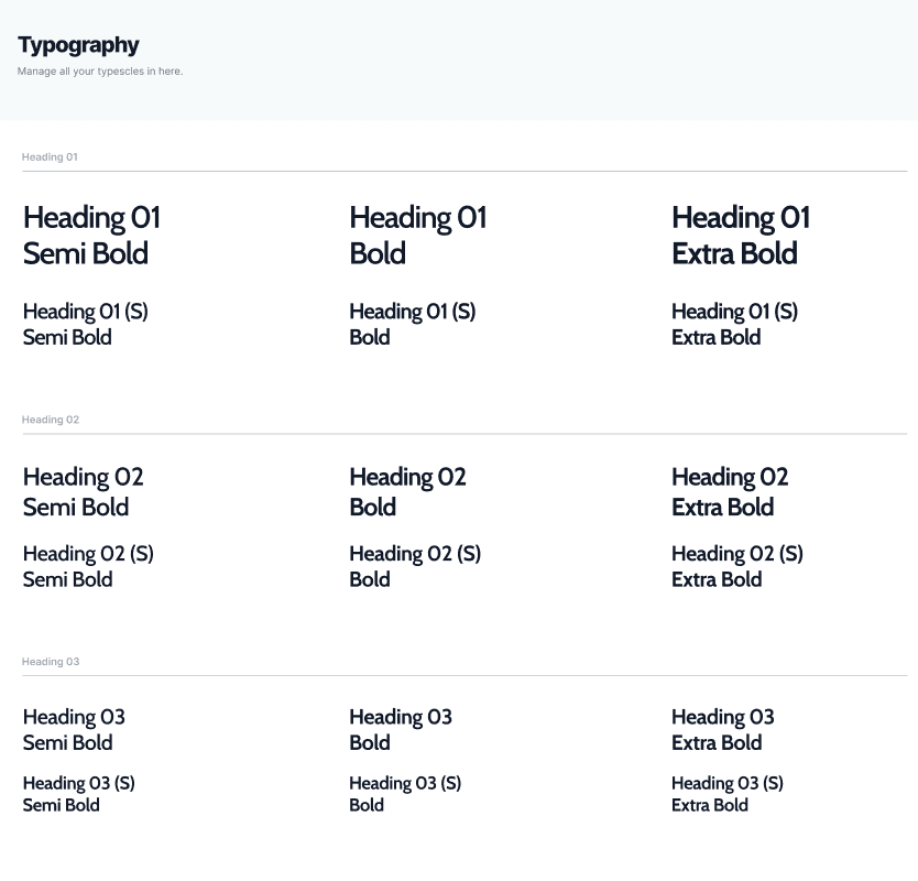
Goodbye, “Amatic” and hello, “Cabin”! The Amatic SC font, ASO's “signature” font, wasn't the best to be used for every text element. I chose the simple san-serif and websafe font, Cabin, to replace the predecessor.
Buttons. Shopify doesn’t allow customization down to the pixels, but establishing a guide for the different states of buttons such as default, pressed, hovered and disabled was essential.
Layouts and design
FINDING THE RIGHT TEMPLATE
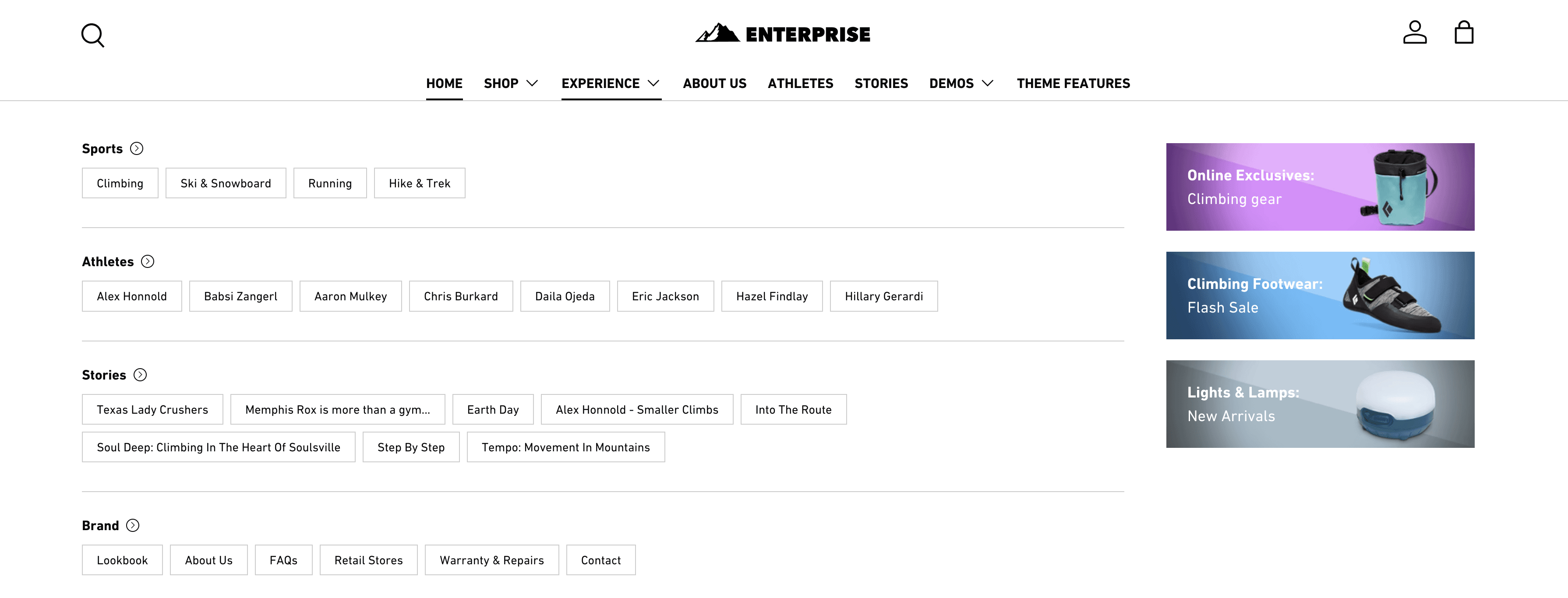
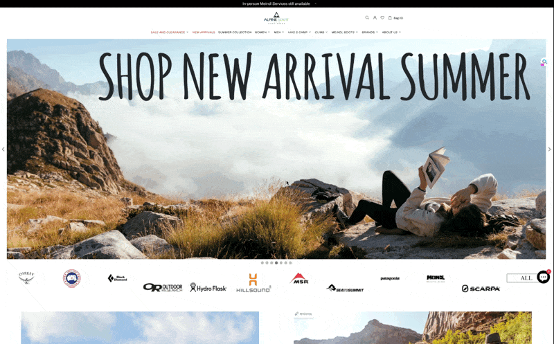
A theme with a mega menu.
Shopify Theme Store is where online business owners purchase templates for their Shopify stores.
As ASO was not planning on outsourcing designs to code, browsing for a Theme was my next step.
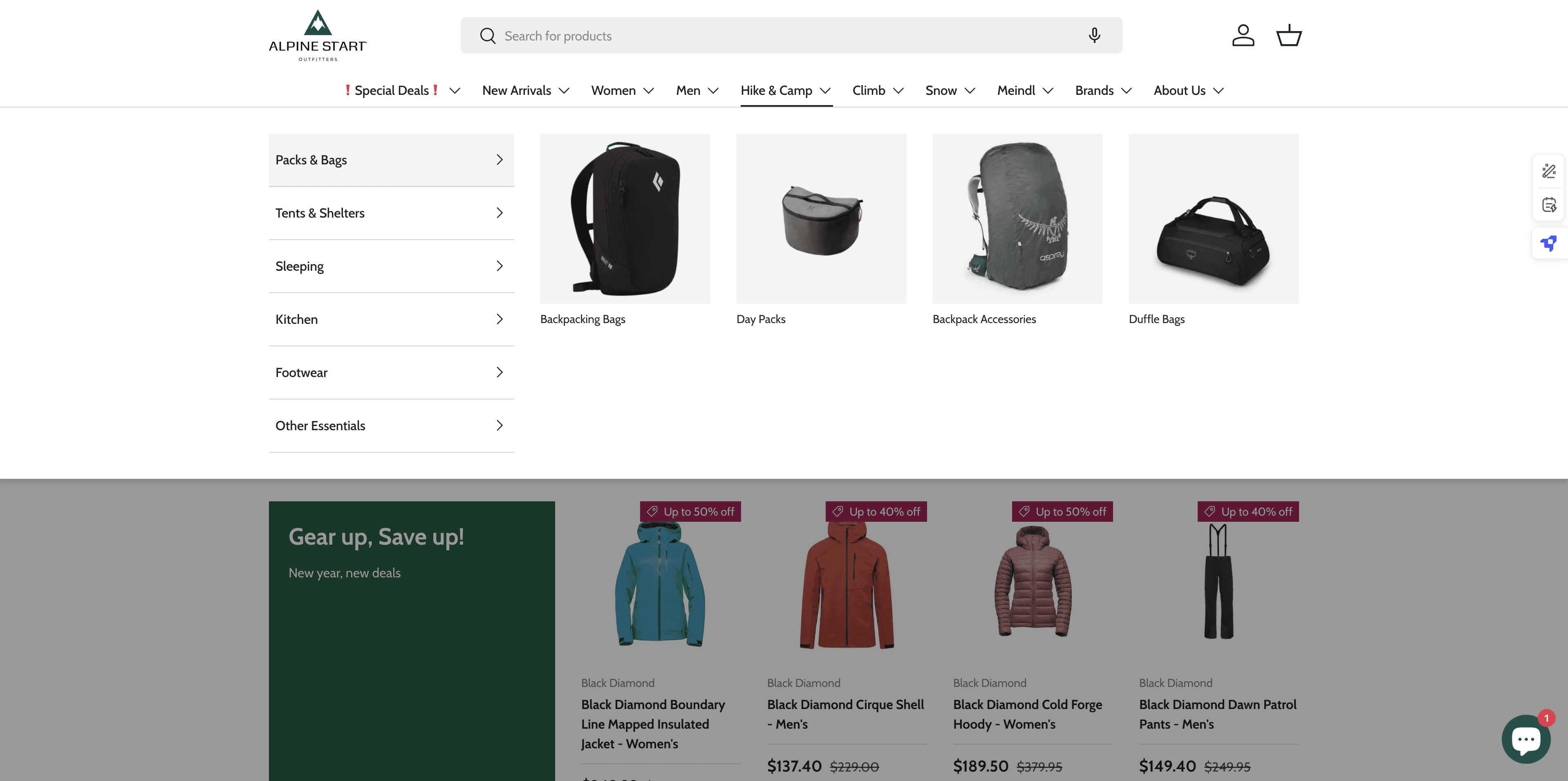
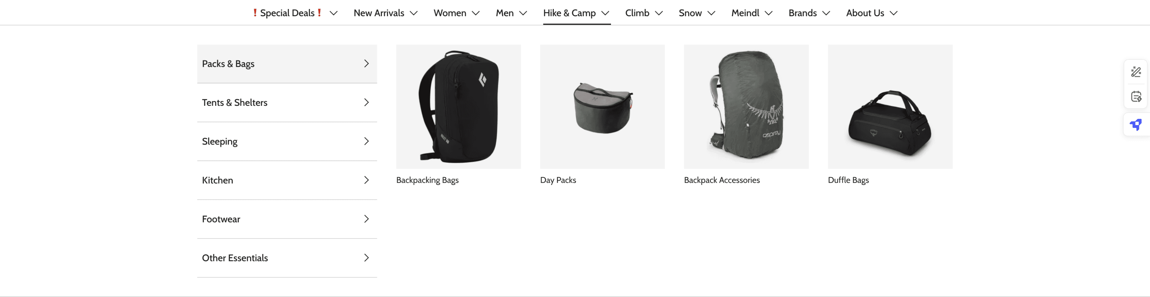
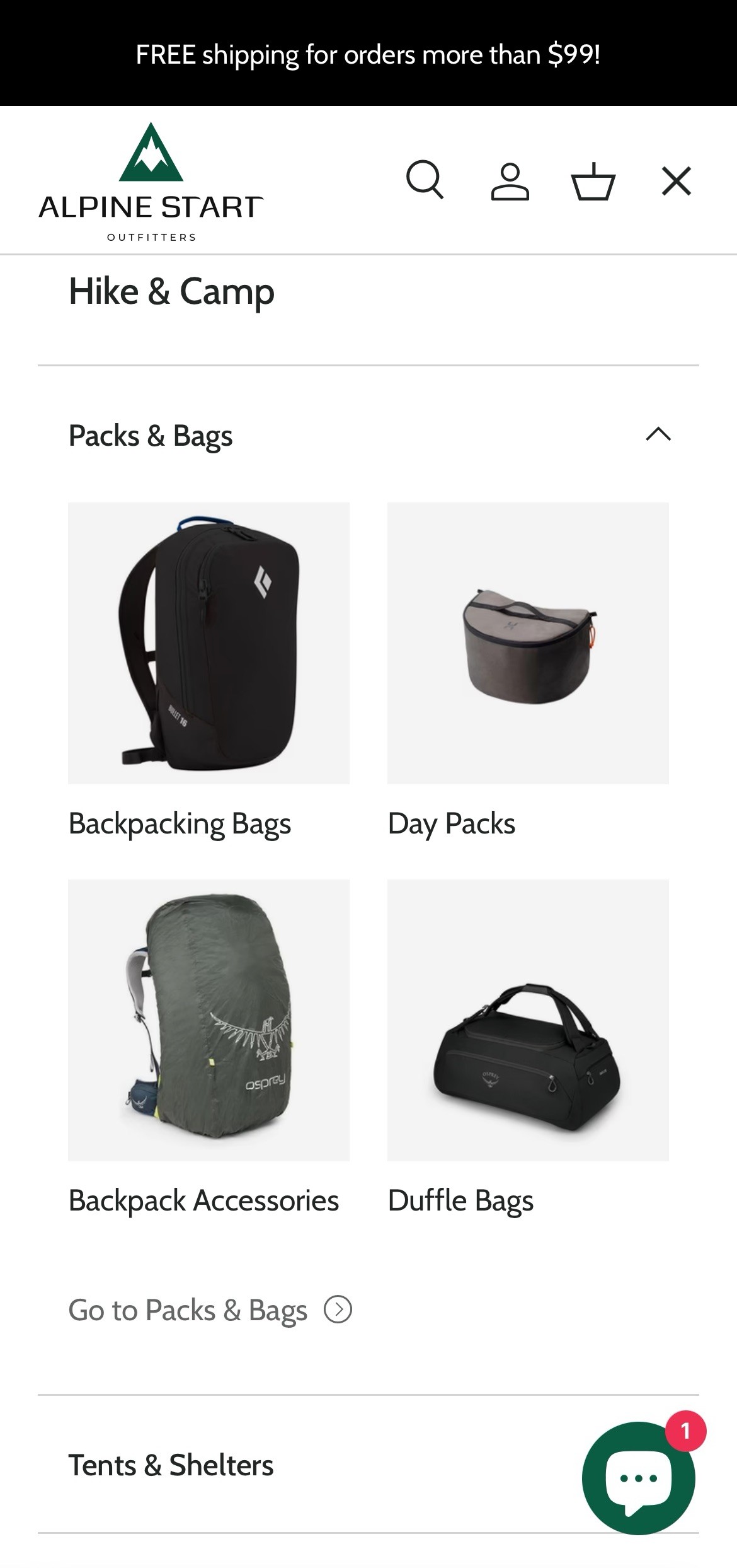
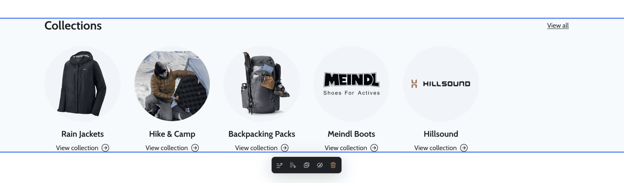
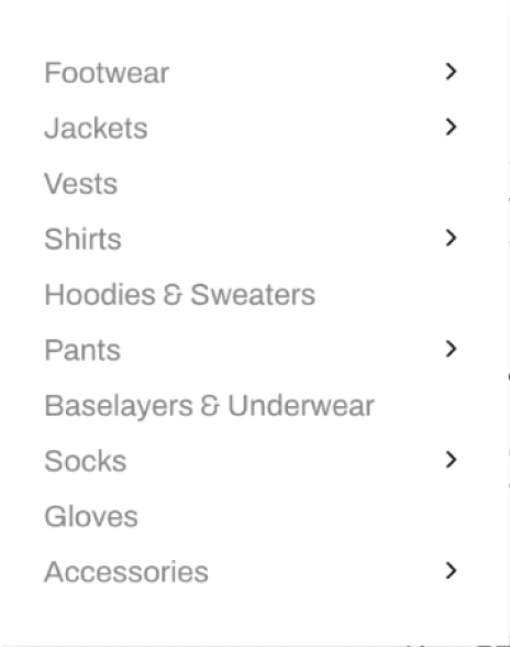
After taking a look at the IA, it turned out that ASO had 91 pages under the main navigation menu. Due to the vast number of category pages, reinforcing the category hierarchy through visual aid was crucial. Therefore, I decided to select a theme that had a “Mega Menu” feature.
I opted for the theme, Enterprise, which gives several options for the “Mega Menu”. Instead of just texts, Enterprise offers more with different sets of image sizes and configurations.
ASO’s previous dropdown menu
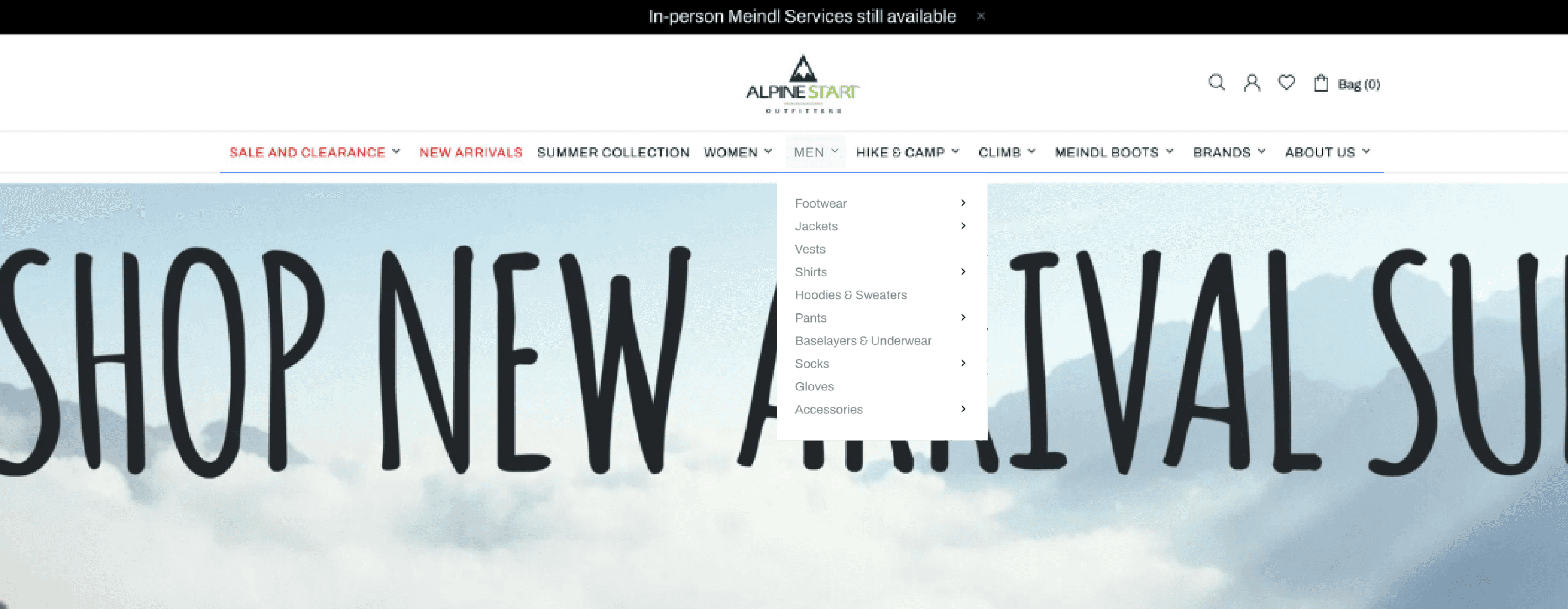
Theme Enterprise demo store’s dropdown menu
All dropdown menus were the same, without any visuals
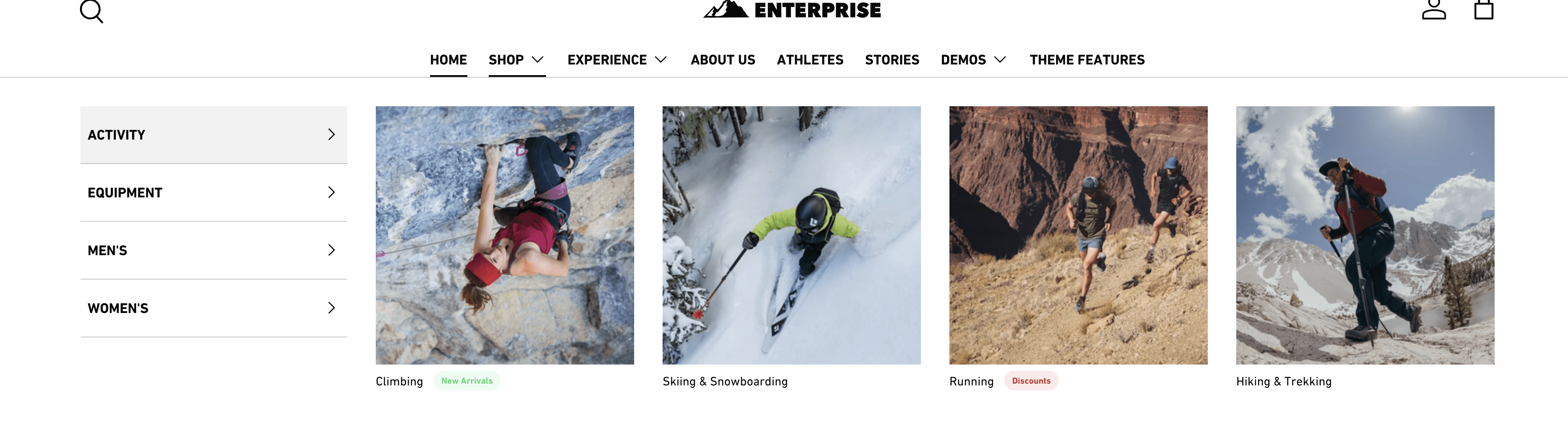
Different layouts of dropdowns are available, including image support
ASO’s previous dropdown menu (top) and 2 different configurations of mega menus (bottom).
Information Architecture
SKELETON REVAMP
Cohesiveness in catgory names.
I looked into why it was 'Casual Shirts & Tanks' under Women but just 'T-shirts' for men.
I kept the naming system as consistent as possible by switching ‘T-shirts’ to ‘Casual Shirts’ for these reasons:
There were both t-shirts & tanks products under men.
T-shirts & Tanks all fall under Casual Shirts (*except for ones with technical fabric)
Before
Shirts
Shirts
Casual Shirts & Tanks
Technical Shirts
T-shirts
Technical Shirts
Women
Men
After
Casual Shirts & Tanks
Technical Shirts
Casual Shirts
Technical Shirts
Women
Men
Shirts
Shirts
renamed!
The before and after of Shirts under women and men.
Keeping product pages up-to-date.
During the initial self-audit, there were a good number of category pages that were either left empty, or had 1 product - mostly sold out. I thought this was a good time to touch on this during this stage. Below are some examples:
After
Stoves & Fuel
Food & Drink
Cookware & Dinnerware
Water Storage & Treatment
Sleeping Bags
Sleeping Mats
Sleeping Accessories
Sleeping
Kitchen
deleted!
Before
Stoves & Fuel
Food & Drink
Cookware & Dinnerware
Water Storage & Treatment
Sleeping Bags
Sleeping Mats
Pillows
Sleeping Liners
Sleeping Bag Accessories
Sleeping
Kitchen

combined!
The before and after of AI of categories, 'Sleeping' and 'Kitchen'.
Combining subcategories. ‘Sleeping Bag Accessories’ was originally empty, however, because it can include “pillows” and “sleeping bag liners”, 3 subcategories were combined to 1. Hence, ‘Sleeping Accessories’!
Deleting subcateogories. There were a couple of category and subcategory pages that were left empty for a long time. By checking with the business team, we decided to delete certain subcategories that had no further plans on being restocked.
Working around constraints
CUSTOMIZATION AND TIME CONSTRAINTS
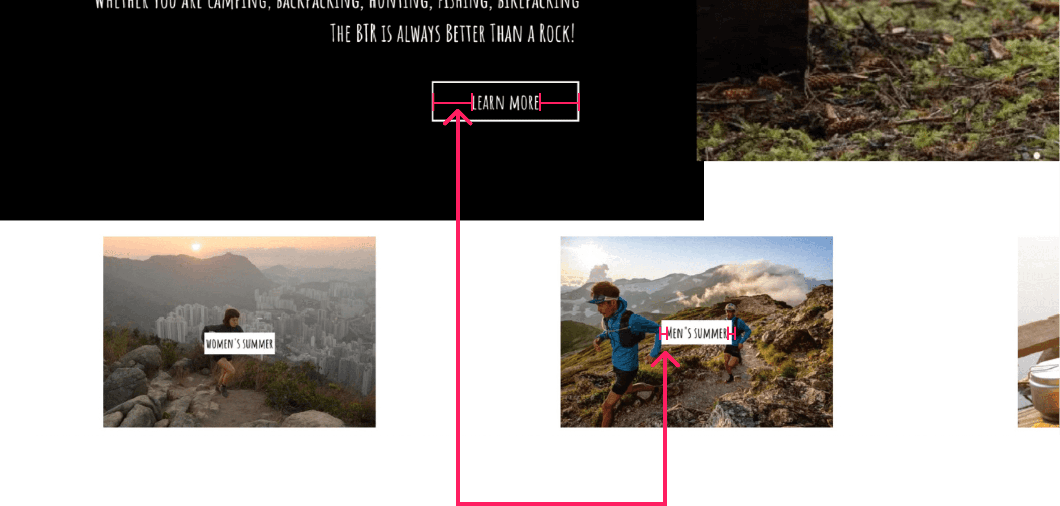
Prioritization in response to time constraints.
Around this time, the previous website started breaking down which tightened our timeline a bunch.
In response to this, I decided to keep the content as it was as much as possible and instead figure out what “snippets” would best help the layout and presentation of the content.
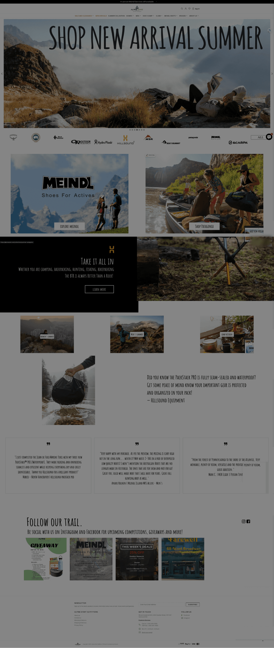
For example, the landing page. Below are some annotations on wireframes I used to communicate with my client.

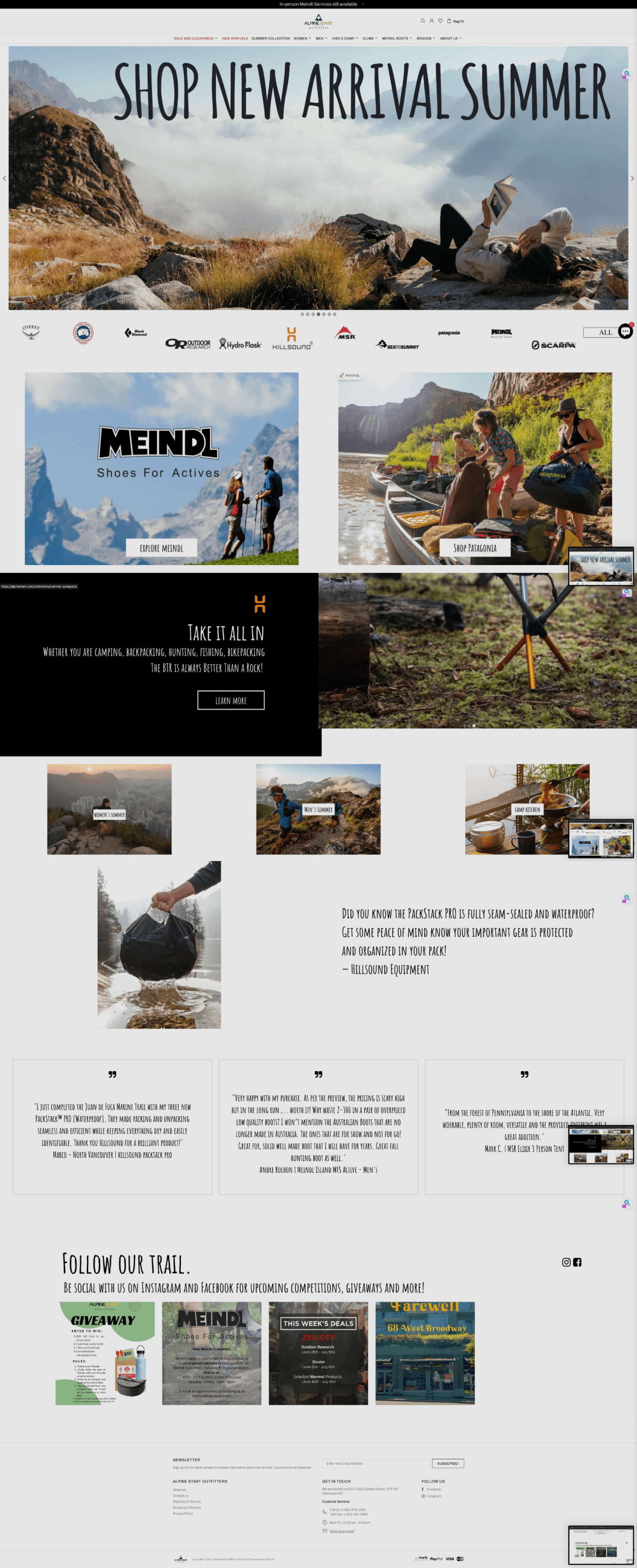
Current layout
New layout
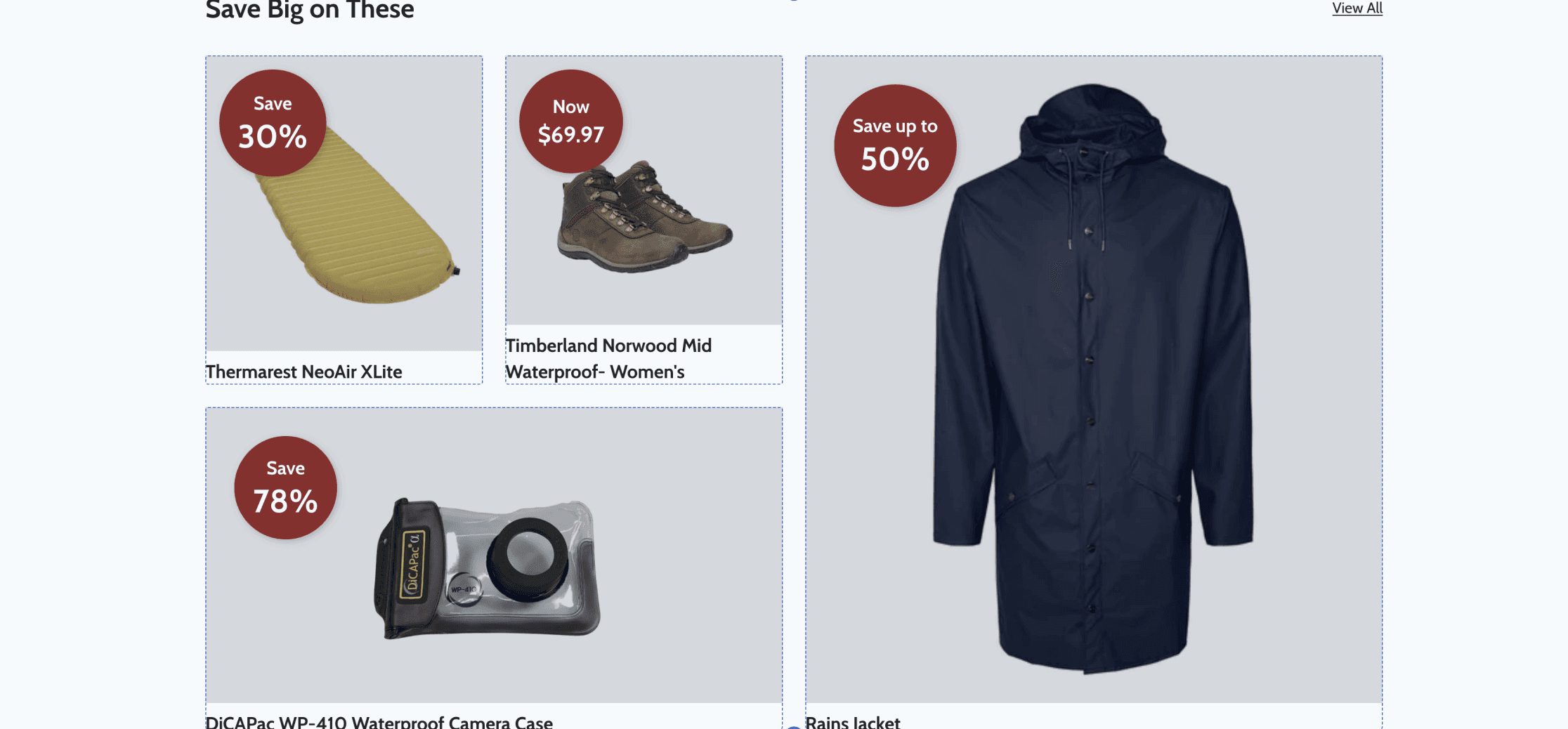
Banner
promotional
site-wide notice
Banner
promotional
site-wide notice
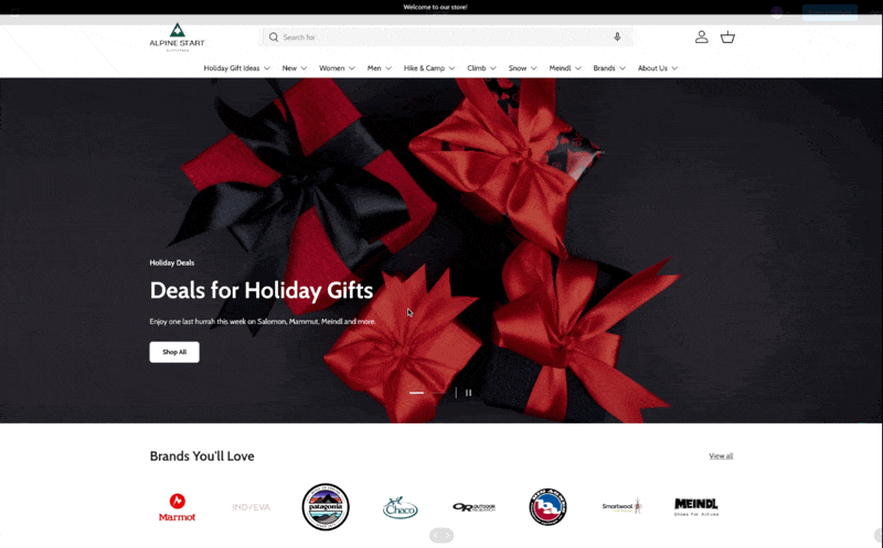
Brands
Brands
Featured brand 1:
Meindl boots
Featured brand 1:
Meindl boots
Collection 1
Collection 1
Review 1
Collection 2
Collection 2
Review 2
Collection 3
Collection 3
Review 3
Featured brand 3:
Hillsound
Hillsound product review
Featured brand 2:
Patagonia
Featured brand 2:
Patagonia
Main collection
Most of traffic come from promotional email newsletters - important to display curated collections instead of selected brands
Hillsound product review
Review 3
Review 2
Review 1
Partnership ended
Ex) Transitioning into fall - hiking for fall/raincouver?
Being a multi-brand carrier, most of our customers search by brand and see if we carry the one they're looking for.
Wireframe of landing page with annotations of layout restructuring.
Dealing with fixed snippets.
Eventually, a lot of the intial plans got set back due to the fixed layout and constraints of the snippets.
For example, collections were to be made through 2 different kinds of snippets: a Featured Collection and a Collection List.
However, without custom coding, you cannot decide on the number of products or the number of collections to be displayed.
To work around this, I utilized other snippets to create a collection with the desired products and the amount of products as well.
The problem:
Default collection snippets give little layout options/customizations.
How I worked around this:
Utilized other snippets to create a collection with the desired products and the amount of products as well.
‘Featured Collection’
If, <6 products, the list doesn’t fill to container
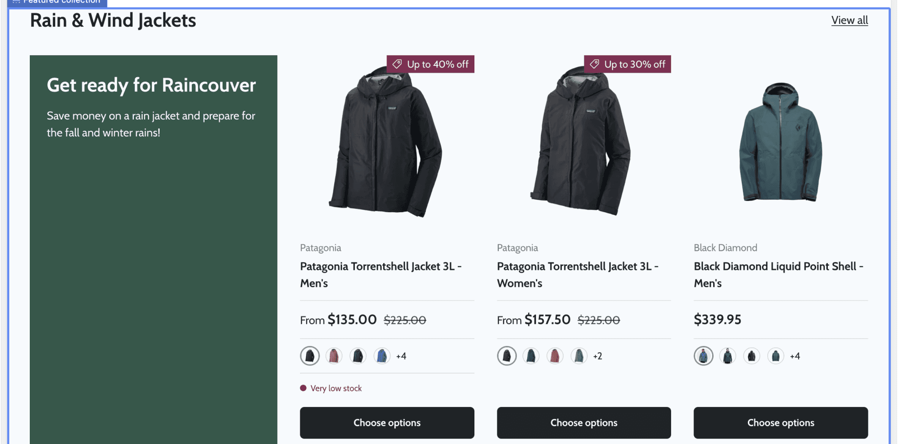
‘Image Gallery’
‘Collection List’
Number of products displayed - non-adjustable
More flexibility of product layout configuration
2 Collection snippets(top) and a Gallery snippet(bottom). All snippets are pre-designed and coded, categorized for different use cases.
Another problem:
Because the Image Gallery grid above wasn’t intended as a collection snippet the links, images, and additional information all had to be manually put in as opposed to the others where everything is automatically linked through the Shopify admin system.
The final decision:
Despite the time-efficiency issue, the client was more happy to see different styles of layouts and we decided to go with this grid.
text
Successfully making ASO 2.0 live
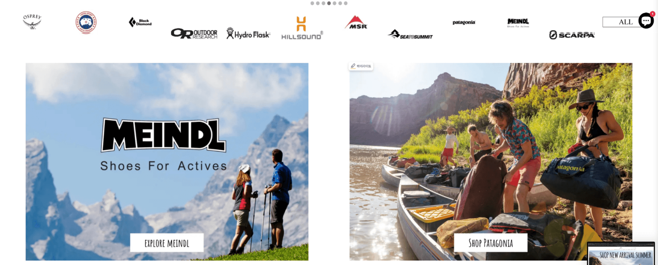
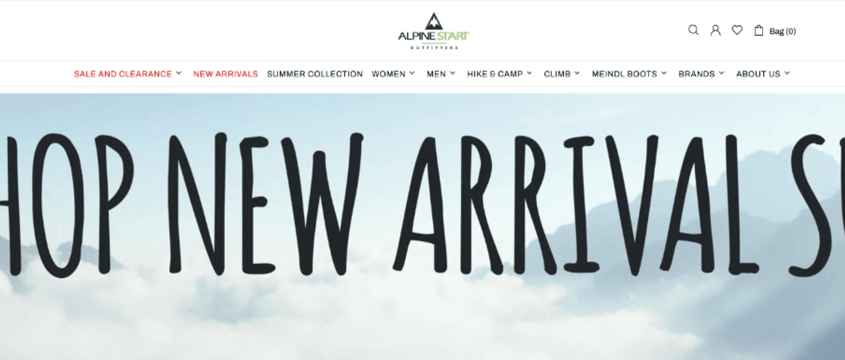
ASO’S NEW OUTFIT
An e-commerce site with more order.
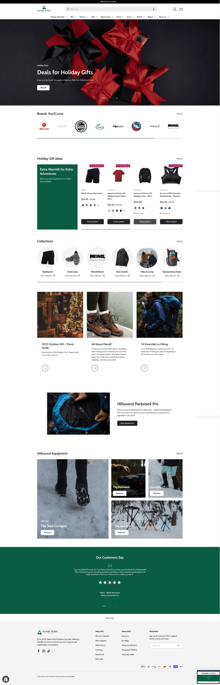
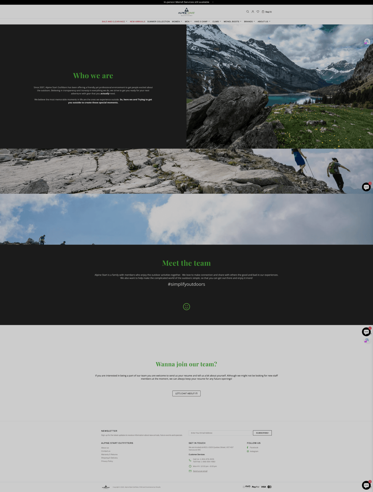
At last, we launched ASO’s newly refurbished website on September 22, 2023. At a glance, the website has more a cohesive structure and layout.
consistent paddings and margins within elements
properly using “button” elements for buttons
consistent use of design guide (e.g. colours & fonts etc.)

Overivew of ASO’s landing page. Before (left) and after (right).
Primary
Secondary
Tertiary
ASO’s new logo set. The primary (left), secondary (middle), and the tertiary (right). Respective favicons placed on bottom.
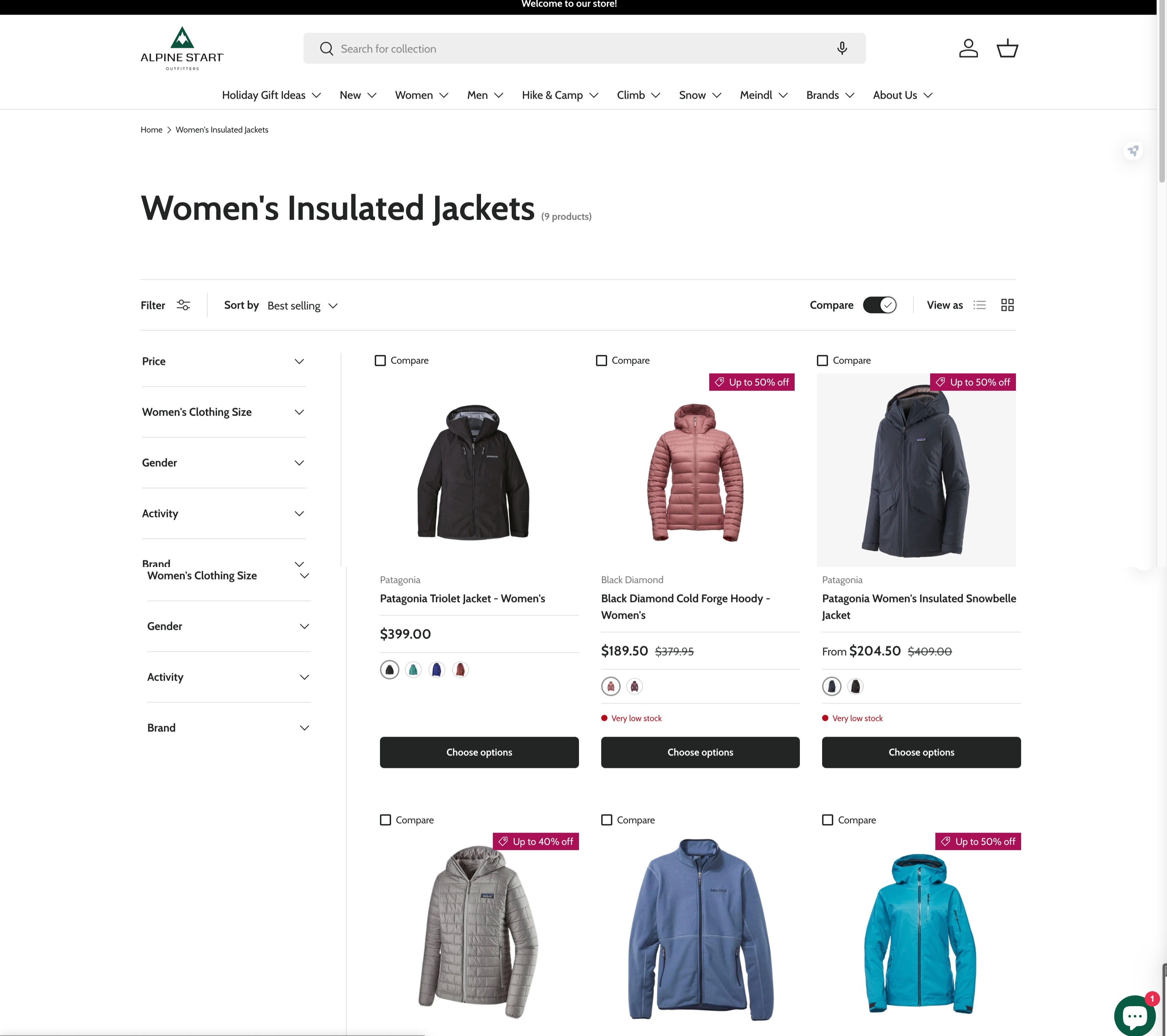
Enhanced visual hierarchy through Mega Menus.
Utilizing the Mega Menu feature from the Theme, we implemented the dropdowns to be a lot more visually-oriented with layouts that enhance visual hierarchy.
Below are some of the changes that were made: the icon logo and the bar.
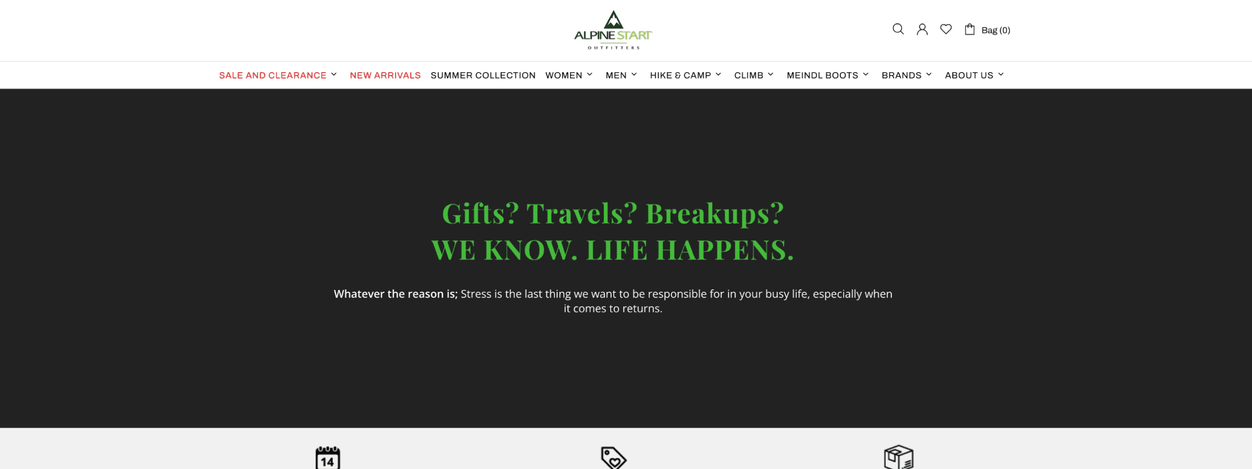
SALE AND CLEARANCE
NEW ARRIVALS
WOMAN
MEN
HIKE & CAMP
CLIMB
MEINDL BOOTS
BRANDS
ABOUT US
SUMMER COLLECTION
Bag (0)
T-Shirts
Technical Shirts
Shirts
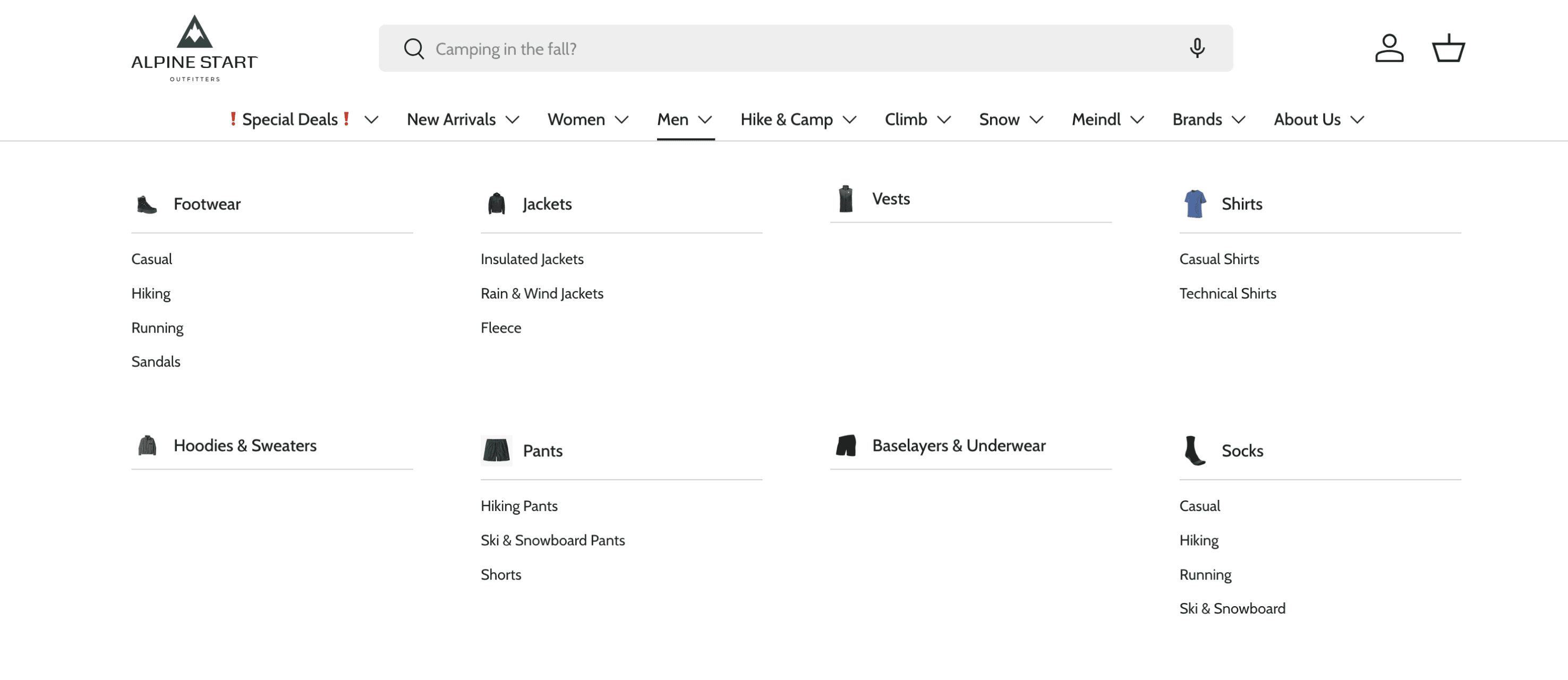
ASO's previous navigation dropdowns (top) and new Mega Menu (bottom).
Use of proximity grouping for visual hierarchy. (+images!) The use of Mega Menus allowed us to make better sense of layouts thus improving the visual hierarchy. We also made use of images that further enhanced the visual hierarchy.
Casual Shirts instead of T-shirts. As explained previously, we decided to keep naming conventions as consistent as possible. Now it’s ‘Casual’ or ‘Technical Shirts’ for BOTH women and men!
Consistent design properties.
One of the main issues with ASO’s previous website was the lack of consistent design properties in elements. By establishing and adhering to the newly made design guide, we were able to to create a much visually organized set of webpages.
Heading with random design properties
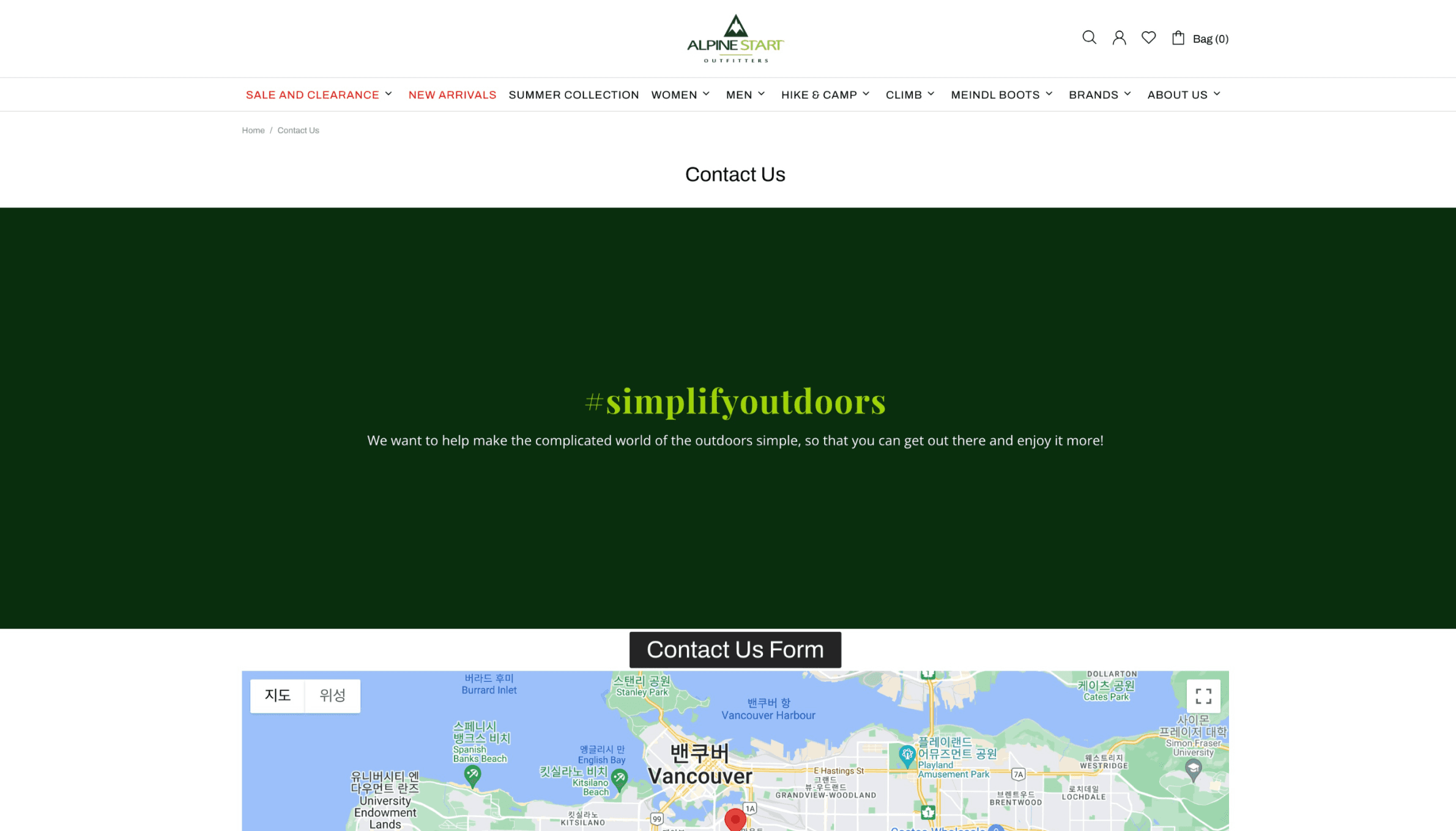
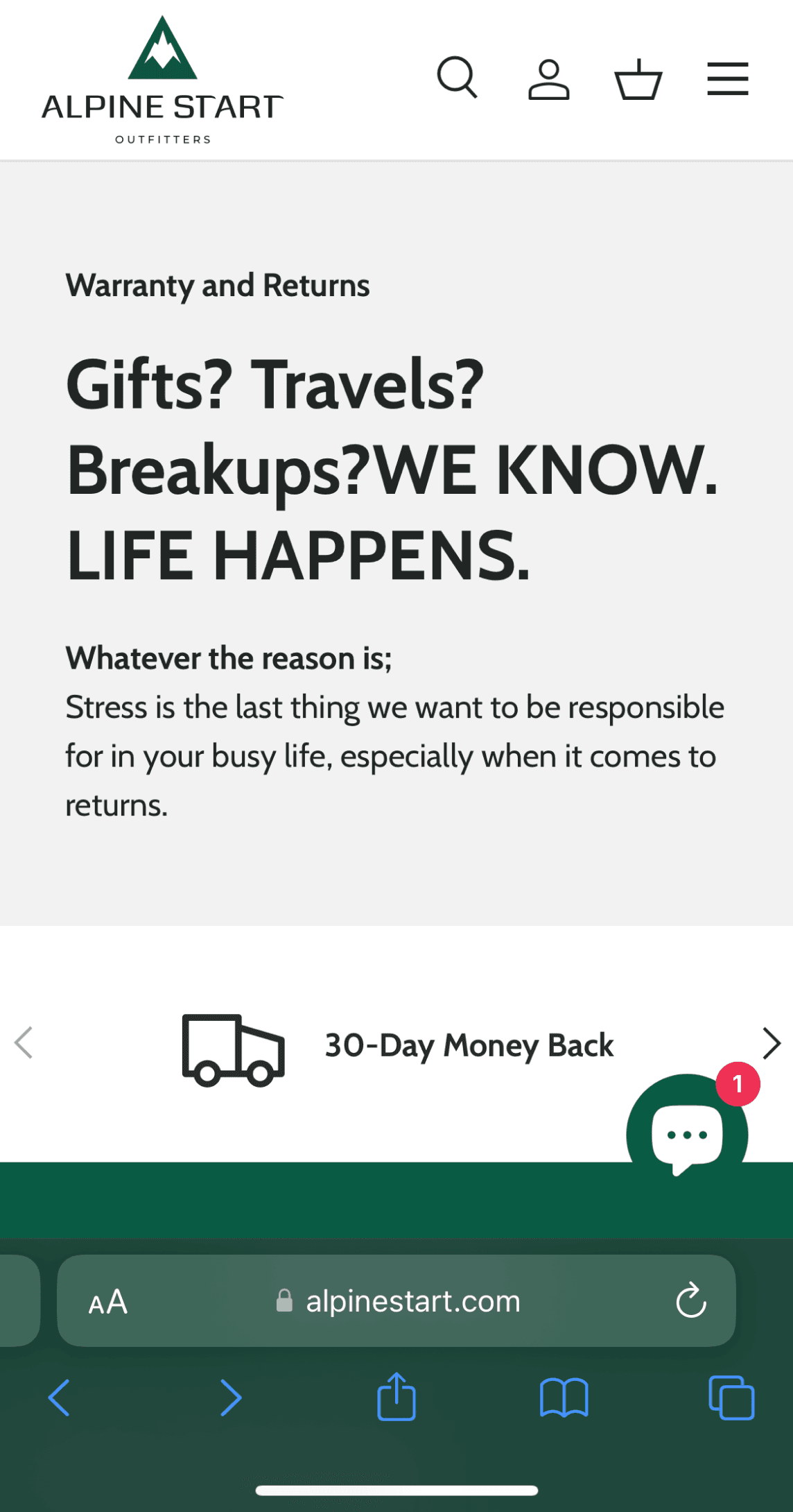
Previous ‘Contact Us’ page
Previous ‘Warranty and Returns’ page
The new ‘Contact Us’ page
CTA button with random design properties - does it even look like one?
Random text & background colours
CTA button with the right design properties from design guide.
Missing Heading - hard to tell what this page was about at a glance
222222
42BC3B
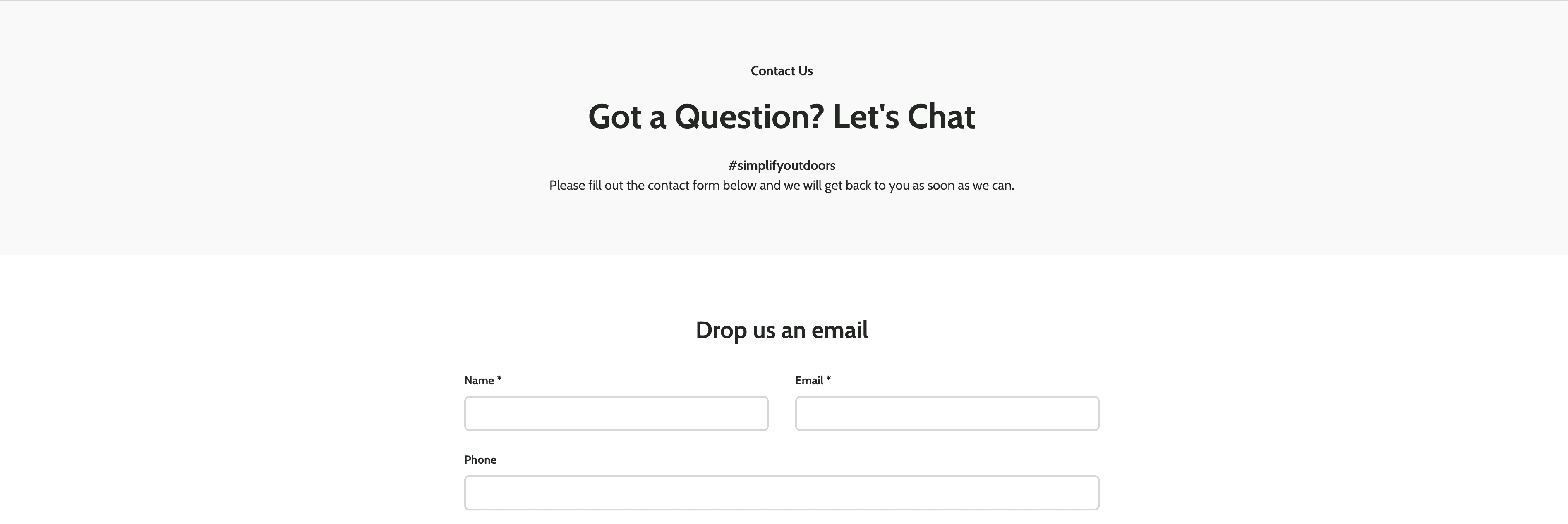


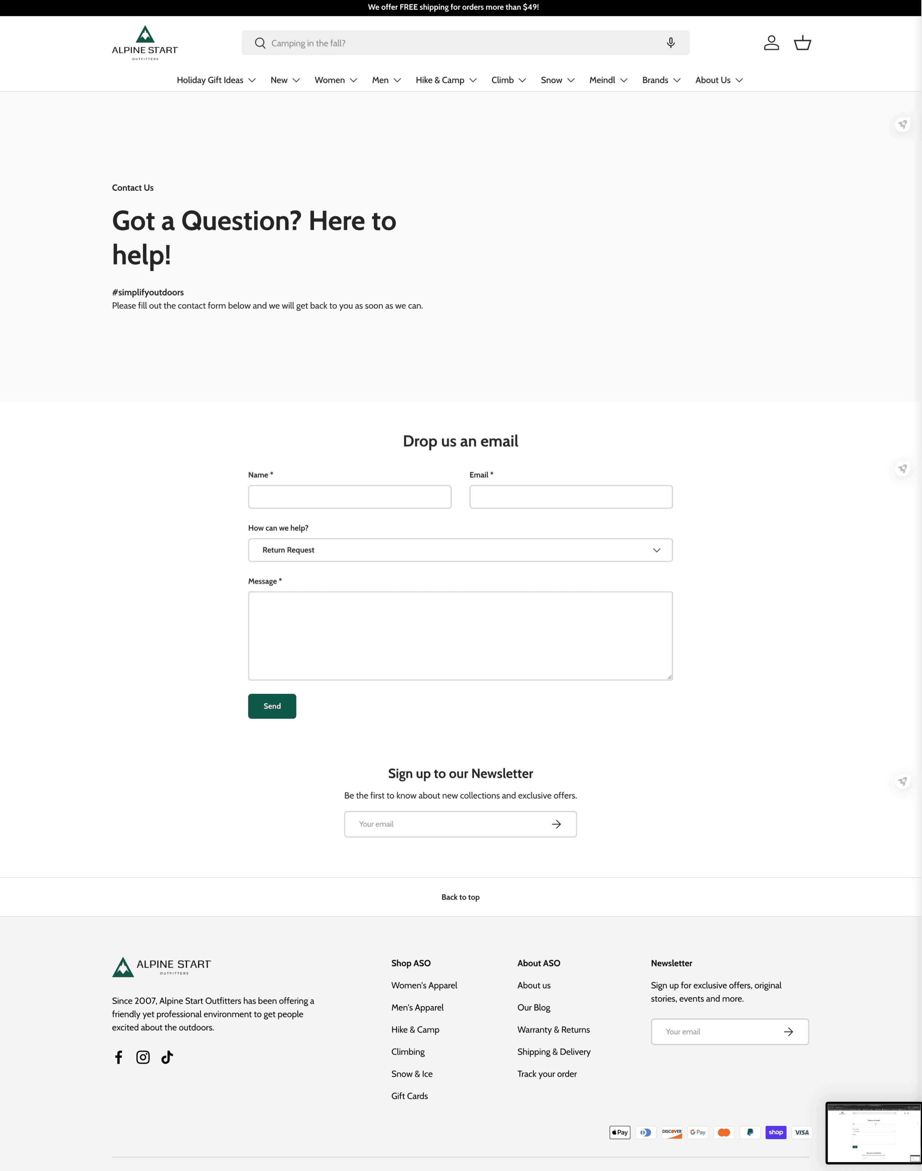
Placed the contact form directly on the webpage instead of having to click on a button to reach one.
Got rid of the map as ASO no longer has offline stores.
Two previous webpages ('Contact Us' & 'Warranty and Returns') on the top and newly designed webpage on the bottom ('Contact Us').
What we have achieved
AN INCREASED NUMBER OVERALL
More attention! Gather around, everyone!
On September 22, 2023, our new website went live. The previous website was having serious issues and therefore, we had to hurry the launch.
However, despite the predicament, we were able to show customers a new and improved version of ASO online.
The project didn’t have any particular goals in number but since the launch, ASO was able to see an increase of visitors by 22%, sessions by 22%, and pageviews by 30%.
*Sep 22, 2023 - Dec 06, 2023: around 76 days since launch
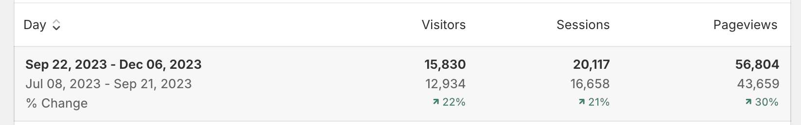
Analytics from Shopify admin.
Learnings
THERE IS INDEED NO “ONE” DESIGN PROCESS
Here’s what came to mind after wrapping up the project.
1
TRUSTING MYSELF
Being the solo designer on the team, I had times when I wished I could have other designers’ opinions to critique my designs and suggestions. However, in the end, this was a great opportunity where I gained confidence in presenting, "defending" and communicating my designs to clients head-on.
2
TRUSTING THE PROCESS
Despite the efforts including research on Shopify before committing to the project, I found out that there were indeed a lot more constraints to building the final product. The fairly “different” design process had me slightly worried thinking that I wasn’t going the right path.
However, after gaining that firsthand experience of roadblocks that come into play during a design process I learned to realize there is indeed no one design process. The more important fact was that I came up with solutions to work around those constraints for end results.