ASO 2.0
ASO 2.0
Alpine Start Outfitters, December 2023
Alpine Start Outfitters, December 2023
Alpine Start Outfitters (ASO), a retailer specializing in outdoor goods from various brands, planned to transition entirely to online sales. To support this shift, ASO needed a refreshed website design. Leading the project, I conducted audits and spearheaded a comprehensive redesign and rebrand to enhance the user experience. The revamped website resulted in a 21% increase in page sessions post-launch.
Alpine Start Outfitters (ASO), a retailer specializing in outdoor goods from various brands, planned to transition entirely to online sales. To support this shift, ASO needed a refreshed website design. Leading the project, I conducted audits and spearheaded a comprehensive redesign and rebrand to enhance the user experience. The revamped website resulted in a 21% increase in page sessions post-launch.
My Role
Lead UX/UI Designer working in a company-wide team of 11
Timeline
5 months
Worked with
E-commerce specialist
Customer Service Representative
Stakeholders (general managers)

Brand
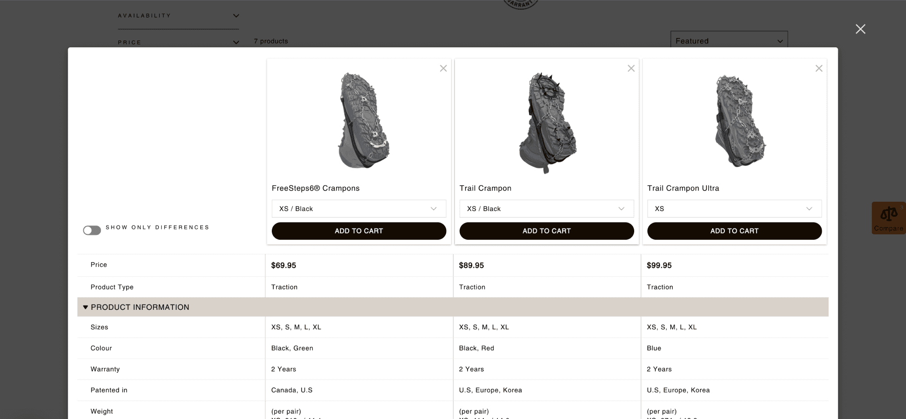
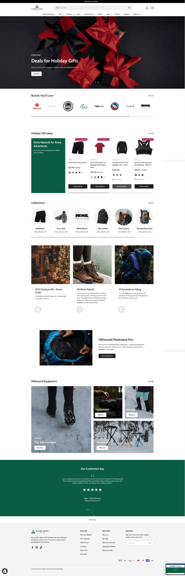
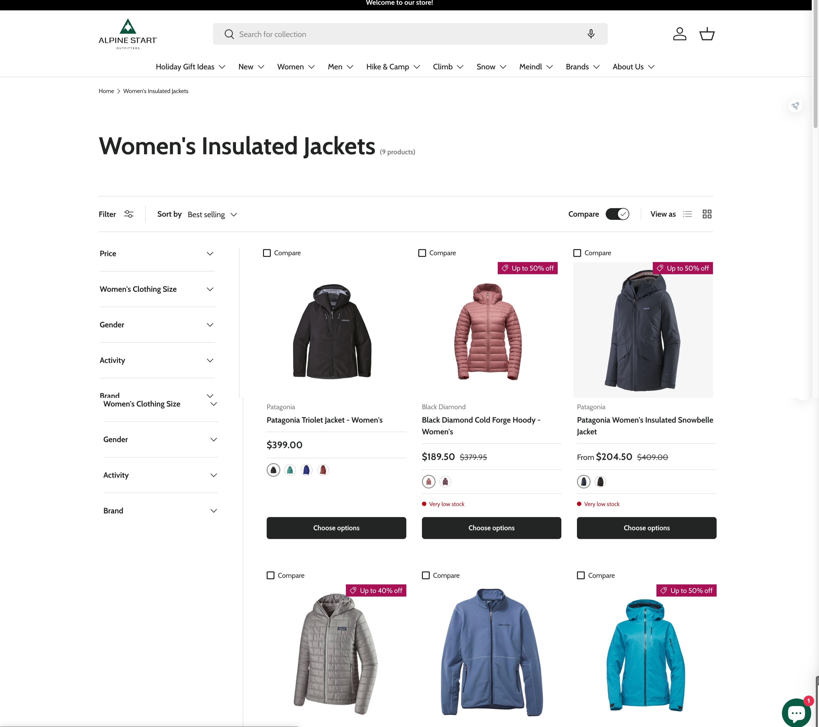
Key desktop version product comparison tables.
Key desktop version product comparison tables.

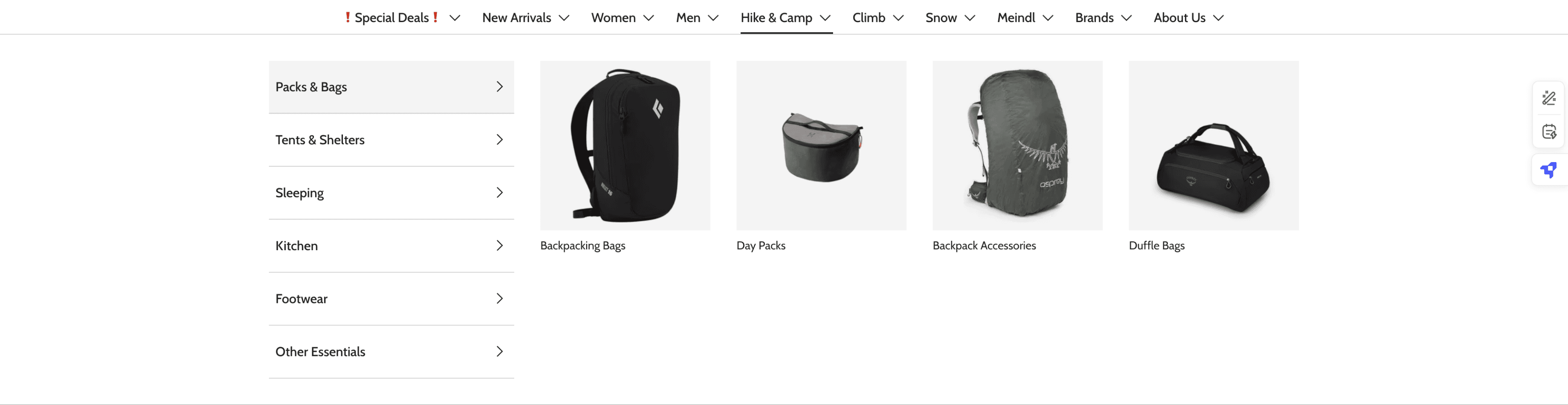

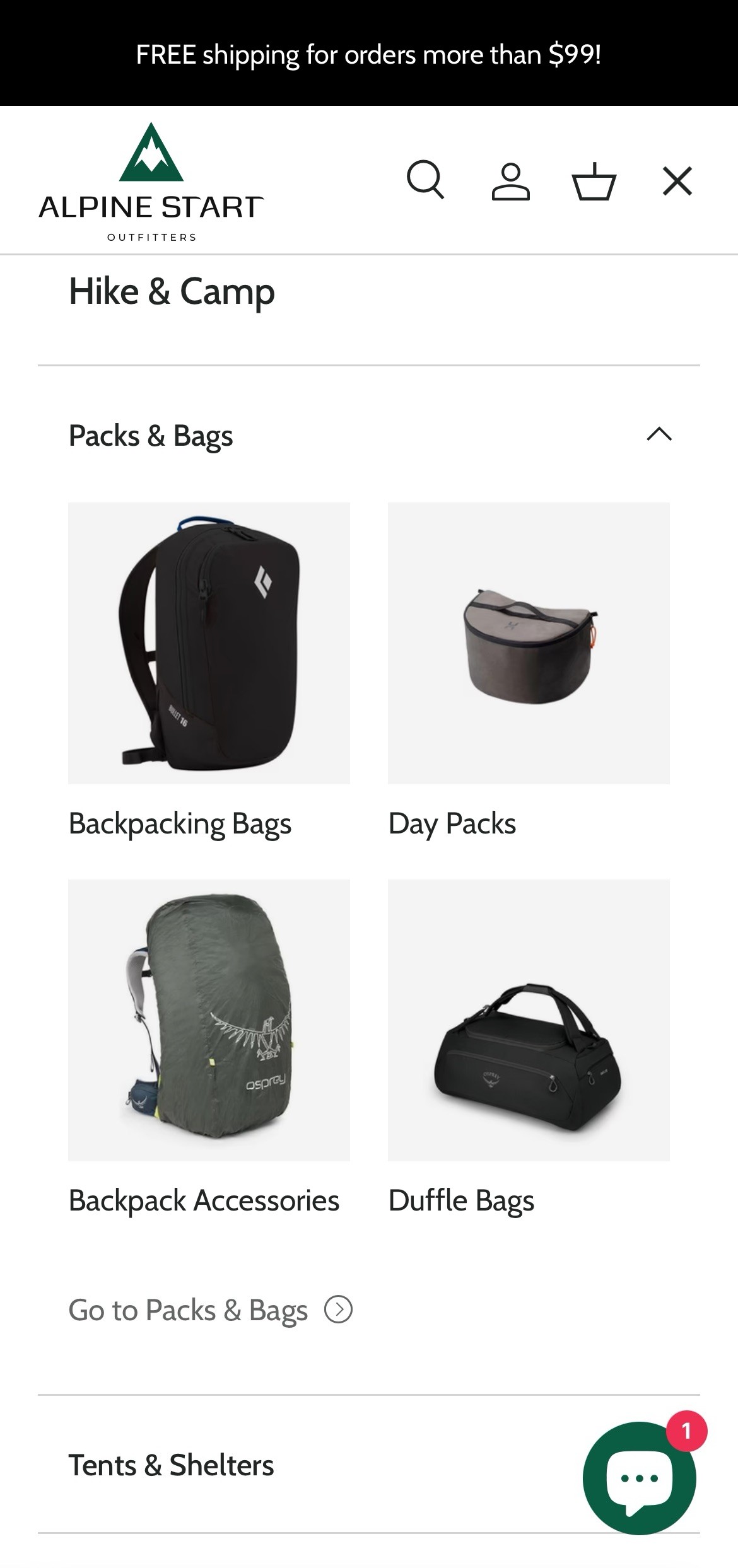
Key mobile version pages.
Key mobile version pages.
Hillsound Equipment’s Goals
A usability audit for their website
The Outcome
THE PRODUCT -
Usability audits led to a rebranding and redesign of ASO's website. At the end of the project, the e-commerce website had a systematic style guide as well as a streamlined IA of product category pages.
IMPACT -
The redesign and launch of the product gave a notable positive impact, with a 21% increase of page sessions on the website.
01 Problem Research
01 Problem Research
01 Problem Research
The audit: Self audit by Cindy Choi
The audit: Self audit by Cindy Choi
“I WONDER HOW MANY PEOPLE WORKED ON THIS.”
“I WONDER HOW MANY PEOPLE WORKED ON THIS.”
Design Inconsistency
Design Inconsistency
I began by addressing one of the most prominent issues identified during the initial meeting: design inconsistency. The website lacked uniformity, with mismatched colors, typefaces, and other design elements, suggesting that the previous designer had repeatedly switched to different styles without maintaining a cohesive approach.
I began by addressing one of the most prominent issues identified during the initial meeting: design inconsistency. The website lacked uniformity, with mismatched colors, typefaces, and other design elements, suggesting that the previous designer had repeatedly switched to different styles without maintaining a cohesive approach.
1
3
2
ASO’s previous landing page
Screenshots of ASO’s 1.0 website.
Screenshots of ASO’s 1.0 website.
1
Inconsistent margins and paddings across all UI elements. Margin and padding around each container/element were all inconsistent.
Inconsistent margins and paddings across all UI elements. Margin and padding around each container/element were all inconsistent.
2
Using image elements as buttons. Not only were the buttons part of the background image, but they also had inconsistent paddings.
Using image elements as buttons. Not only were the buttons part of the background image, but they also had inconsistent paddings.
3
Not following the best practices (e.g. all-caps font used as paragraph text). The previously used typeface, Amatic SC, does not have lowercase glyphs. Therefore, text in all caps made it especially hard to read.
Not following the best practices (e.g. all-caps font used as paragraph text). The previously used typeface, Amatic SC, does not have lowercase glyphs. Therefore, text in all caps made it especially hard to read.
4
Unclear brand voice. The categories, Description, Price, Reviews etc.,
The audit: Interviews
The audit: Interviews
TALKING TO THE INTERNAL TEAM
TALKING TO THE INTERNAL TEAM
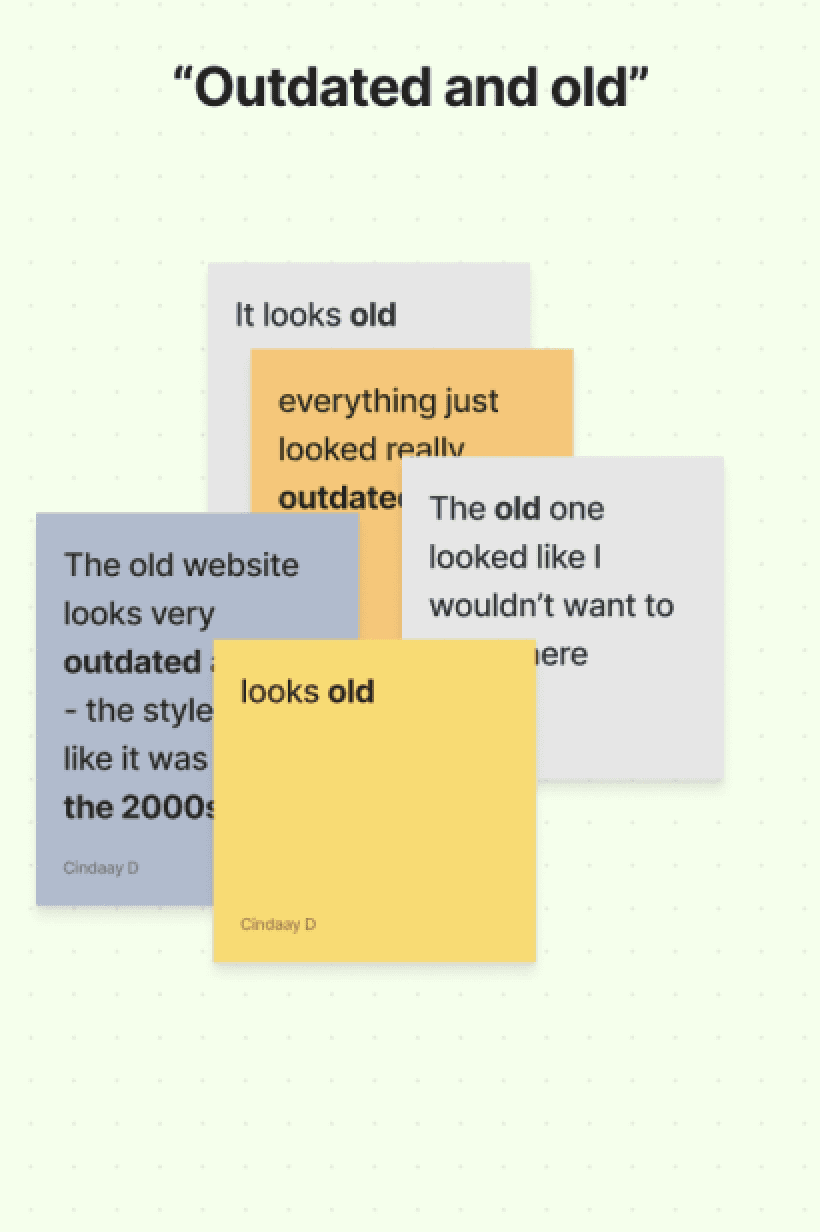
"Different and old"
"Different and old"
To validate my assumptions, I sought feedback from another key group: ASO’s staff. Considering the tight schedule and budget, I interviewed 10 staff members to gather insights on:
Their experiences with ASO’s previous website.
Their shopping habits and behaviors when purchasing outdoor gear and apparel.
In summary, the staff confirmed that the website suffered from a disorganized and inconsistent application of its design and brand guidelines.
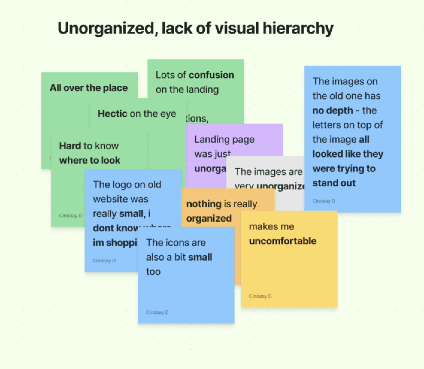
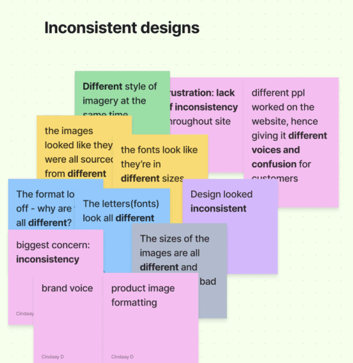
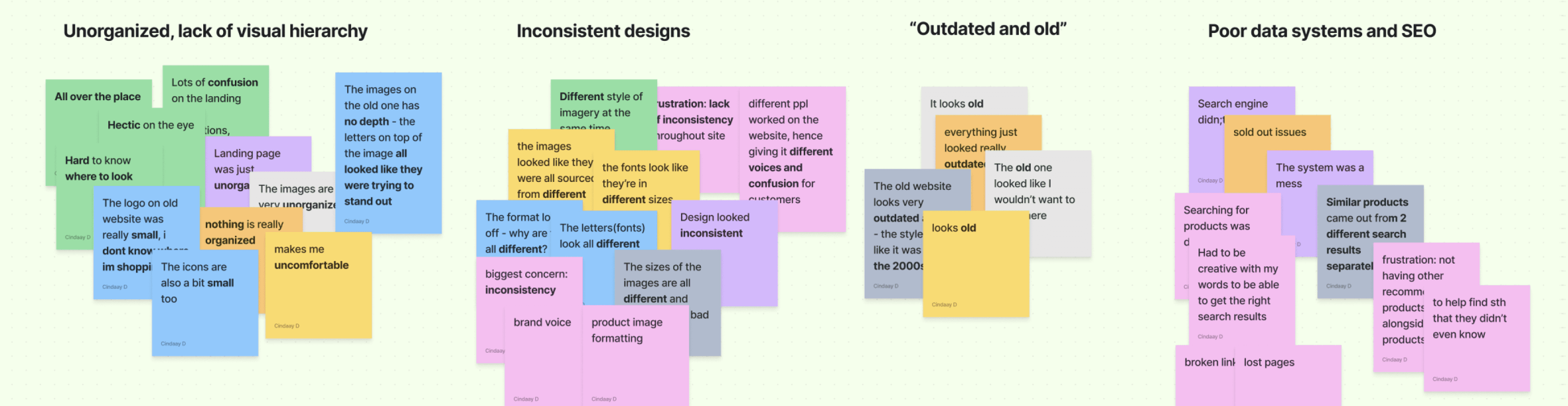
Grouped similar words, and drew keywords. 7 out of 10 people mentioned either mentioned, “unorganized” or “different”.
Grouped similar words, and drew keywords. 7 out of 10 people mentioned either mentioned, “unorganized” or “different”.
02 Define
02 Define
02 Define
The Diagnosis
The Diagnosis
SUGGESTING ASO 2.0
The proposal.
There were two things to consider:
ASO was shifting their offline business completely online.
The previous "placeholder" website was very outdated.
I proposed the following to my clients with the information gathered above:
📌 Rebranding and redesigning the website
📌 Create a design guideline
📌 Restructure website IA
03 Branding
03 Branding
03 Branding
Brand Research
Brand Research
FIGURING OUT ASO'S NEW STYLE
FIGURING OUT ASO'S NEW STYLE
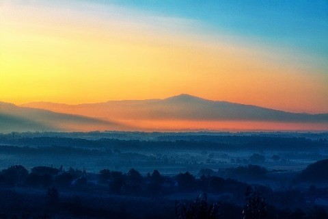
Alpine Start doesn't always mean "green".
To establish a design guide/system, I further explored color palette options. To guide this process, I delved into the brand's origin and the meaning of "alpine start."
I discovered that "alpine start" refers to "early dawn" or "daybreak." Using this insight, I researched images of these moments and extracted colors from them to build a visual reference for a more fitting and cohesive palette.
Here's what I uncovered:
94C83D
073F2E
ASO’s previous logo and colours


DC905D
01216C
093A61
FAD07B
43779F
0B6363
097288
Images of “alpine start” and colours
Images of “alpine start” and colours
Images searched with “alpine start” and colours selected with colour pickers.
Images searched with “alpine start” and colours selected with colour pickers.
“Early dawn” or “Daybreak”. Alpine start would mean an early morning start, typically before dawn, often used in mountaineering or long hikes to allow for maximum daylight and favorable weather conditions. (Campnab)
“Early dawn” or “Daybreak”. Alpine start would mean an early morning start, typically before dawn, often used in mountaineering or long hikes to allow for maximum daylight and favorable weather conditions. (Campnab)
Not so much green. Due to "alpine start" referring to a time before dawn, it was interesting to see more of warm orange or rather than just shades of green.
Not so much green. Due to "alpine start" referring to a time before dawn, it was interesting to see more of warm orange or rather than just shades of green.
The Final Decisions
The Final Decisions
MINIMIZING THE CHANGE
MINIMIZING THE CHANGE
A trend in the logos: Simple styles.
Market research revealed a growing trend among brands to simplify their designs by reducing the use of colors and visual elements. This approach has the added benefit of promoting environmental sustainability, such as minimizing the use of colored inks.
The client embraced this idea, as it aligns closely with the brand's core values and commitment to sustainability.
Opted for a san-serif and simplified elements such as the lines and illustration (trees and landscape).
After


Before
The background colours and landscape were removed.
Examples of logo rebrands. Annotations of detailed analysis on the right in pink.
Examples of logo rebrands. Annotations of detailed analysis on the right in pink.
Minimizing the revamp of branding.
After several revision meetings, we decided to retain the main mountain logo and the green hue in the color palette to maintain brand recognition and minimize customer confusion.
However, the logo was refined with simplified strokes and elements, along with an updated, cohesive color palette to give it a modern and streamlined appearance.
ASO 2.0 logo
ASO 2.0 logo
ASO 2.0 logo
previous logo
previous logo
previous logo
kept the mountain logo
kept the mountain logo
kept the mountain logo
kept the mountain logo
reduced the boldness
but kept the signature tails/feet of font
reduced the boldness
but kept the signature tails/feet of font
reduced the boldness
but kept the signature tails/feet of font
reduced the boldness
but kept the signature tails/feet of font
minimized elements & colour
minimized elements & colour
minimized elements & colour
minimized elements & colour
ASO’s previous logo (left), and the new logo (right).
ASO’s previous logo (left), and the new logo (right).
Design Style/Guideline
Design Style/Guideline
REINFORCING THE ONENESS
REINFORCING THE ONENESS
ASO's new design guideline.
ASO's website had been live for five years, but with multiple contributors over time, the graphics and UI lacked a cohesive "voice." Essentially, there was no design guide to ensure consistency.
To address this, I developed a minimal design guide/system focused on organization and efficiency. Considering the customization limitations of Shopify websites, I prioritized the most essential elements: button styles, color palettes, and typefaces.
Design library “curated” from a template on Mizko’s Designership.
Design library “curated” from a template on Mizko’s Designership.
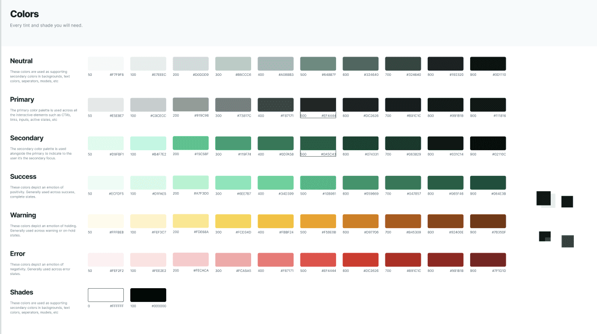
The Colour Palette. We started with a green shade (#09543D) and a black variant (#212523) which was derived from the green shade. I used a template from Mizko to create different shades of the two colours as well as the other essential colours to save time.
The Colour Palette. We started with a green shade (#09543D) and a black variant (#212523) which was derived from the green shade. I used a template from Mizko to create different shades of the two colours as well as the other essential colours to save time.
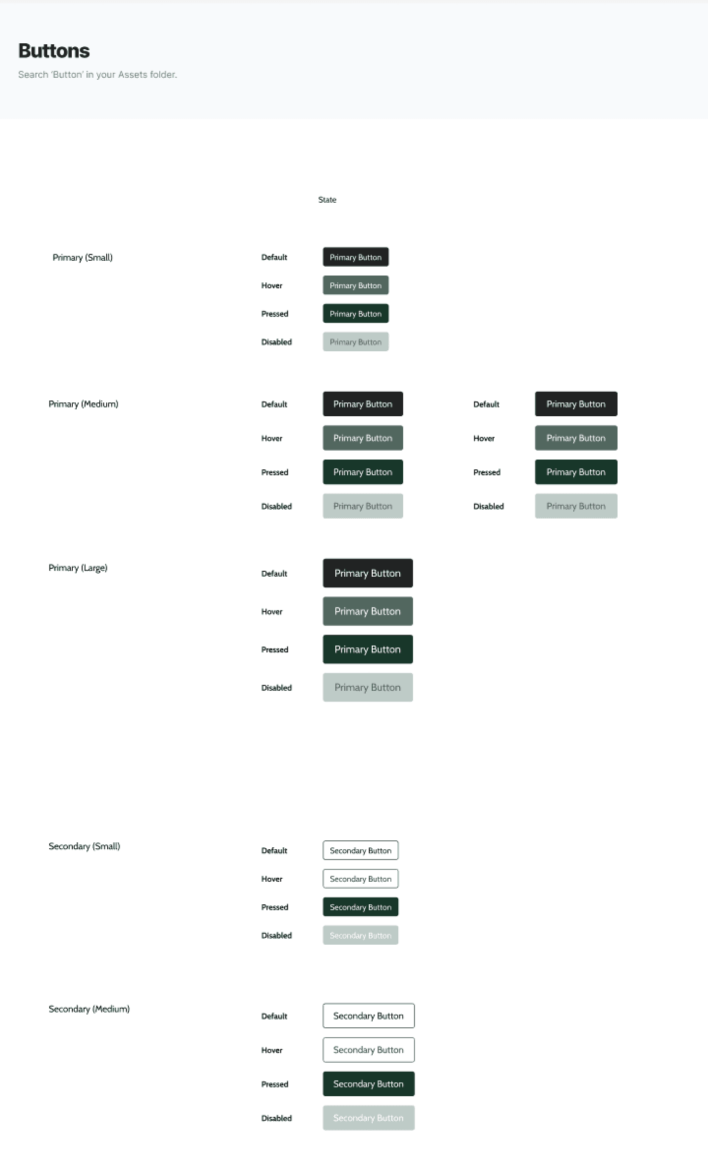
Buttons. Shopify doesn’t allow customization down to the pixel, but establishing a style guide for the different states of buttons such as default, pressed, hovered and disabled was essential to enhance cohesiveness.
Buttons. Shopify doesn’t allow customization down to the pixel, but establishing a style guide for the different states of buttons such as default, pressed, hovered and disabled was essential to enhance cohesiveness.
Goodbye, “Amatic” and hello, “Cabin”! The Amatic SC font, ASO's “signature” font, wasn't the best to be used for every text element. I chose the simple san-serif and websafe font, Cabin, to replace the predecessor.
Goodbye, “Amatic” and hello, “Cabin”! The Amatic SC font, ASO's “signature” font, wasn't the best to be used for every text element. I chose the simple san-serif and websafe font, Cabin, to replace the predecessor.
04 Design
04 Design
04 Design
Layouts and Design
Layouts and Design
FINDING THE RIGHT TEMPLATE
FINDING THE RIGHT TEMPLATE
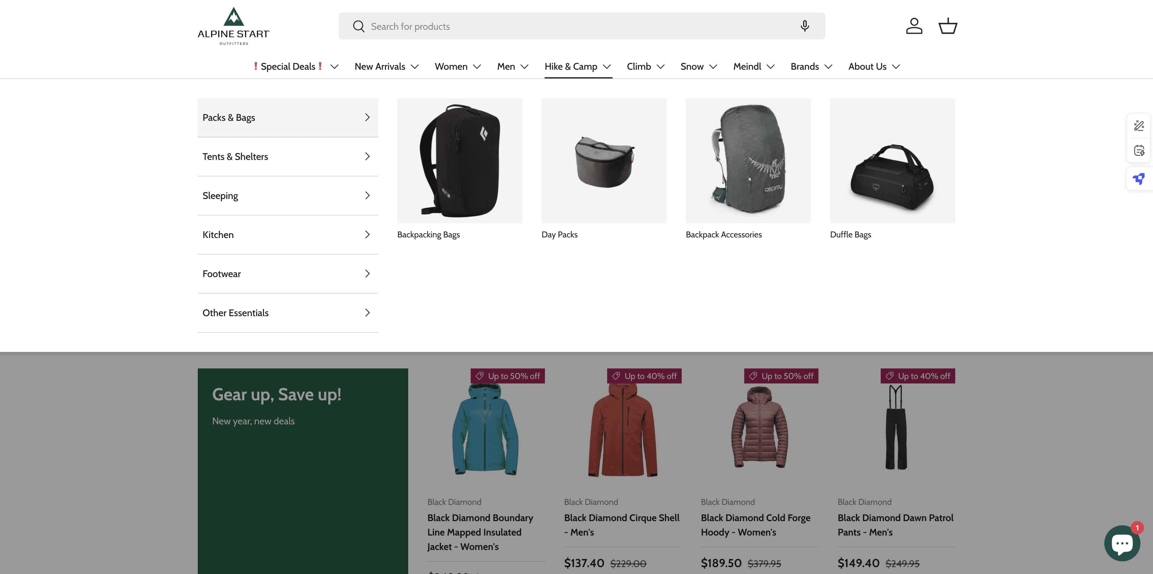
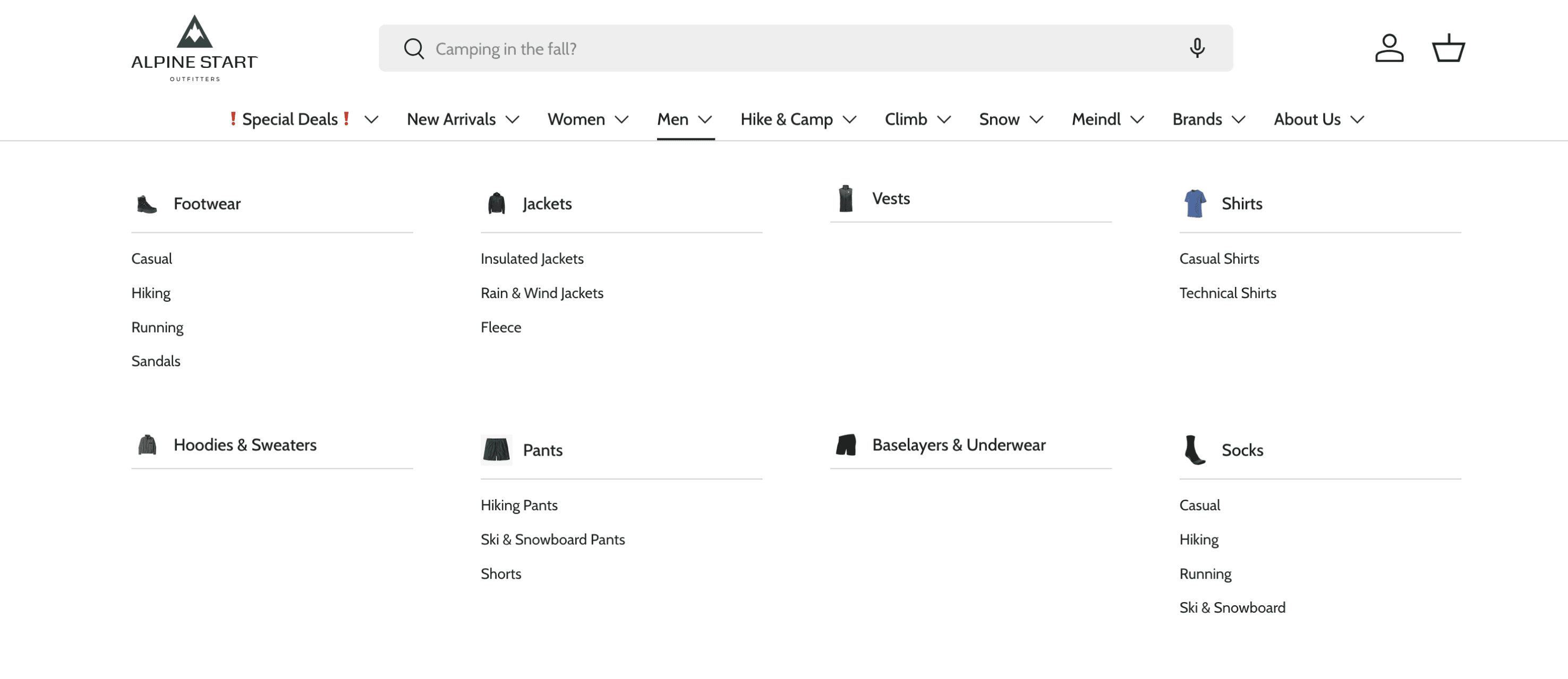
A theme with a mega menu.
The Shopify Theme Store provides templates for online business owners to customize their Shopify stores.
Since ASO opted not to outsource design to code, my next step was to browse for a suitable theme. Upon reviewing the website’s information architecture (IA), I found that ASO had 91 pages under the main navigation menu. This extensive structure made it essential to reinforce the category hierarchy with visual aids.
I selected the Enterprise theme, which features a versatile Mega Menu. Unlike basic text-based menus, Enterprise offers various image sizes and configurations, enhancing navigation and visual clarity for users.
ASO’s previous dropdown menu
ASO’s previous dropdown menu
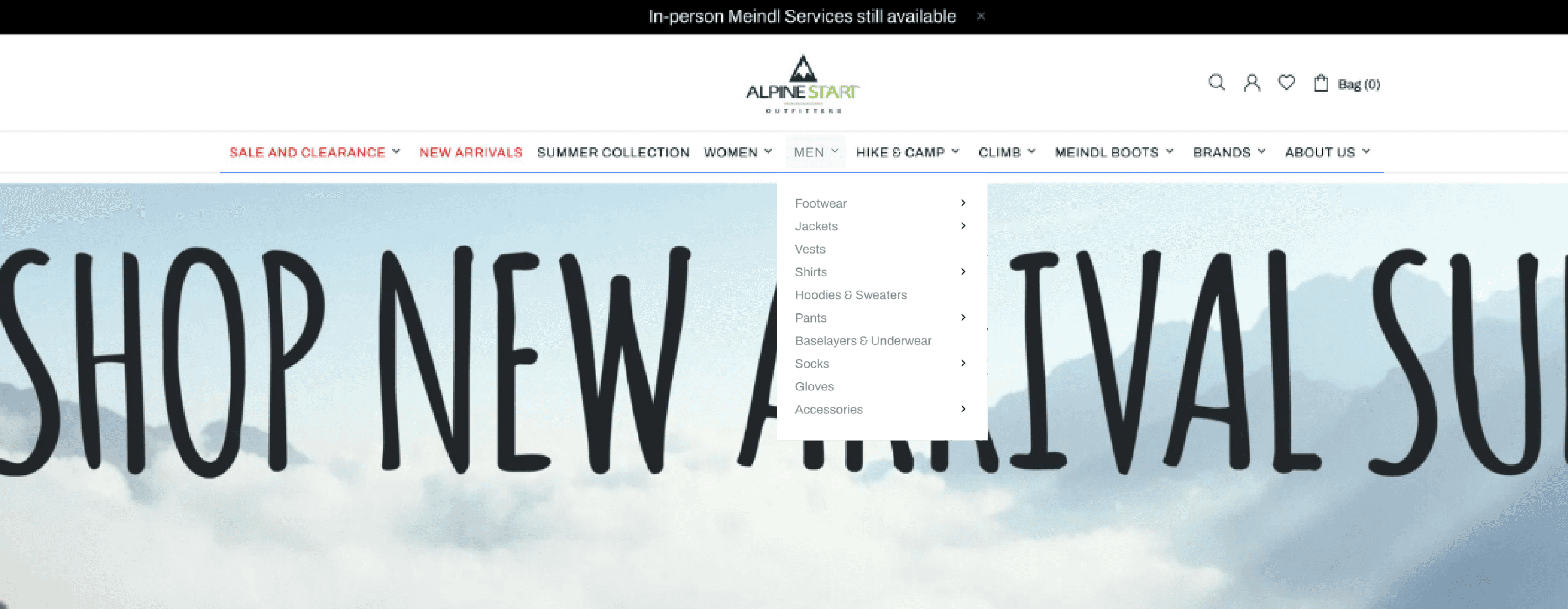
Theme Enterprise demo store’s dropdown menu
Theme Enterprise demo store’s
dropdown menu
All dropdown menus were the same, without any visuals
All dropdown menus were the same, without any visuals
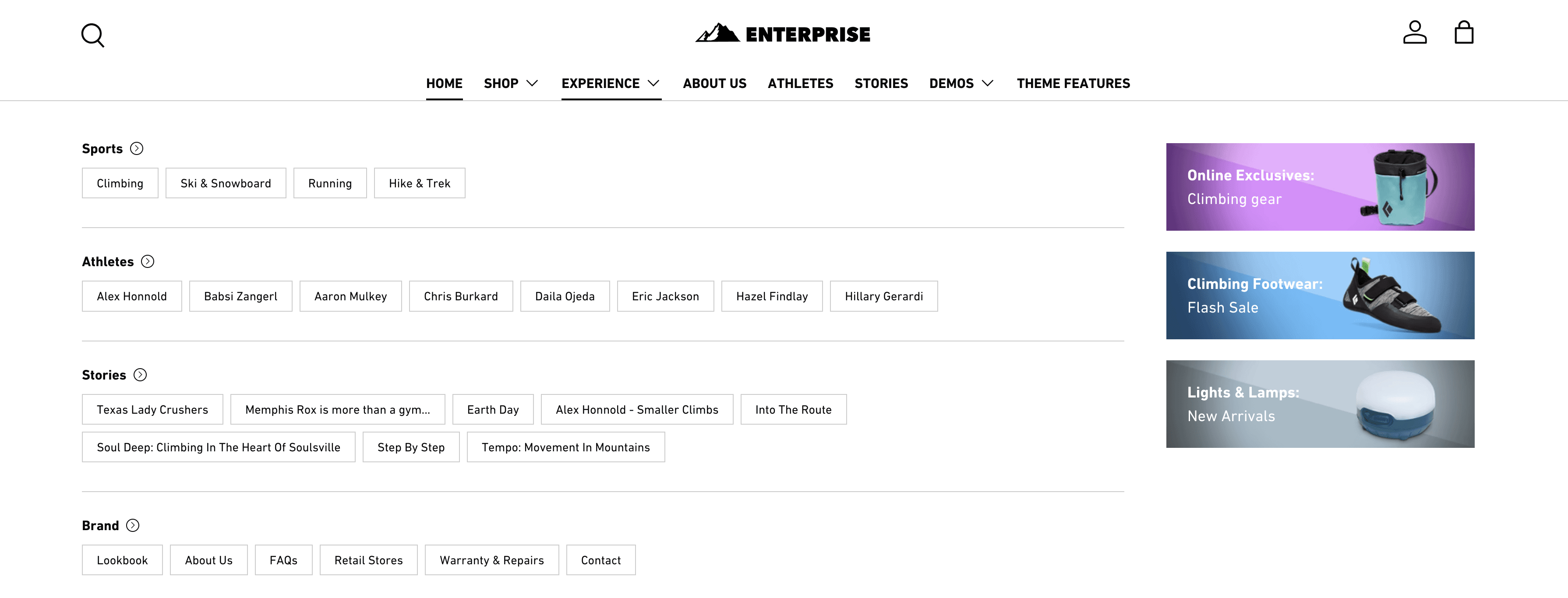
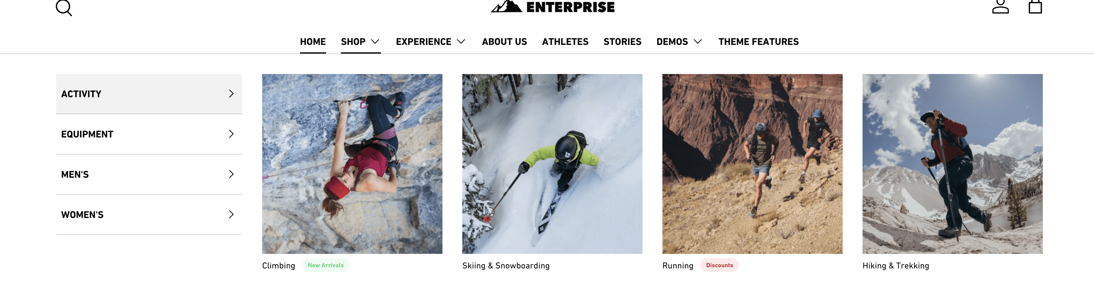
Different layouts of dropdowns are available, including image support
Different layouts of dropdowns are available, including image support
ASO’s previous dropdown menu (top) and 2 different configurations of mega menus (bottom).
ASO’s previous dropdown menu (top) and 2 different configurations of mega menus (bottom).
Information Architecture
Information Architecture
SKELETON REVAMP
SKELETON REVAMP
Cohesiveness in catgory names.
I noticed an inconsistency in the naming system as well: under Women, the category was labeled "Casual Shirts & Tanks," while for Men, it was simply "T-shirts."
To ensure consistency, I renamed "T-shirts" to "Casual Shirts" for the Men’s category. This change was based on two key reasons:
The Men’s category included both T-shirts and tanks.
Both T-shirts and tanks fall under the broader category of Casual Shirts (excluding those made with technical fabrics).
Before
Before
Shirts
Shirts
Shirts
Shirts
Casual Shirts & Tanks
Casual Shirts
& Tanks
Technical Shirts
Technical
Shirts
T-shirts
T-shirts
Technical Shirts
Technical
Shirts
Women
Women
Men
Men
After
After
Casual Shirts & Tanks
Casual Shirts
& Tanks
Technical Shirts
Technical
Shirts
Casual Shirts
Casual
Shirts
Technical Shirts
Technical
Shirts
Women
Women
Men
Men
Shirts
Shirts
Shirts
Shirts
renamed!
renamed!
The before and after of Shirts under women and men.
The before and after of Shirts under women and men.
Keeping product pages up-to-date.
During the initial self-audit, I identified several category pages that were either completely empty or contained only a single product, many of which were sold out. This presented an excellent opportunity to address these issues during this stage of the project.
Below are a few examples:
After
Stoves & Fuel
Stoves & Fuel
Food & Drink
Food & Drink
Cookware & Dinnerware
Cookware & Dinnerware
Cookware
& Dinnerware
Water Storage & Treatment
Water Storage & Treatment
Water Storage
& Treatment
Sleeping Bags
Sleeping Bags
Sleeping Mats
Sleeping Mats
Sleeping Accessories
Sleeping Accessories
Sleeping
Accessories
Sleeping
Sleeping
Kitchen
Kitchen
deleted!
deleted!
deleted!
Before
Stoves & Fuel
Stoves & Fuel
Stoves & Fuel
Food & Drink
Food & Drink
Food & Drink
Cookware & Dinnerware
Cookware & Dinnerware
Cookware
& Dinnerware
Water Storage & Treatment
Water Storage & Treatment
Water Storage
& Treatment
Sleeping Bags
Sleeping Bags
Sleeping Bags
Sleeping Mats
Sleeping Mats
Sleeping Mats
Pillows
Pillows
Pillows
Sleeping Liners
Sleeping Liners
Sleeping Liners
Sleeping Bag Accessories
Sleeping Bag Accessories
Sleeping Bag
Accessories
Sleeping
Sleeping
Sleeping
Kitchen
Kitchen
Kitchen

combined!
combined!
The before and after of AI of categories, 'Sleeping' and 'Kitchen'.
The before and after of AI of categories, 'Sleeping' and 'Kitchen'.
Combining subcategories. ‘Sleeping Bag Accessories’ was originally empty, however, because it can include “pillows” and “sleeping bag liners”, 3 subcategories were combined to 1. Hence, ‘Sleeping Accessories’!
Combining subcategories. ‘Sleeping Bag Accessories’ was originally empty, however, because it can include “pillows” and “sleeping bag liners”, 3 subcategories were combined to 1. Hence, ‘Sleeping Accessories’!
Deleting subcateogories. There were a couple of category and subcategory pages that were left empty for a long time. By checking with the business team, we decided to delete certain subcategories that had no further plans on being restocked.
Deleting subcateogories. There were a couple of category and subcategory pages that were left empty for a long time. By checking with the business team, we decided to delete certain subcategories that had no further plans on being restocked.
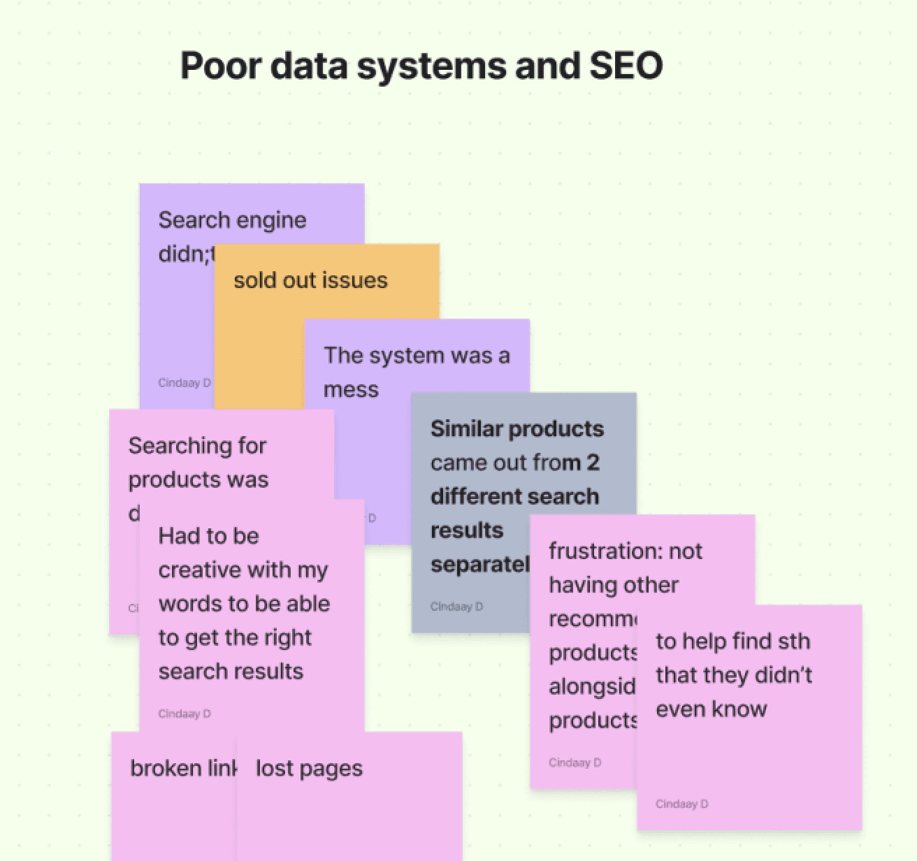
Unexpected roadblock
ADAPTING TO TIMELINE CONSTRAINTS
ADAPTING TO TIMELINE CONSTRAINTS
Focusing on snippets for layout optimization.
Focusing on snippets for layout optimization.
Around this time, the previous website began to experience technical issues, significantly tightening our timeline.
To adapt, I chose to retain most of the existing content and focused on identifying the best snippets to enhance the layout and presentation. For instance, on the landing page, I prioritized using snippets that optimized structure and visuals.
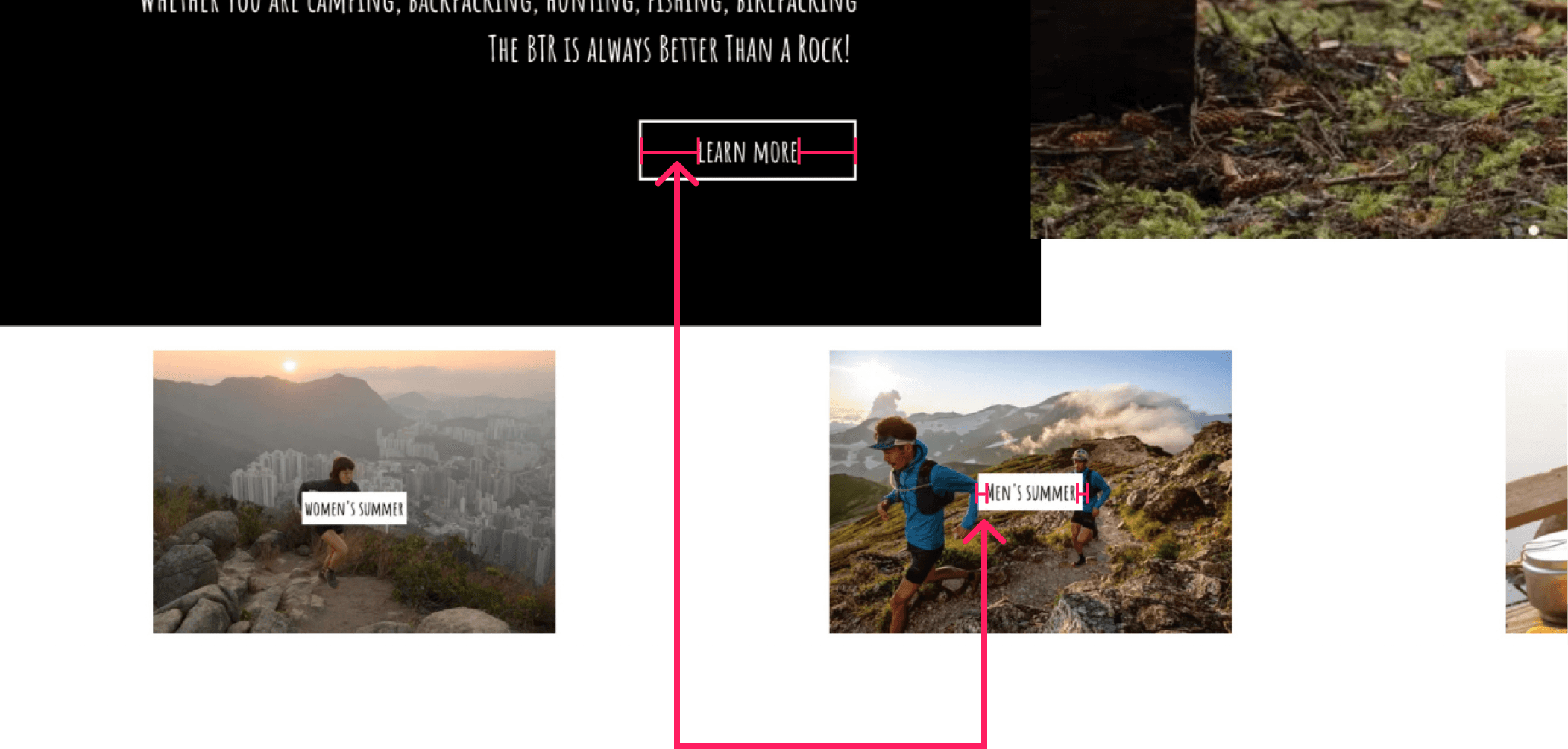
Below are annotated wireframes I used to effectively communicate these decisions with my client.
Around this time, the previous website began to experience technical issues, significantly tightening our timeline.
To adapt, I chose to retain most of the existing content and focused on identifying the best snippets to enhance the layout and presentation. For instance, on the landing page, I prioritized using snippets that optimized structure and visuals.
Below are annotated wireframes I used to effectively communicate these decisions with my client.

Current layout
Current layout
New layout
New layout
Banner
promotional
site-wide notice
Banner
promotional
site-wide notice
Banner
promotional
site-wide notice
Banner
promotional
site-wide notice
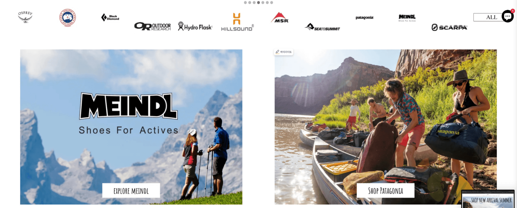
Brands
Brands
Brands
Brands
Featured brand 1:
Meindl boots
Featured brand 1:
Meindl boots
Featured brand 1:
Meindl boots
Featured brand 1:
Meindl boots
Collection 1
Collection 1
Collection 1
Collection 1
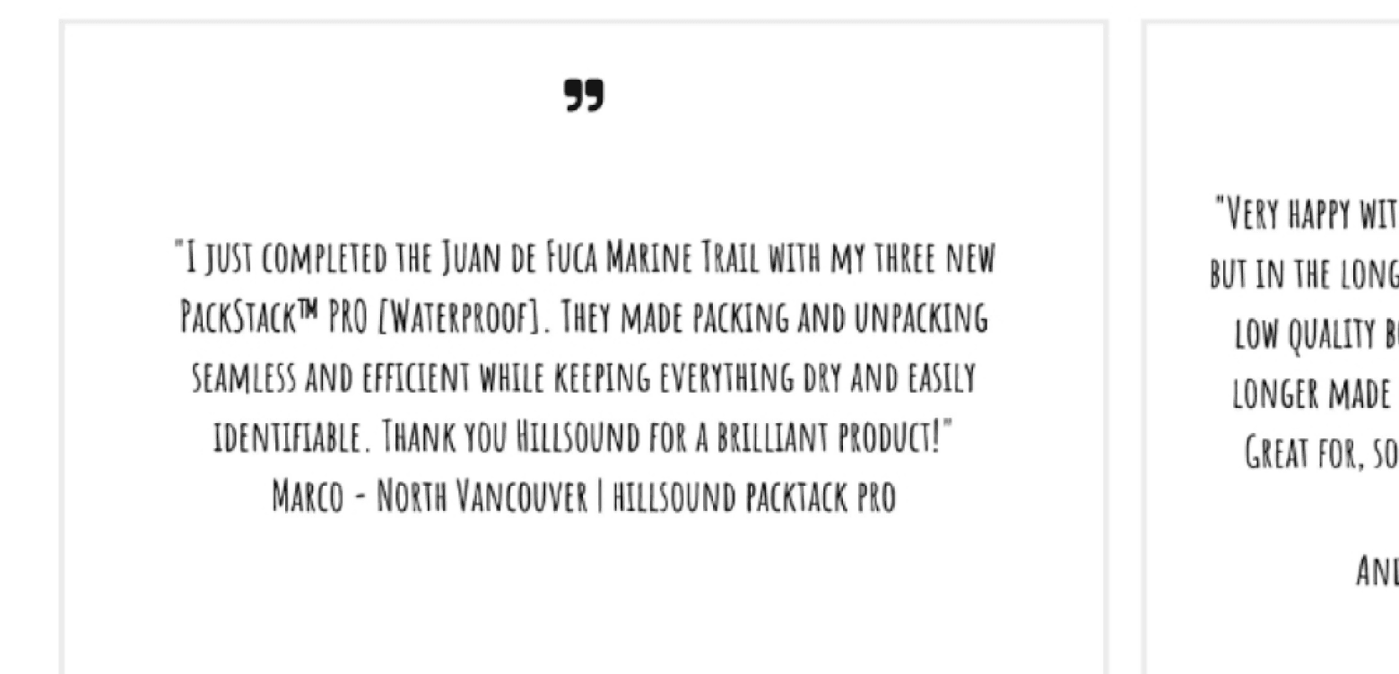
Review 1
Review 1
Collection 2
Collection 2
Collection 2
Collection 2
Review 2
Review 2
Collection 3
Collection 3
Collection 3
Collection 3
Review 3
Review 3
Featured brand 3:
Hillsound
Featured brand 3:
Hillsound
Hillsound product review
Hillsound product review
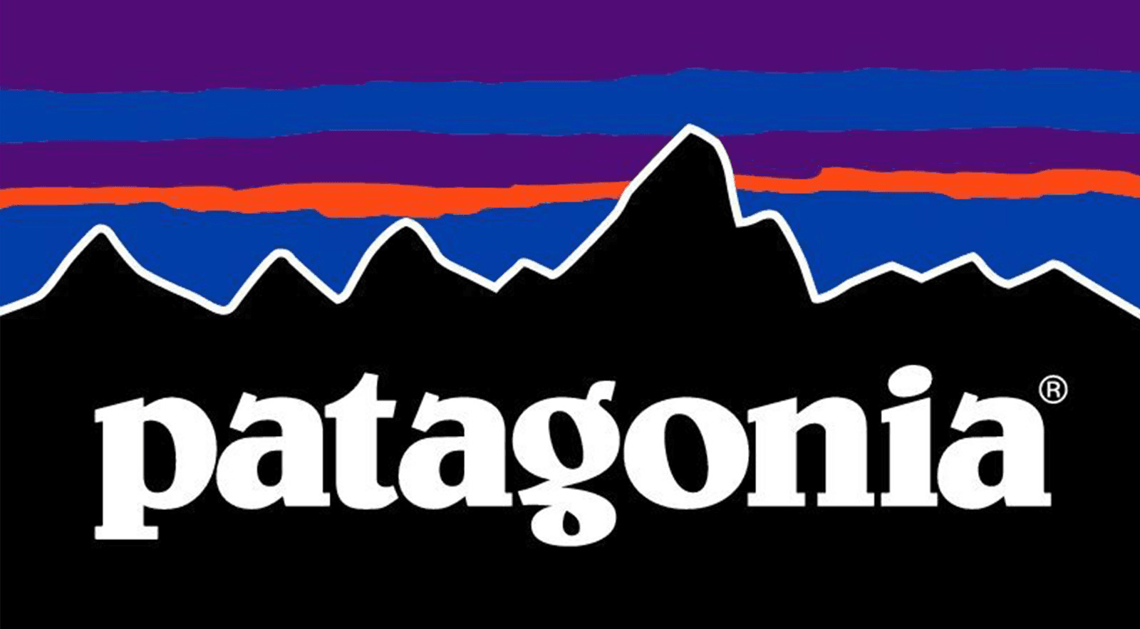
Featured brand 2:
Patagonia
Featured brand 2:
Patagonia
Featured brand 2:
Patagonia
Featured brand 2:
Patagonia
Main collection
Main collection
Most of traffic come from promotional email newsletters - important to display curated collections instead of selected brands
Most of traffic come from promotional email newsletters - important to display curated collections instead of selected brands
Hillsound product review
Review 3
Review 3
Review 2
Review 2
Review 1
Review 1
Partnership ended
Partnership ended
Ex) Transitioning into fall - hiking for fall/raincouver?
Ex) Transitioning into fall - hiking for fall/raincouver?
Ex) Transitioning into fall - hiking for fall/raincouver?
Being a multi-brand carrier, most of our customers search by brand and see if we carry the one they're looking for.
Being a multi-brand carrier, most of our customers search by brand and see if we carry the one they're looking for.
Being a multi-brand carrier, most of our customers search by brand and see if we carry the one they're looking for.
Wireframe of landing page with annotations of layout restructuring.
Wireframe of landing page with annotations of layout restructuring.
06 Final Designs
06 Final Designs
06 Final Designs
Successfully making ASO 2.0 live
Successfully making ASO 2.0 live
ASO’S NEW OUTFIT
ASO’S NEW OUTFIT
An e-commerce site with more order.
An e-commerce site with more order.
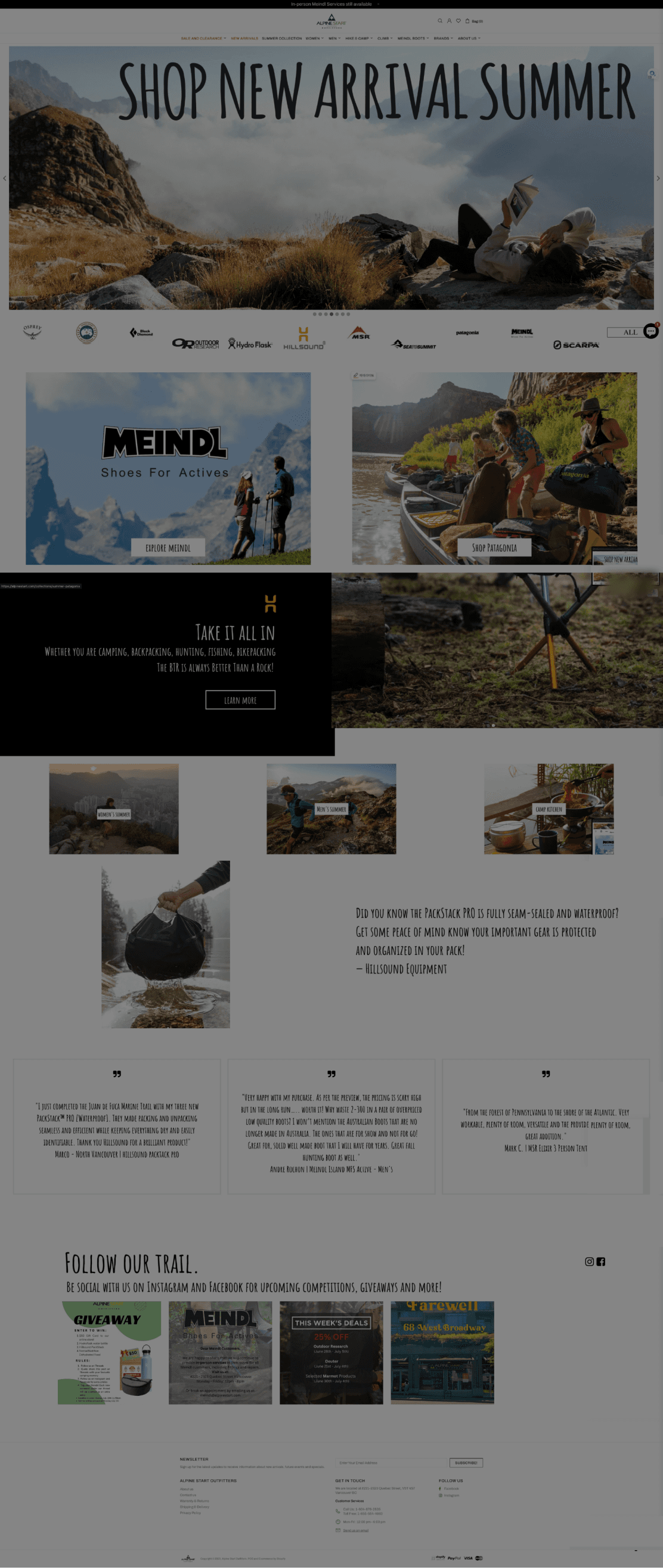
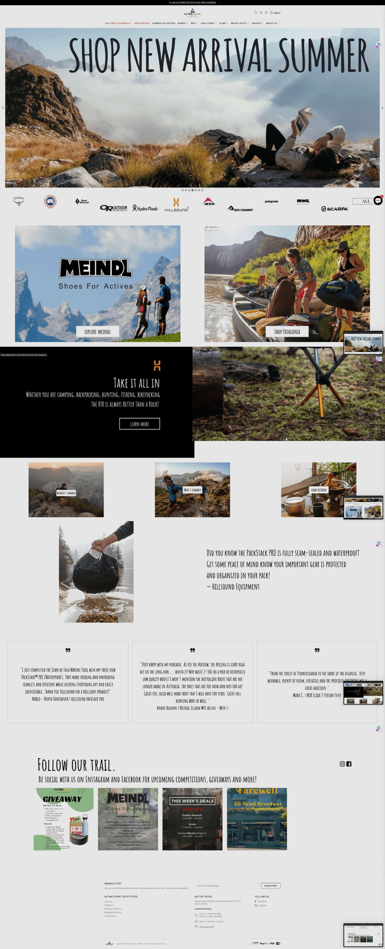
At last, we launched ASO’s newly refurbished website on September 22, 2023. At a glance, the website has more a cohesive structure and layout.
consistent paddings and margins within elements
properly using “button” elements for buttons
consistent use of design guide (e.g. colours & fonts etc.)
At last, we launched ASO’s newly refurbished website on September 22, 2023. At a glance, the website has more a cohesive structure and layout.
consistent paddings and margins within elements
properly using “button” elements for buttons
consistent use of design guide (e.g. colours & fonts etc.)

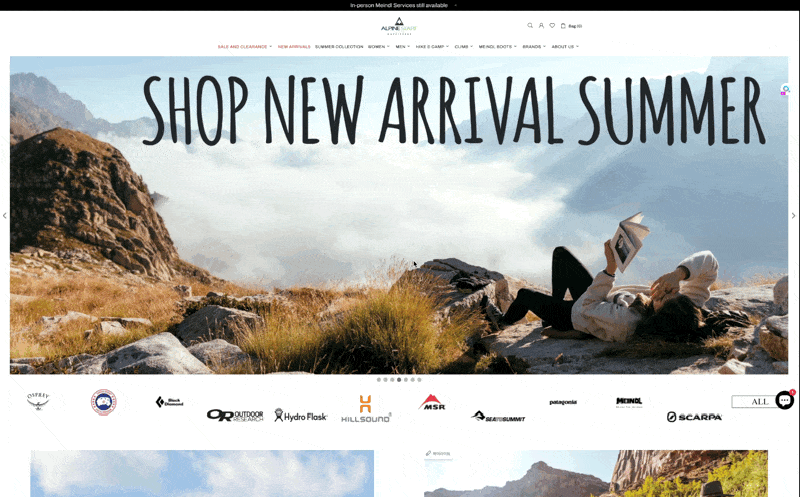
Overivew of ASO’s landing page. Before (left) and after (right).
Overivew of ASO’s landing page. Before (top - left) and after (bottom - right).
Overivew of ASO’s landing page. Before (left) and after (right).
Primary
Secondary
Tertiary
ASO’s new logo set. The primary (left), secondary (middle), and the tertiary (right). Respective favicons placed on bottom.
ASO’s new logo set. The primary (left), secondary (middle), and the tertiary (right). Respective favicons placed on bottom.
Enhanced visual hierarchy through Mega Menus.
Enhanced visual hierarchy through Mega Menus.
Utilizing the Mega Menu feature from the Theme, we implemented the dropdowns to be a lot more visually-oriented with layouts that enhance visual hierarchy.
Below are some of the changes that were made: the icon logo and the bar.
Utilizing the Mega Menu feature from the Theme, we implemented the dropdowns to be a lot more visually-oriented with layouts that enhance visual hierarchy.
Below are some of the changes that were made: the icon logo and the bar.
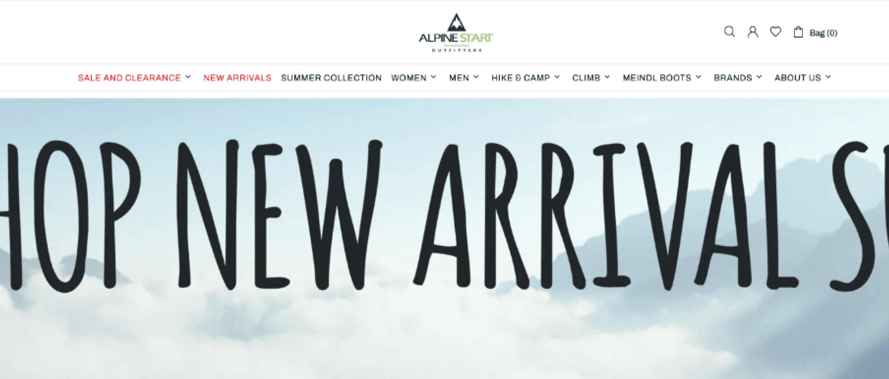
SALE AND CLEARANCE
NEW ARRIVALS
WOMAN
MEN
HIKE & CAMP
CLIMB
MEINDL BOOTS
BRANDS
ABOUT US
SUMMER COLLECTION
Bag (0)
T-Shirts
Technical Shirts
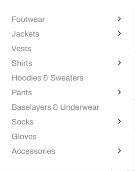
Shirts
ASO's previous navigation dropdowns (top) and new Mega Menu (bottom).
ASO's previous navigation dropdowns (top) and new Mega Menu (bottom).
Use of proximity grouping for visual hierarchy. (+images!) The use of Mega Menus allowed us to make better sense of layouts thus improving the visual hierarchy. We also made use of images that further enhanced the visual hierarchy.
Use of proximity grouping for visual hierarchy. (+images!) The use of Mega Menus allowed us to make better sense of layouts thus improving the visual hierarchy. We also made use of images that further enhanced the visual hierarchy.
Casual Shirts instead of T-shirts. As explained previously, we decided to keep naming conventions as consistent as possible. Now it’s ‘Casual’ or ‘Technical Shirts’ for BOTH women and men!
Casual Shirts instead of T-shirts. As explained previously, we decided to keep naming conventions as consistent as possible. Now it’s ‘Casual’ or ‘Technical Shirts’ for BOTH women and men!
Consistent design properties.
Consistent design properties.
One of the main issues with ASO’s previous website was the lack of consistent design properties in elements. By establishing and adhering to the newly made design guide, we were able to to create a much visually organized set of webpages.
One of the main issues with ASO’s previous website was the lack of consistent design properties in elements. By establishing and adhering to the newly made design guide, we were able to to create a much visually organized set of webpages.
Heading with random design properties
Heading with random design properties
Heading with random design properties
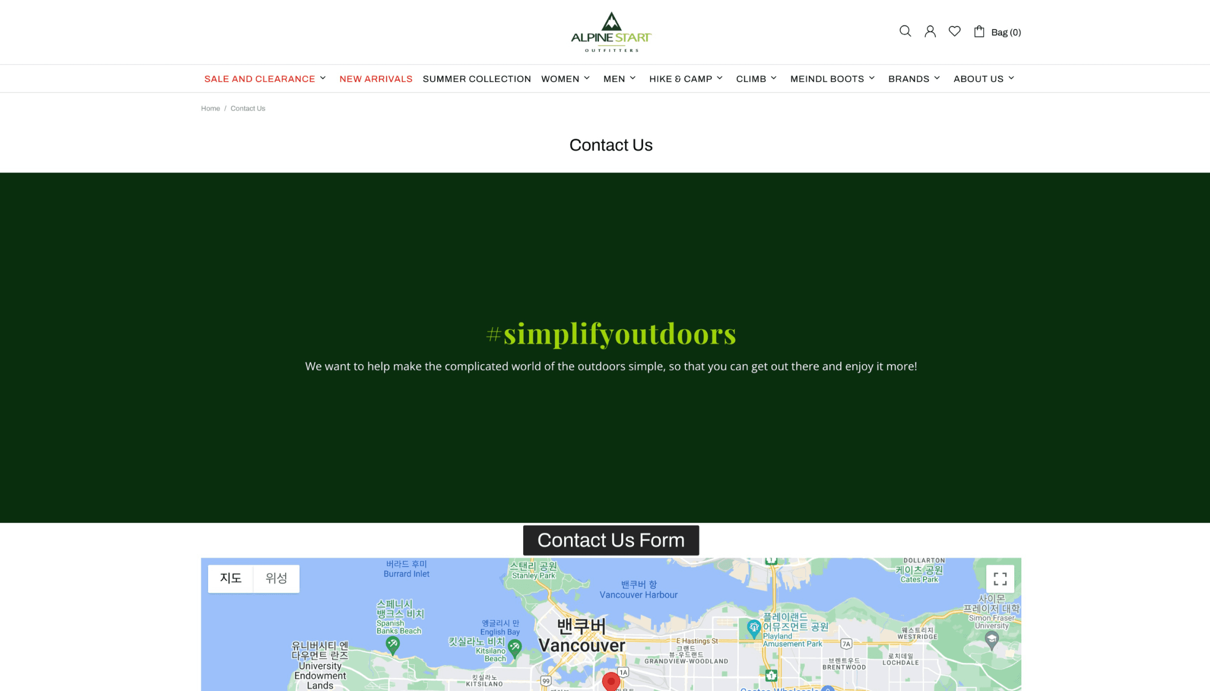
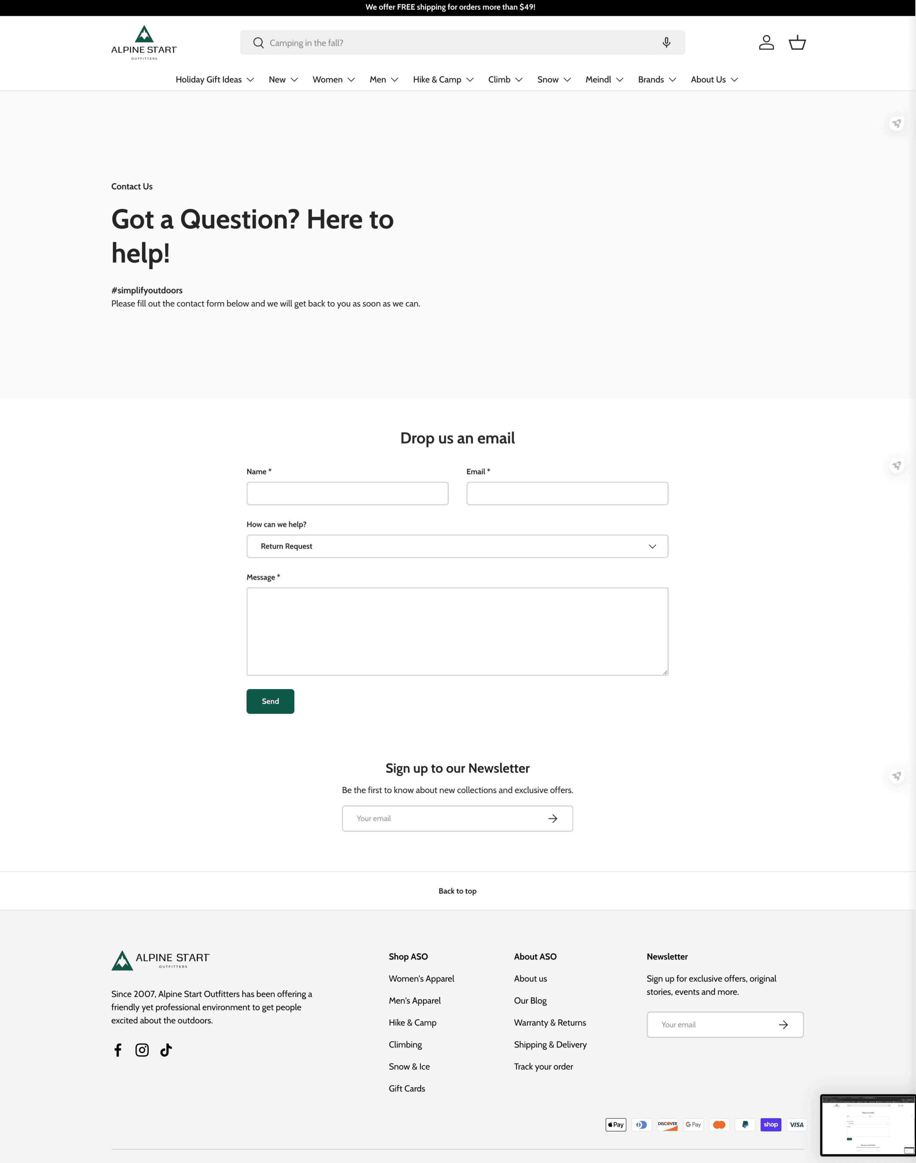
Previous ‘Contact Us’ page
Previous ‘Warranty and Returns’ page
The new ‘Contact Us’ page
CTA button with random design properties - does it even look like one?
CTA button with random design properties - does it even look like one?
Random text & background colours
Random text & background colours
CTA button with the right design properties from design guide.
CTA button with the right design properties from design guide.
Missing Heading - hard to tell what this page was about at a glance
Missing Heading - hard to tell what this page was about at a glance
222222
42BC3B
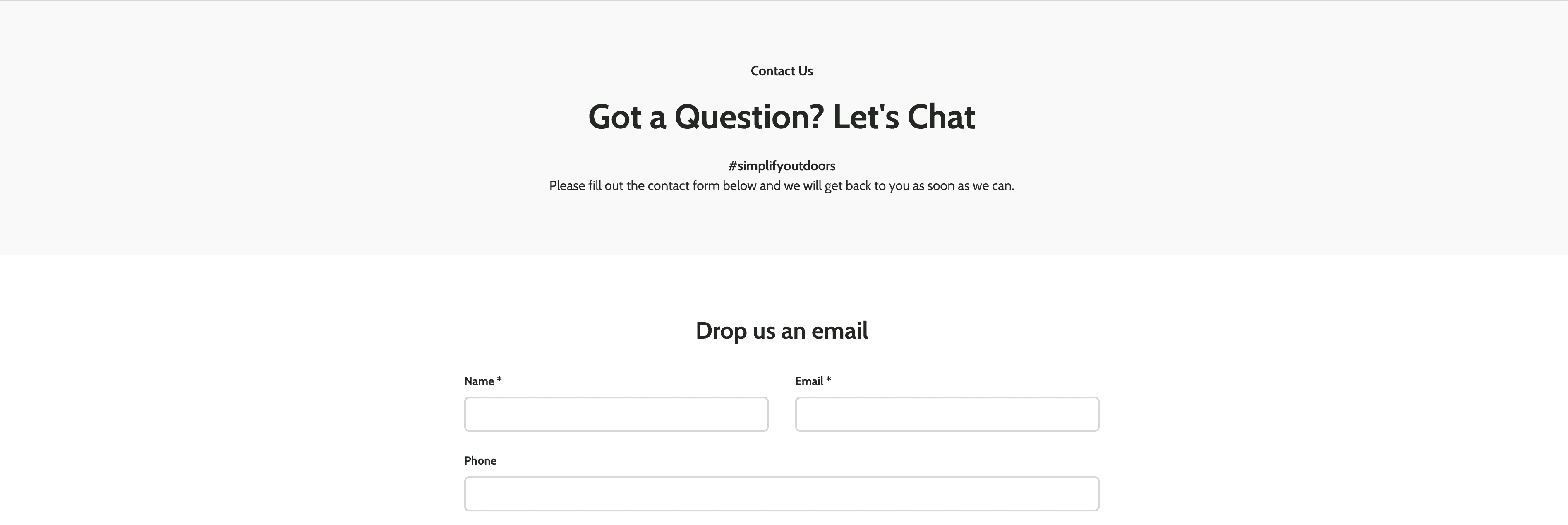


Placed the contact form directly on the webpage instead of having to click on a button to reach one.
Placed the contact form directly on the webpage instead of having to click on a button to reach one.
Got rid of the map as ASO no longer has offline stores.
Got rid of the map as ASO no longer has offline stores.
Two previous webpages ('Contact Us' & 'Warranty and Returns') on the top and newly designed webpage on the bottom ('Contact Us').
Two previous webpages ('Contact Us' & 'Warranty and Returns') on the top and newly designed webpage on the bottom ('Contact Us').
07 Metrics
07 Metrics
07 Metrics
What we have achieved
What we have achieved
AN INCREASED NUMBER OVERALL
AN INCREASED NUMBER OVERALL
More attention! Gather around, everyone!
More attention! Gather around, everyone!
On September 22, 2023, our new website went live. The previous website was having serious issues and therefore, we had to hurry the launch.
However, despite the predicament, we were able to show customers a new and improved version of ASO online.
The project didn’t have any particular goals in number but since the launch, ASO was able to see an increase of visitors by 22%, sessions by 22%, and pageviews by 30%.
*Sep 22, 2023 - Dec 06, 2023: around 76 days since launch
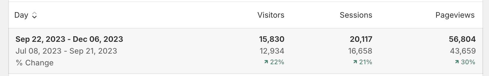
Analytics from Shopify admin.
Analytics from Shopify admin.
08 Learnings
08 Learnings
08 Learnings
Learnings
Learnings
THERE IS INDEED NO “ONE” DESIGN PROCESS
THERE IS INDEED NO “ONE” DESIGN PROCESS
Here’s what came to mind after wrapping up the project.
Here’s what came to mind after wrapping up the project.
1
TRUSTING MYSELF
Being the solo designer on the team, I had times when I wished I could have other designers’ opinions to critique my designs and suggestions. However, in the end, this was a great opportunity where I gained confidence in presenting, "defending" and communicating my designs to clients head-on.
Being the solo designer on the team, I had times when I wished I could have other designers’ opinions to critique my designs and suggestions. However, in the end, this was a great opportunity where I gained confidence in presenting, "defending" and communicating my designs to clients head-on.
2
TRUSTING THE PROCESS
Despite the efforts including research on Shopify before committing to the project, I found out that there were indeed a lot more constraints to building the final product. The fairly “different” design process had me slightly worried thinking that I wasn’t going the right path.
However, after gaining that firsthand experience of roadblocks that come into play during a design process I learned to realize there is indeed no one design process. The more important fact was that I came up with solutions to work around those constraints for end results.