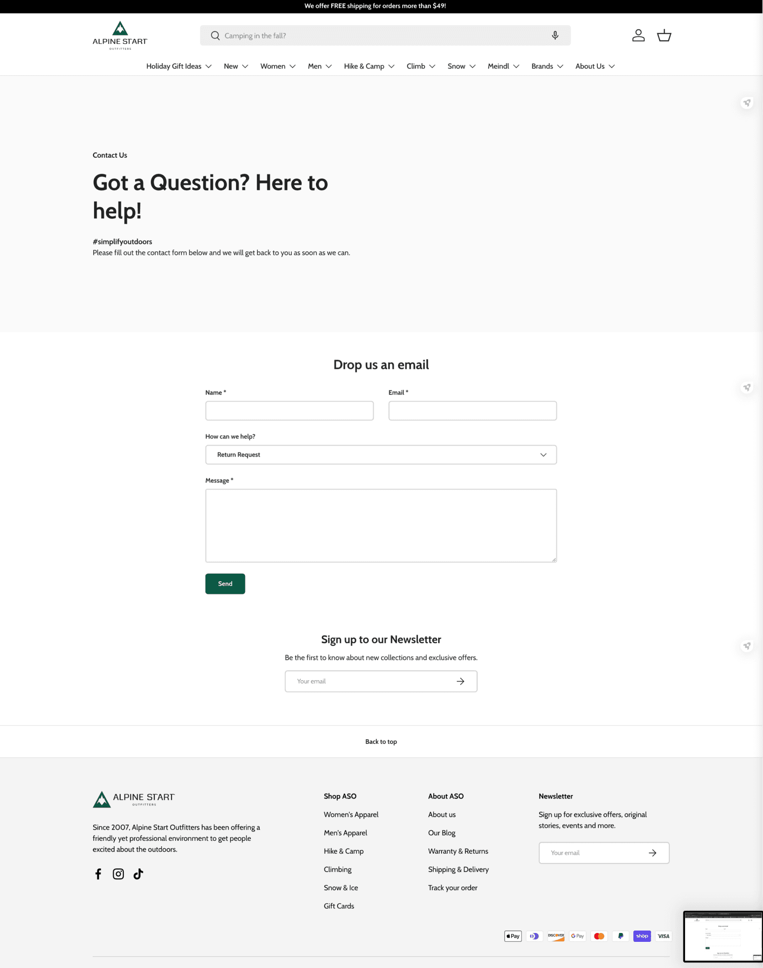
My Role
Lead UX/UI Designer working in a company-wide team of 11
Timeline
8 weeks
Worked with
Marketing Coordinator
Customer Service Representative
Business Management


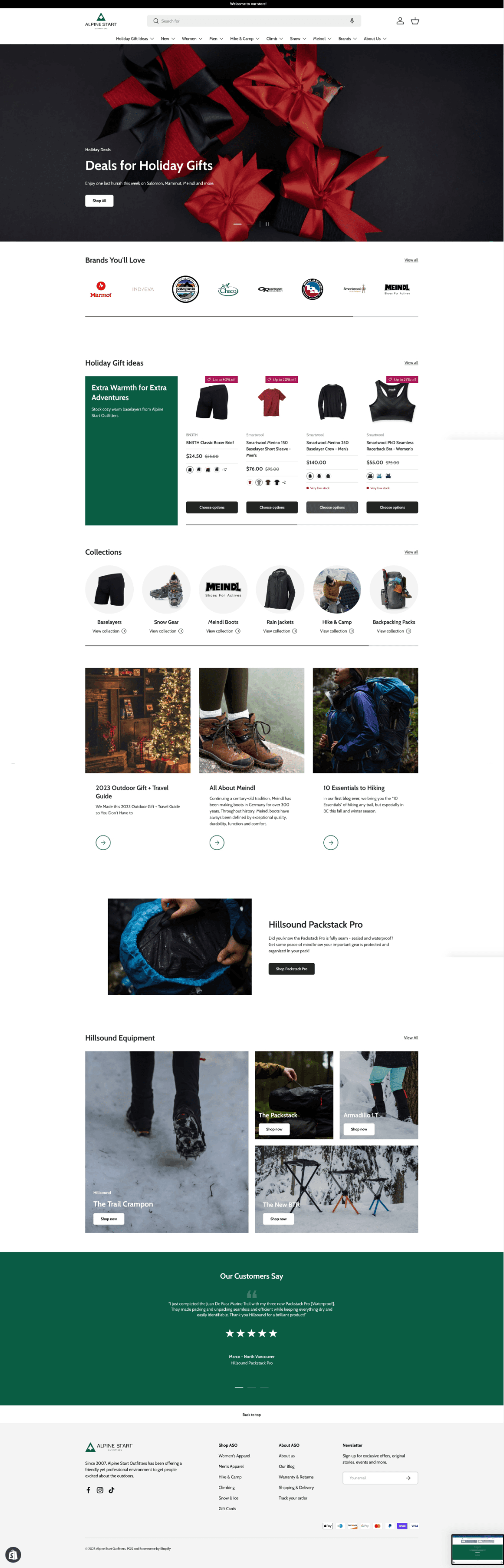
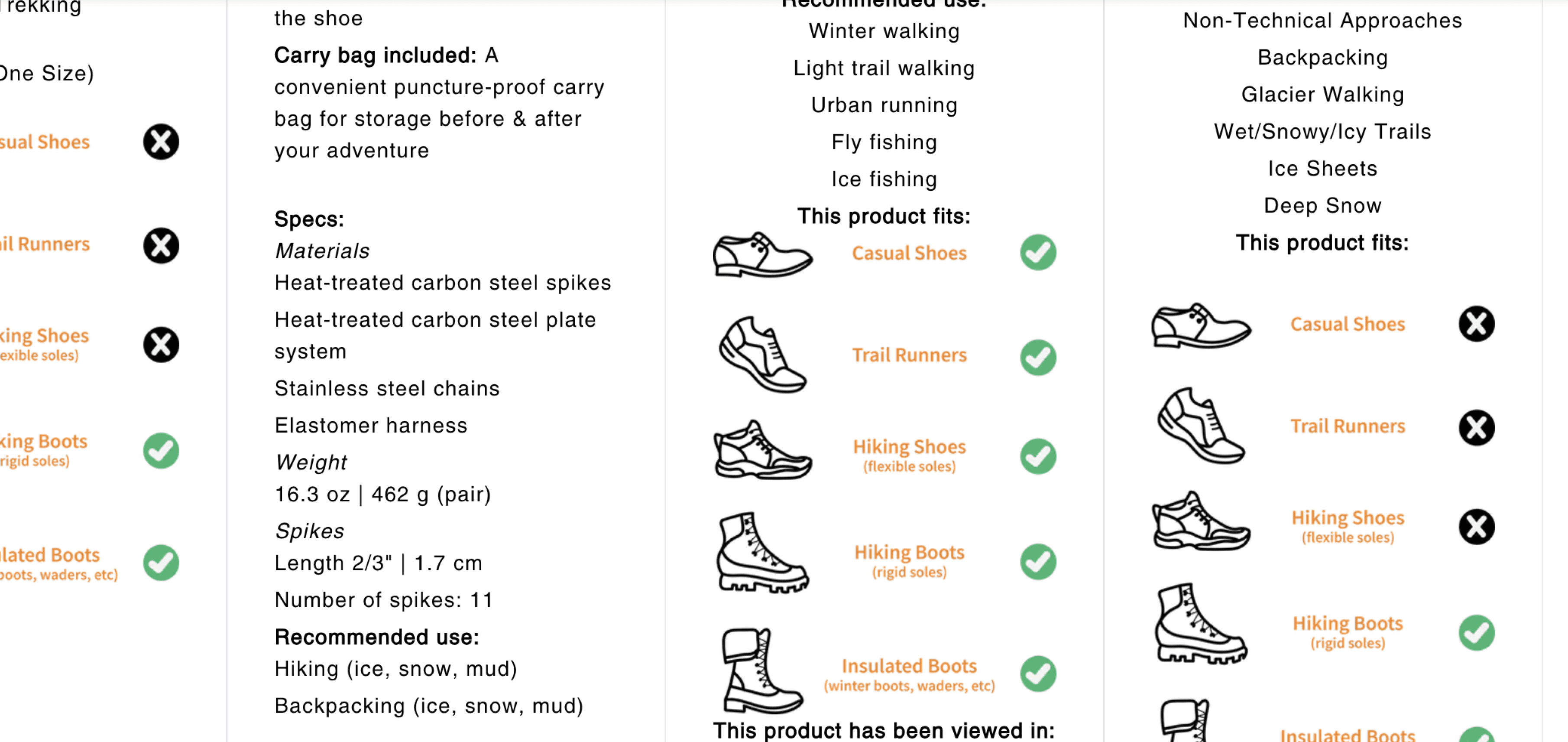
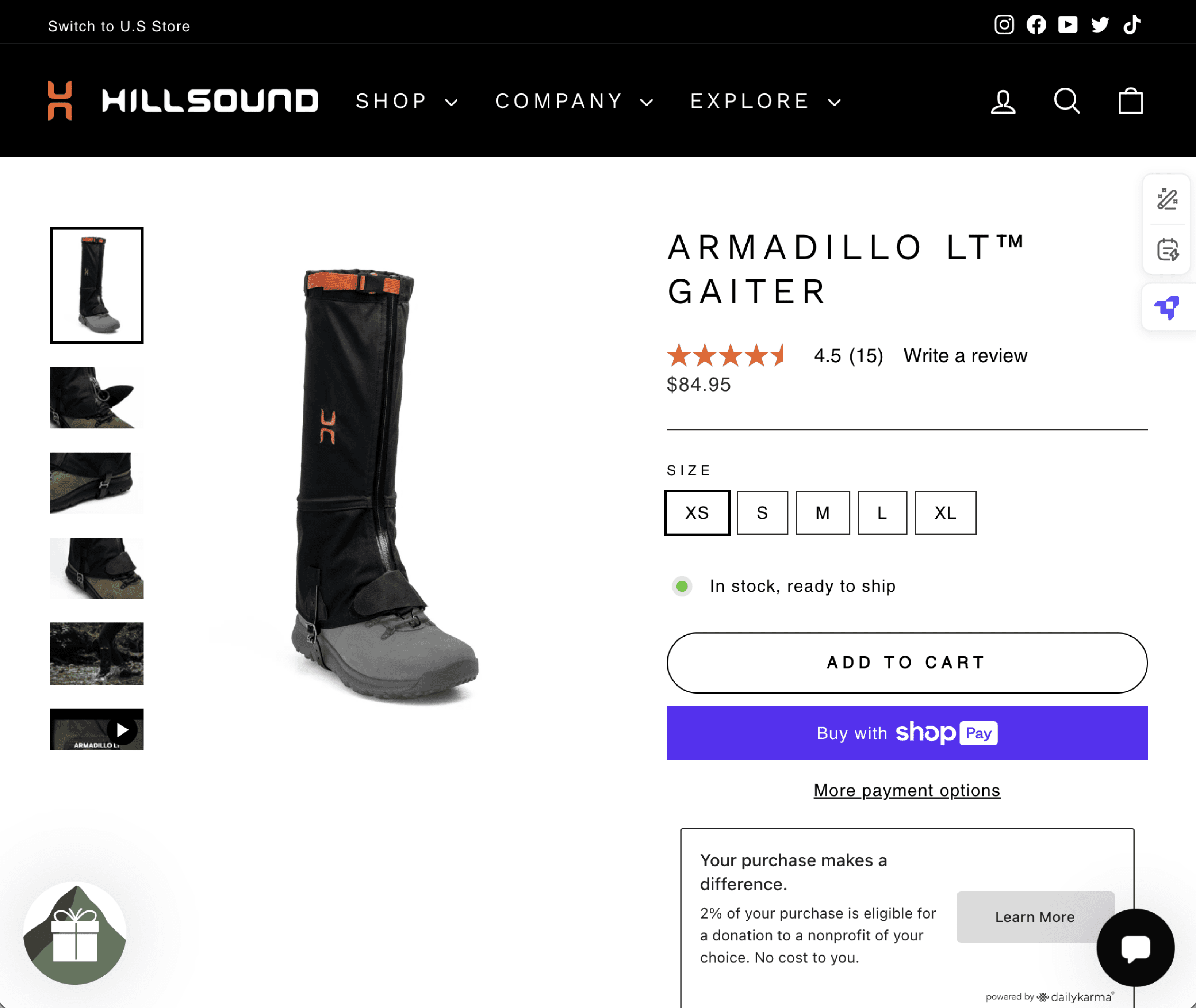
Key mobile version pages.
Hillsound Equipment’s Goals
Audit of current comparison feature
Reduce the number of relevant customer inquiries
The Outcome
THE PRODUCT -
I examined and surfaced a deeper user issue that caused comparison inconvenience. This led to a design solution with reinforced product specifications and accessible UI that increased product comparison efficiency.
IMPACT -
The redesign and launch of the feature gave a notable positive impact, with a 25% decrease of product recommendation inquiries on the website’s customer service platform.
Upon learning about Hillsound’s gear expert chat service, I connected with the customer service representative to access firsthand customer data.
By analyzing 50 of the most recent conversations, I identified a clear trend: 85% of users sought crampons and gaiters tailored to a specific use case combined with a specific terrain. This insight became instrumental in refining product specifications and improving the user experience.
Detailed Research Analysis
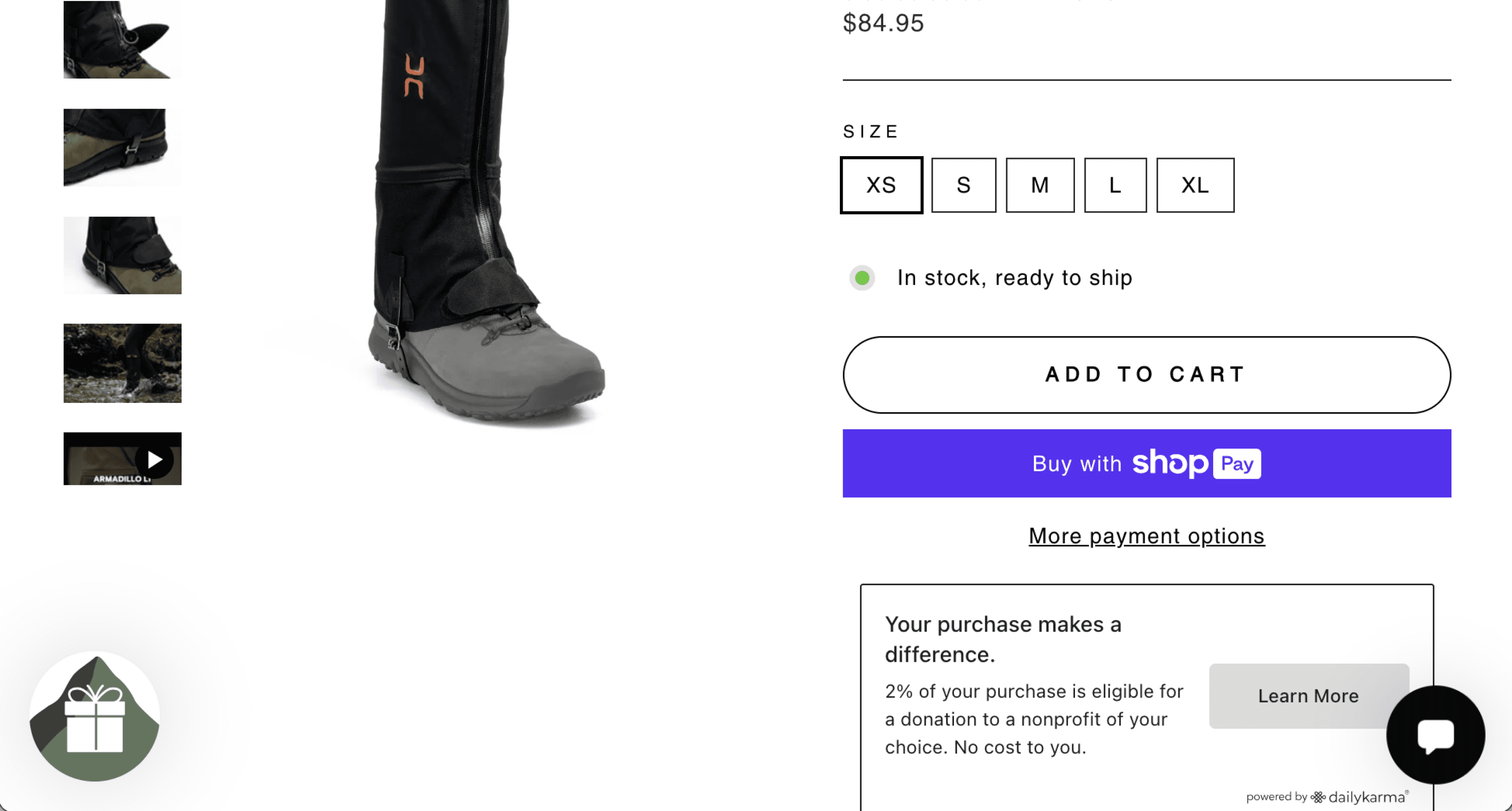
Choosing the best gaiter for walking in the bush in snow.
- Melissa
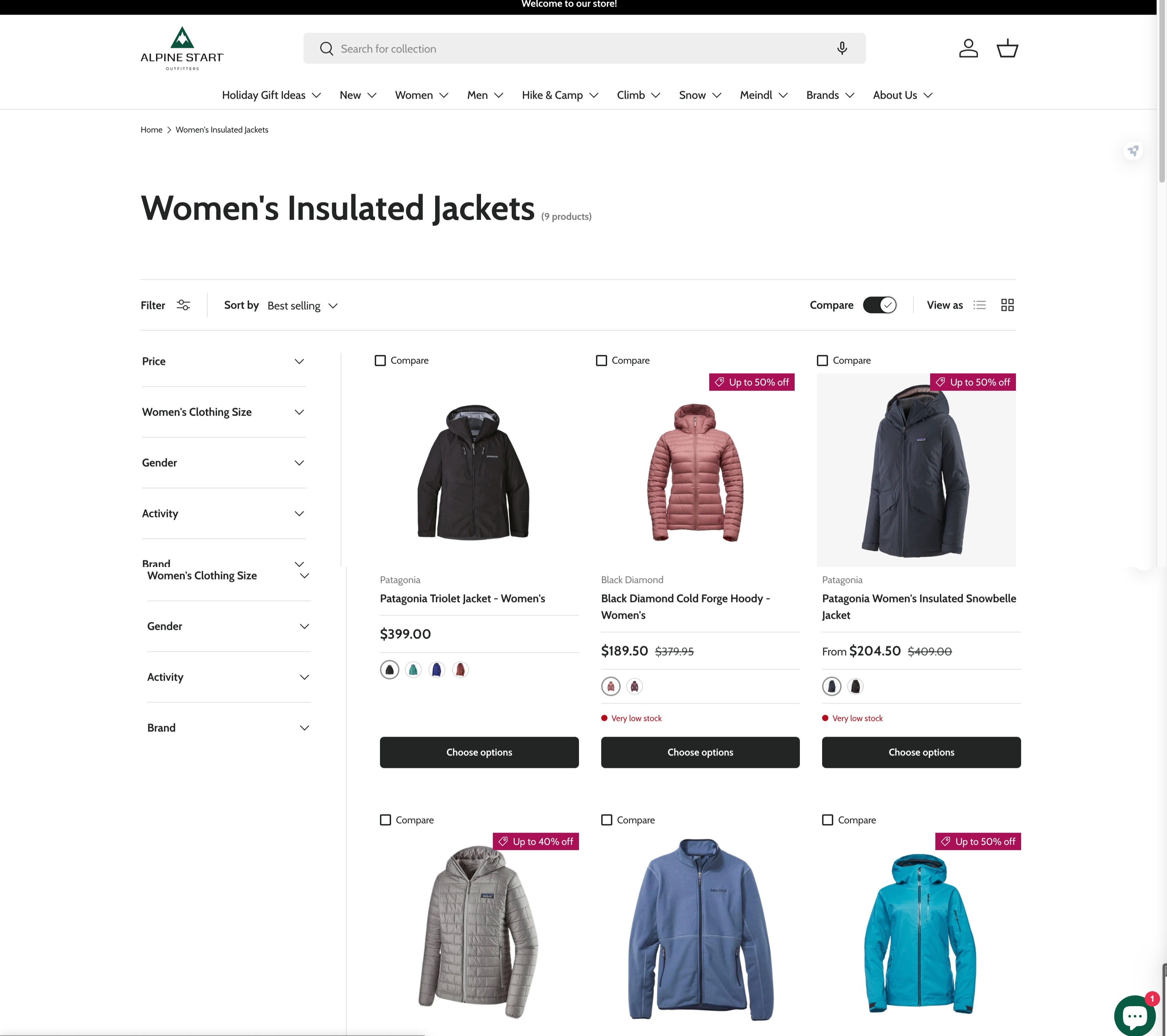
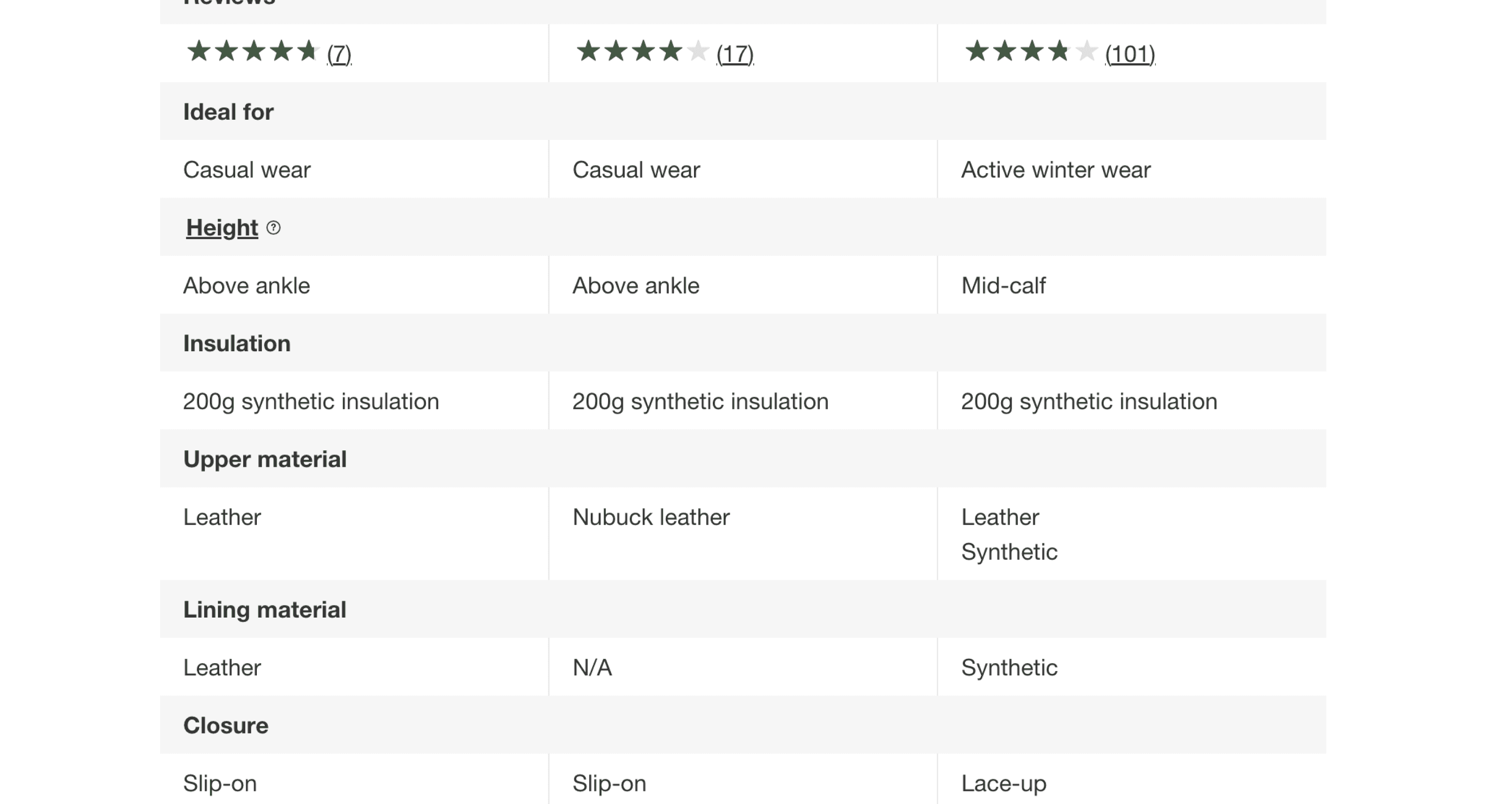
To gain clarity on Hillsound's challenges, I focused on the compare feature, which users struggled to navigate efficiently. A closer analysis revealed significant visual design and user-centric issues.
While there were many areas for improvement, here are a few key examples:
1
1
2
3
3
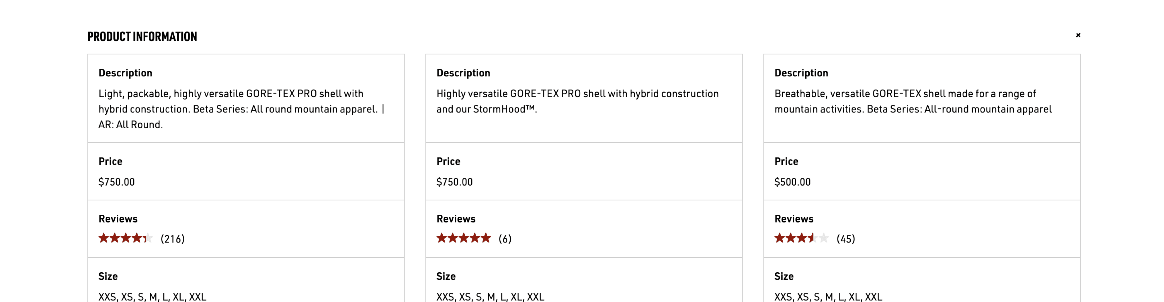
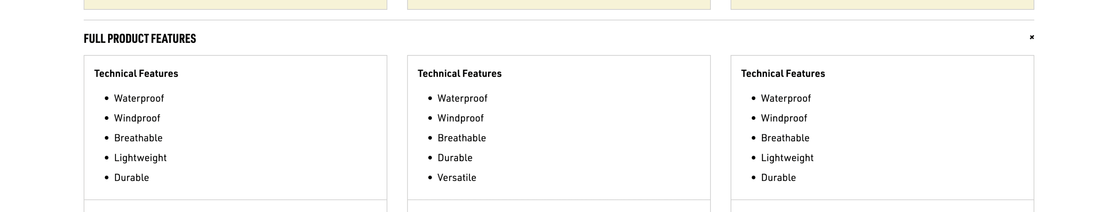
Given the niche-specific nature of the products, I aimed to better understand how competitors supported product comparison. To do this, I analyzed the websites of 8 outdoor equipment brands to identify features designed to facilitate comparisons.
Here are some key highlights from my findings:

1
2
1
1
2
Research Takeaways
Based on the research findings and takeaways, I summarized the higher level goals I hope to achieve with the project.
A
B
You could raise the question (Believe me, I did too),
'Seems like an easy fix, why was a table with straight rows and columns difficult to achieve for Hillsound?'
This is how looking into the platform took off.
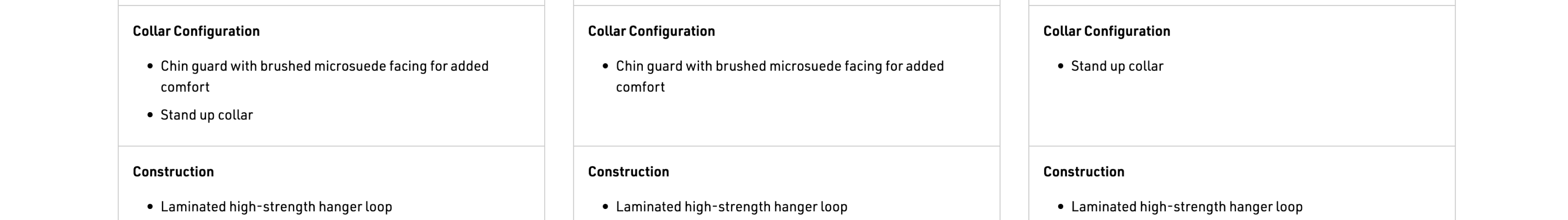
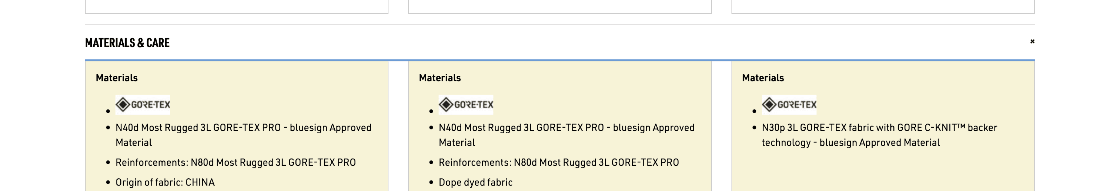
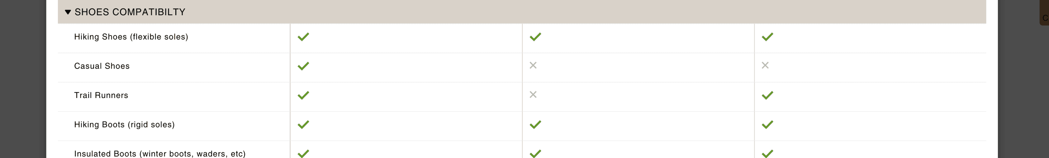
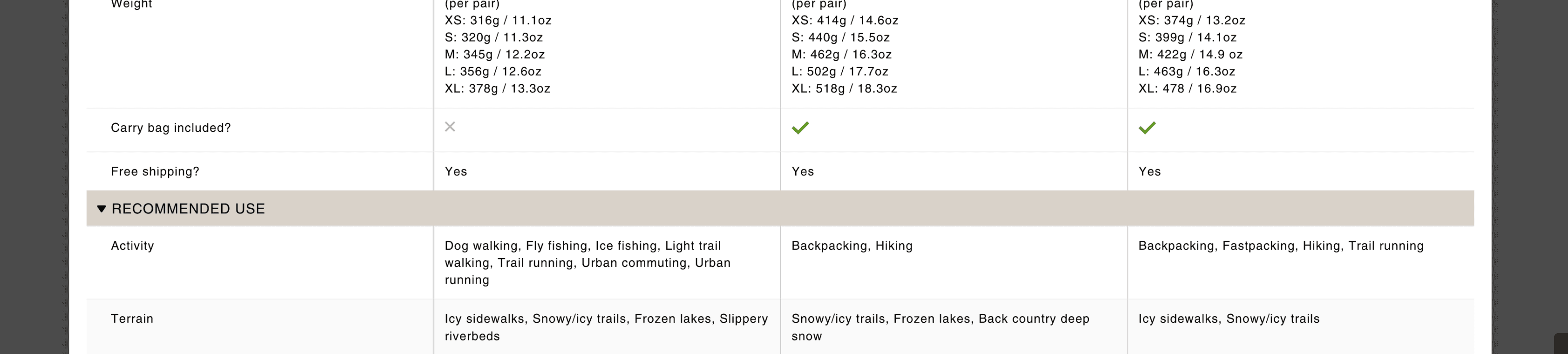
Basically, all product information was managed under each individual product page (as shown below). Here, the product information was written under "Description". Because there were no other tags/identifiers, the software was just merely allowing users to compare "Description"s, hence, the unordered tables.
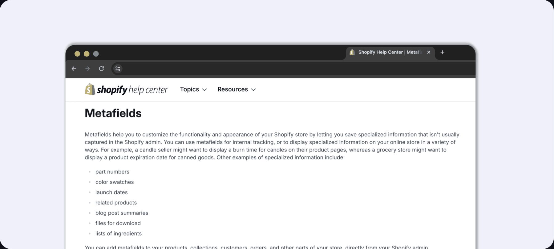
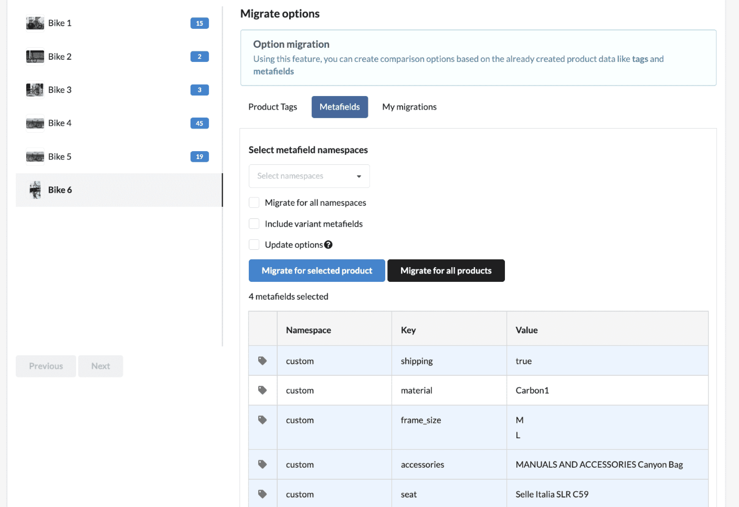
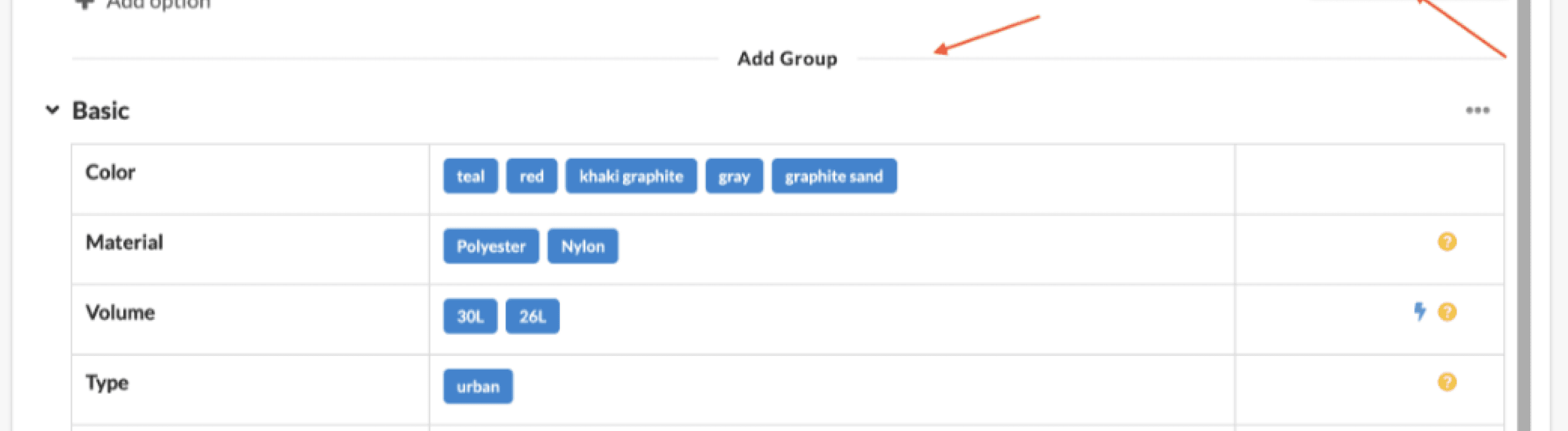
Through research, I discovered Shopify’s Metafields feature. Metafields are custom data tools that allow online stores to enhance functionality and appearance by saving specialized information not typically captured in the Shopify admin.
By integrating Metafields into product specifications, we created tags that enable Shopify’s system to organize and differentiate product details based on their respective Metafields. This enhanced the store’s ability to deliver tailored information and improve the user experience.
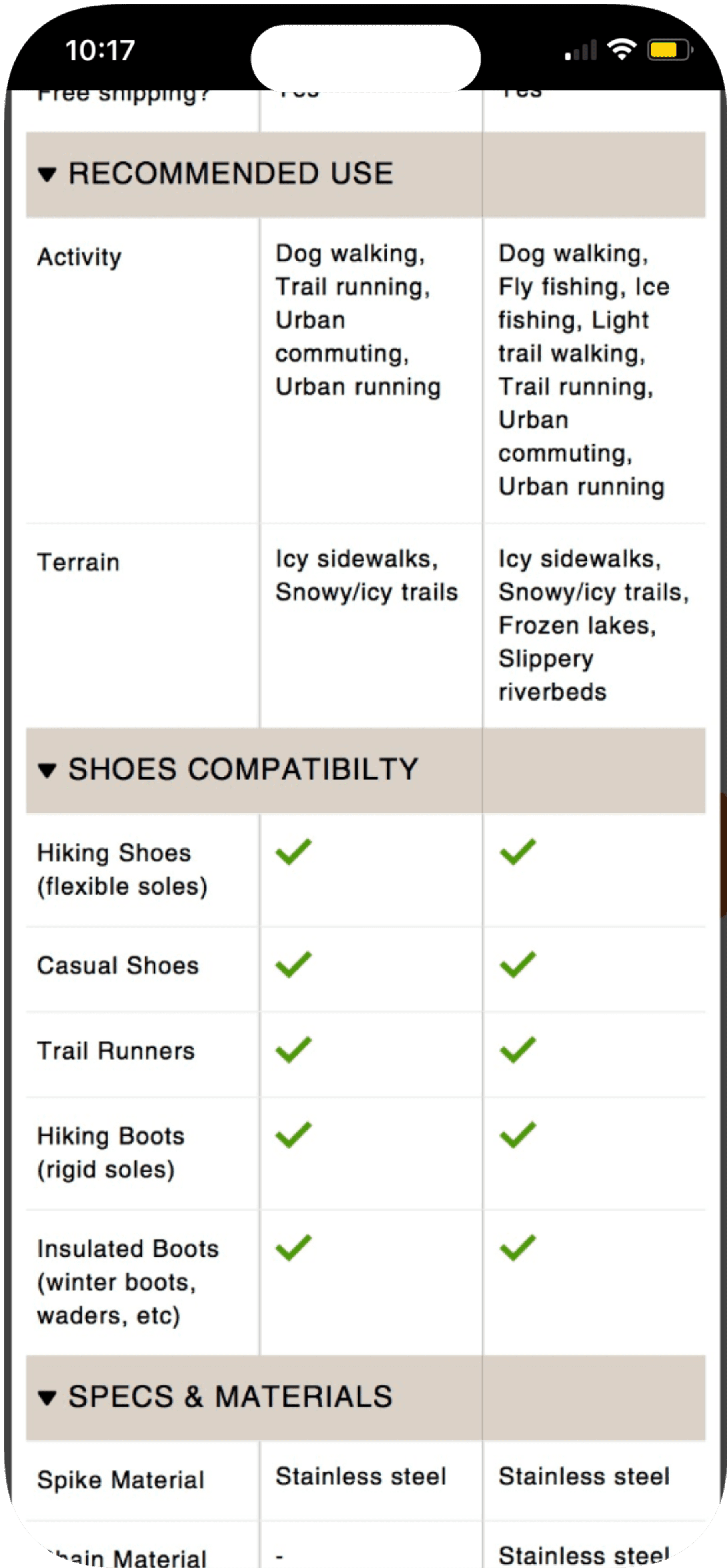
Before integrating Metafields, we revisited the product specifications based on insights from customer chats. Many inquiries paired a specific terrain with an activity when seeking product recommendations.
Adding "Terrain" as a standalone specification felt semantically off. According to our team of outdoor enthusiasts, "The environment or terrain could fit under Recommended Use."
To address this, we refined the specifications by splitting "Recommended Use" into two categories: Activity and Terrain. After conducting a quick internal poll, we aligned on these terms to ensure clarity and relevance.
...
...
3
1
2
4
After
Before
1
2
3
4
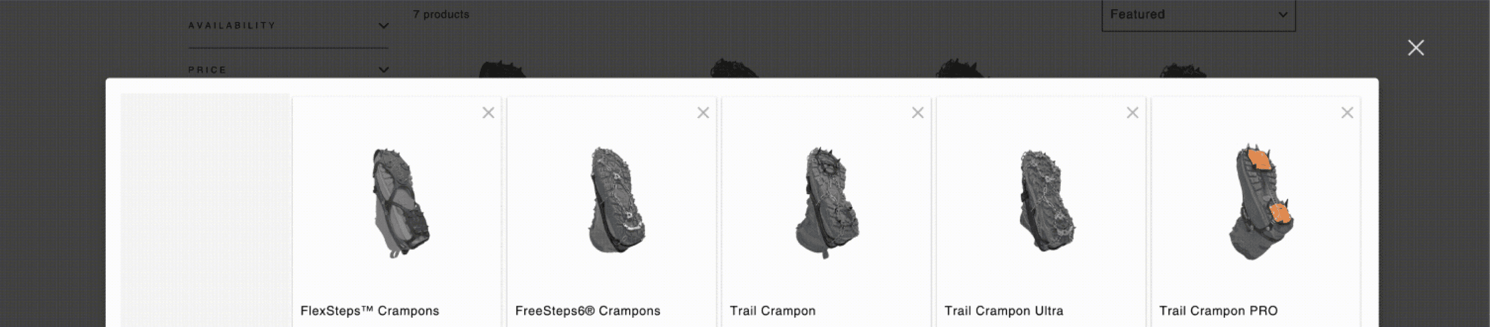
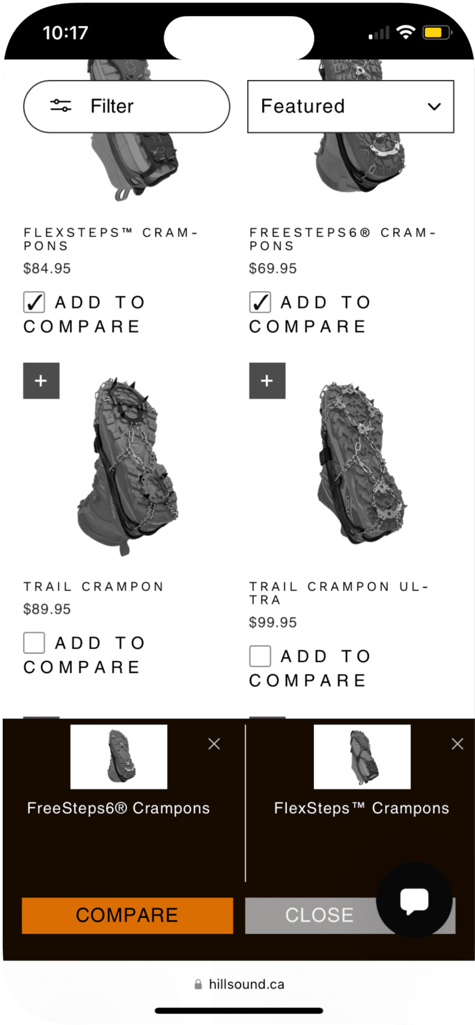
Now that we have taken care of the product data, it was time to figure out how the UI is to be displayed. Or in this project, it was time to implement an app that is capable of showcasing the product information and the comparison function.
Where are the wireframes and sketches?
My approach deviated from conventional design steps. I began with comparative research on available apps, followed by creating a prioritization matrix to evaluate functions and features, ensuring the selection of the most suitable app solution.
The key requirement for this project was seamless and flexible integration with Metafields, given Hillsound’s extensive product variants and option values that directly impact the number of Metafields.
Ultimately, I chose the app Comparable for its superior compatibility with:
Metafields integration
Category hierarchy grouping
3
1
5
3
3
2

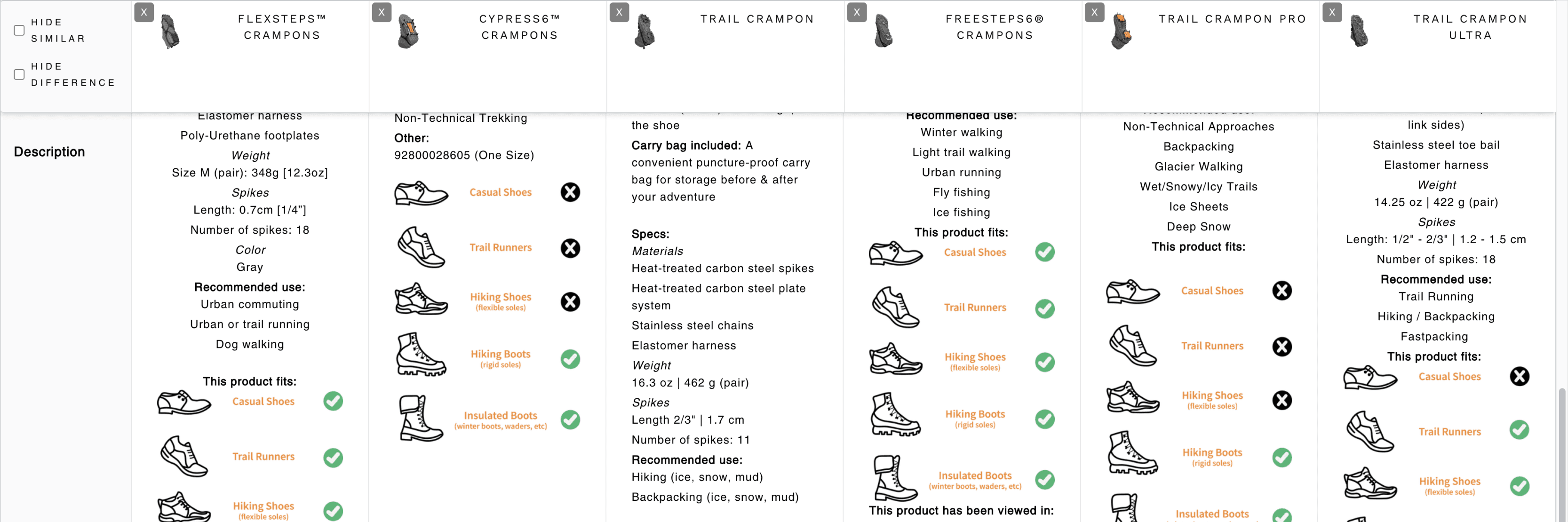
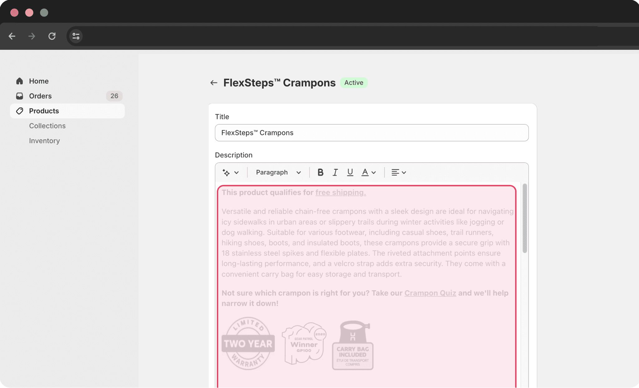
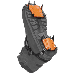
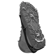
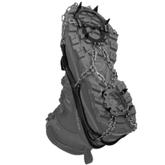
Flexsteps Crampons
Freesteps6 Crampons
Trail Crampon
Trail Crampon Ultra
Trail Crampon Pro
Cypress6 Crampons
Skikeeper


4
colour
warranty
weight
(per pair) XS: 316g / 11.1oz
Lifetime
Black
Black
Green
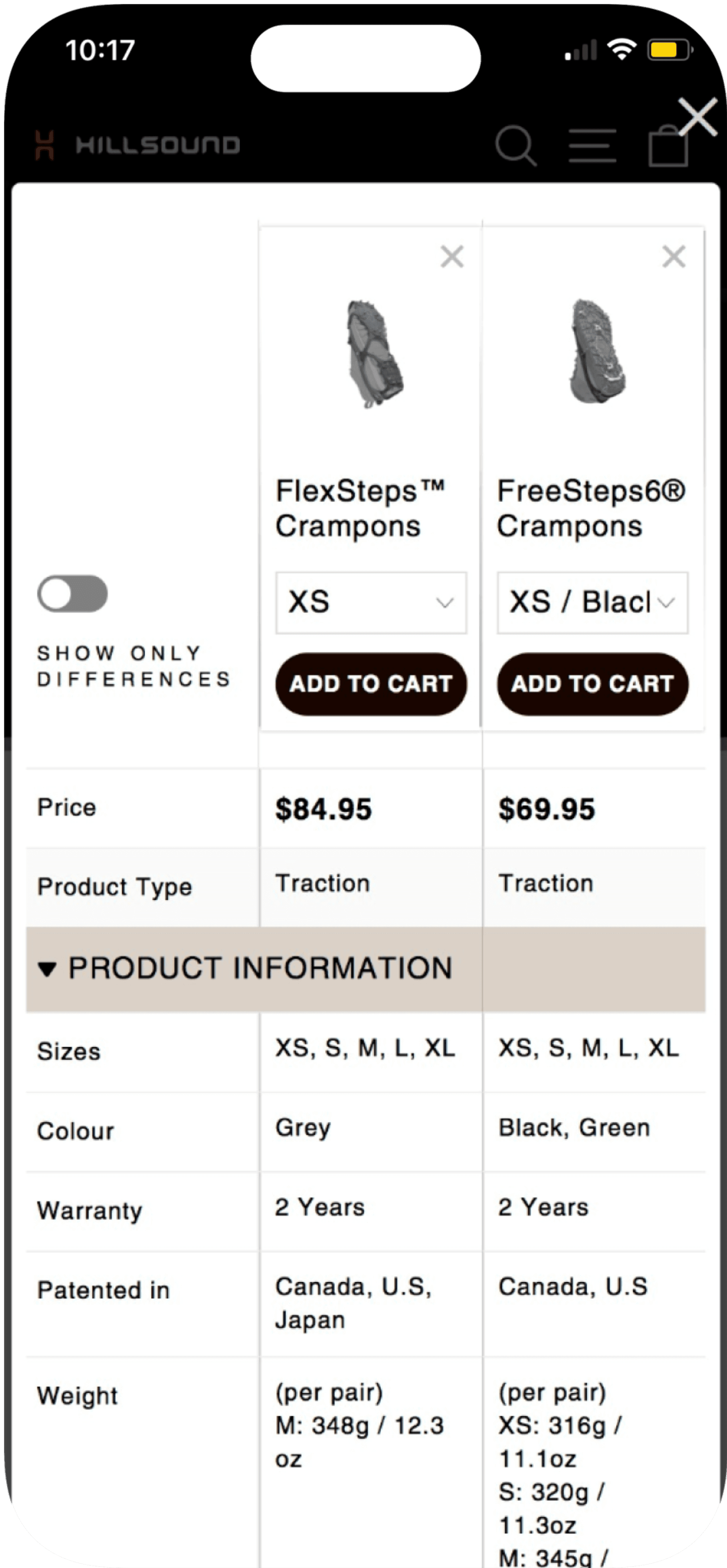
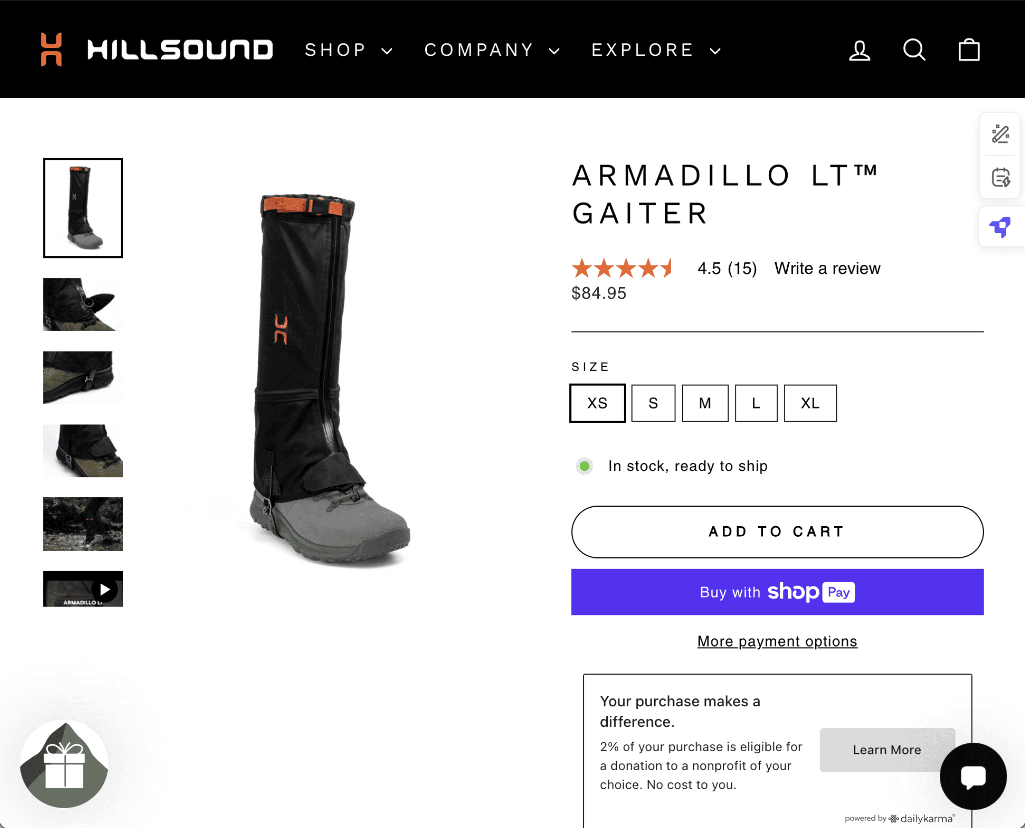
Product Information
Sizes
Colour
Warranty
Patented in
XS
black
2 years
Canada
S
M
L
XL
green
U.S
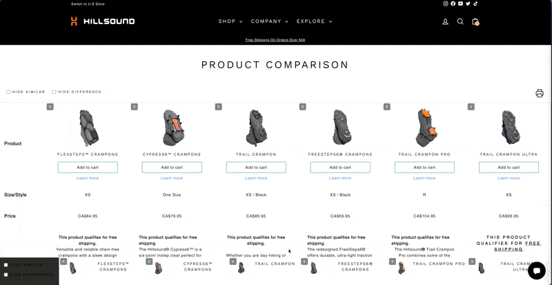
Comparison tables before (left) and after (right).
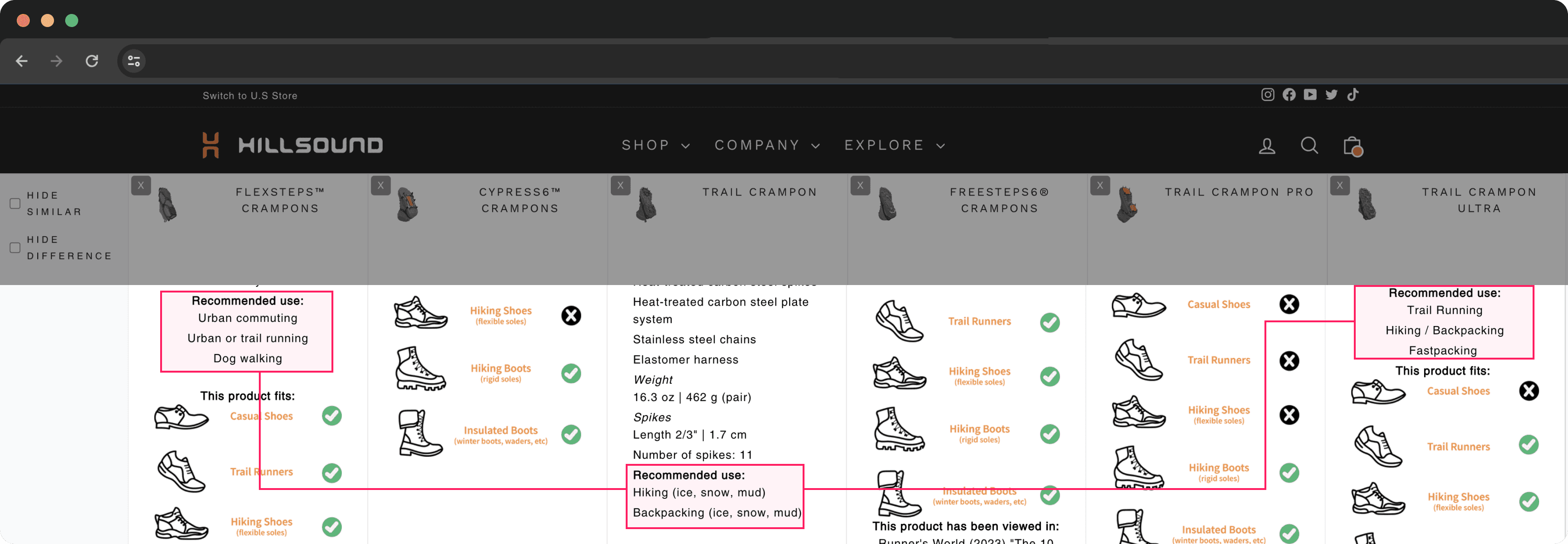
Before

Comparison tables before (top) and after (bottom).
The previous comparison app's UI elements lacked visual and brand consistency. While customization options were limited, I prioritized aligning the UI elements with the brand's design assets to create a cohesive experience.
Highlighted Changes:
Icon Logo
Comparison Bar


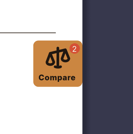
2
Compare
2
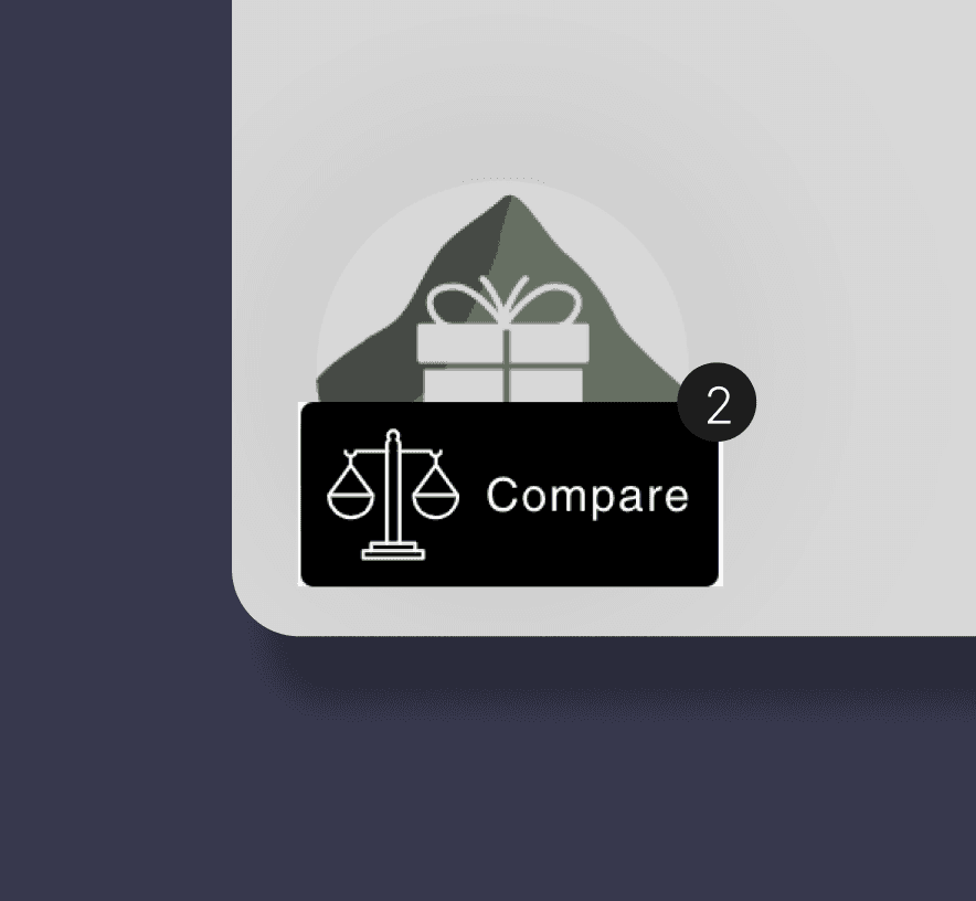
Compare
2

Hillsound's primary objectives for this project were:
Reducing the number of inquiries on Remark
Cutting costs associated with responding to inquiries
Did we achieve these goals? Absolutely.
Before the launch, 76% of total inquiries were related to product recommendations and comparisons. Following the launch, this was reduced by 25%.
Of these inquiries, 58% specifically focused on recommended use. Post-launch, this number dropped by 17%, from 58% to 41%.
This measurable improvement reflects the success of the project in addressing Hillsound's goals.
-25%
12/14/23
01/08/24
30 days
02/24/24
01/30/24
(Launch)
30 days
Was this truly the best design that you could come up with?
1
2