Comparable
Redesigned comparison experience for clearer product decision-making.


My Role
Lead UX/UI Designer in a company-wide team of 11
Worked with
Marketing Coordinator
Customer Service Representative
Business Management
Timeline
8 weeks
Hillsound Equipment?
Hillsound Equipment Inc. is an outdoor brand that produces backpacking, hiking, and trail running accessories for outdoor enthusiasts.


Compare
Compare
Compare
Compare
Key mobile version pages.
Hillsound Equipment’s asked:
Find out what's causing repetitive inquiries and
reduce the number of those relevant customer inquiries.
I delivered:
The product 👩💻 : Reinforced IA and Comparison Feature Redesign.
I recategorized and modified product specifications based on customers' needs.
I redesigned the comparison feature focusing on usability heuristics and function prioritization.
The impact 📊 : 25% decrease of product recommendation inquiries.
The redesign of the feature gave a notable positive impact, with a 25% decrease of product recommendation inquiries on the website’s customer service platform, which dropped costs for the business.
CX Analysis
What were Customers Asking for?
To save time, I chose to learn the customer data that was already available instead of allotting time and seeking newer customers. Therefore, I connected with the customer service representative to access and take a look at customer service chats.
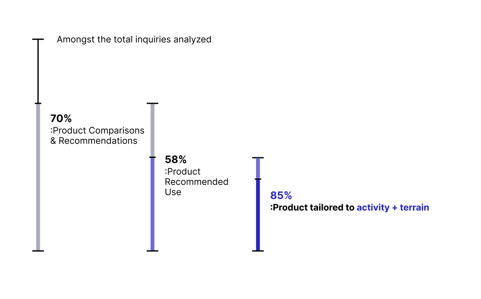
By analyzing 50 of the most recent conversations, I identified some trends:
76% of all inquiries were related to product comparisons.
Of that, 58% of those were comparing the recommended use for them.
Of that, 85% of those specifically mentioned an activity with a terrain.
Choosing the best gaiter for
walking in the bush in snow. - Melissa
Feature Audit
What was Hillsound Missing?
-> Rows and clear product data.
The thing was, Hillsound's website already had a product comparison feature.
So, what was Hillsound missing?
To gain clarity on this, I perused the compare feature.
A closer analysis revealed significant visual design and user-centric issues. Amongst the many areas for improvement, here are a few key examples:
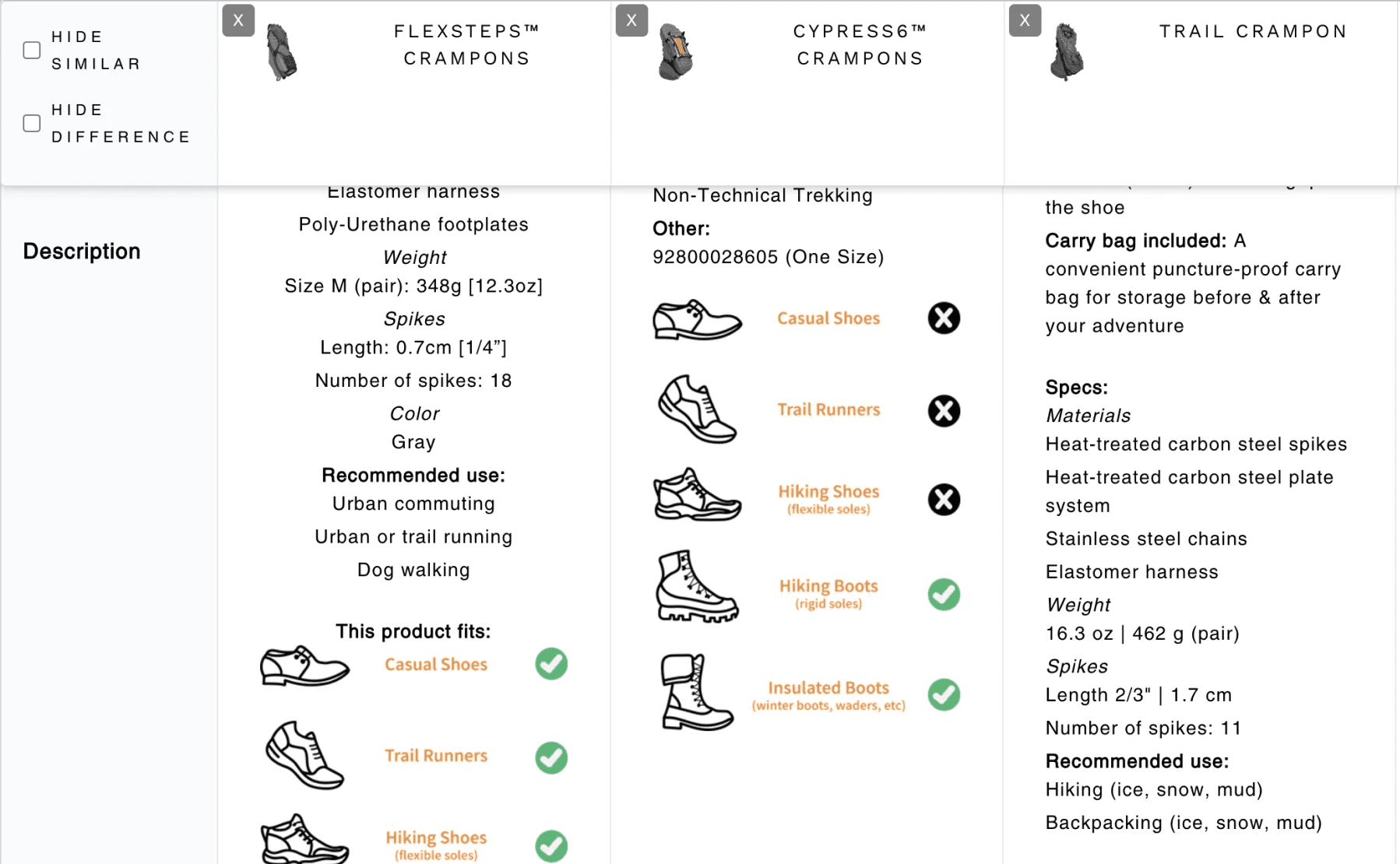

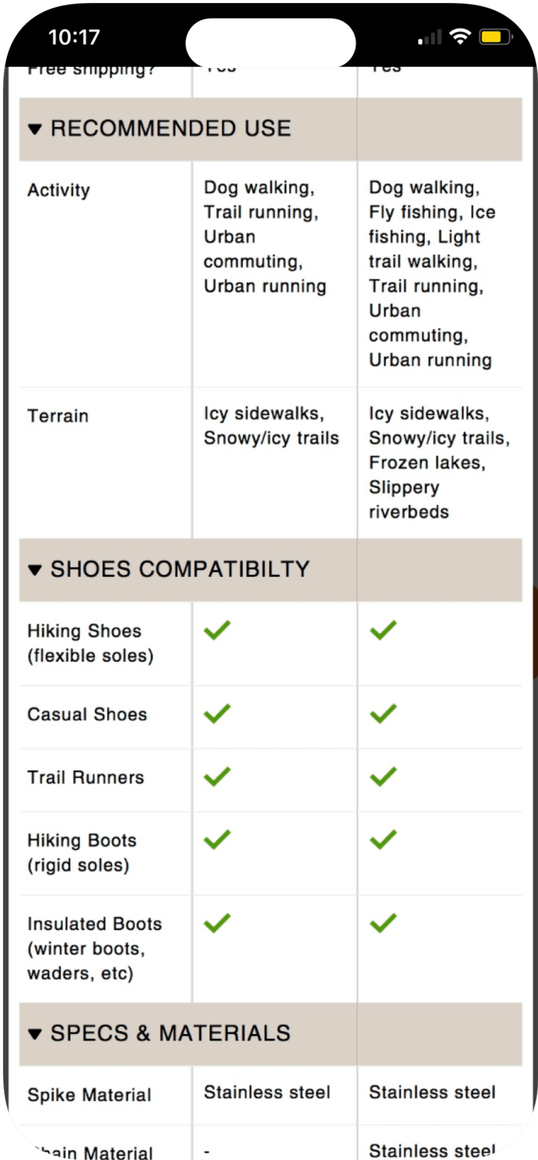
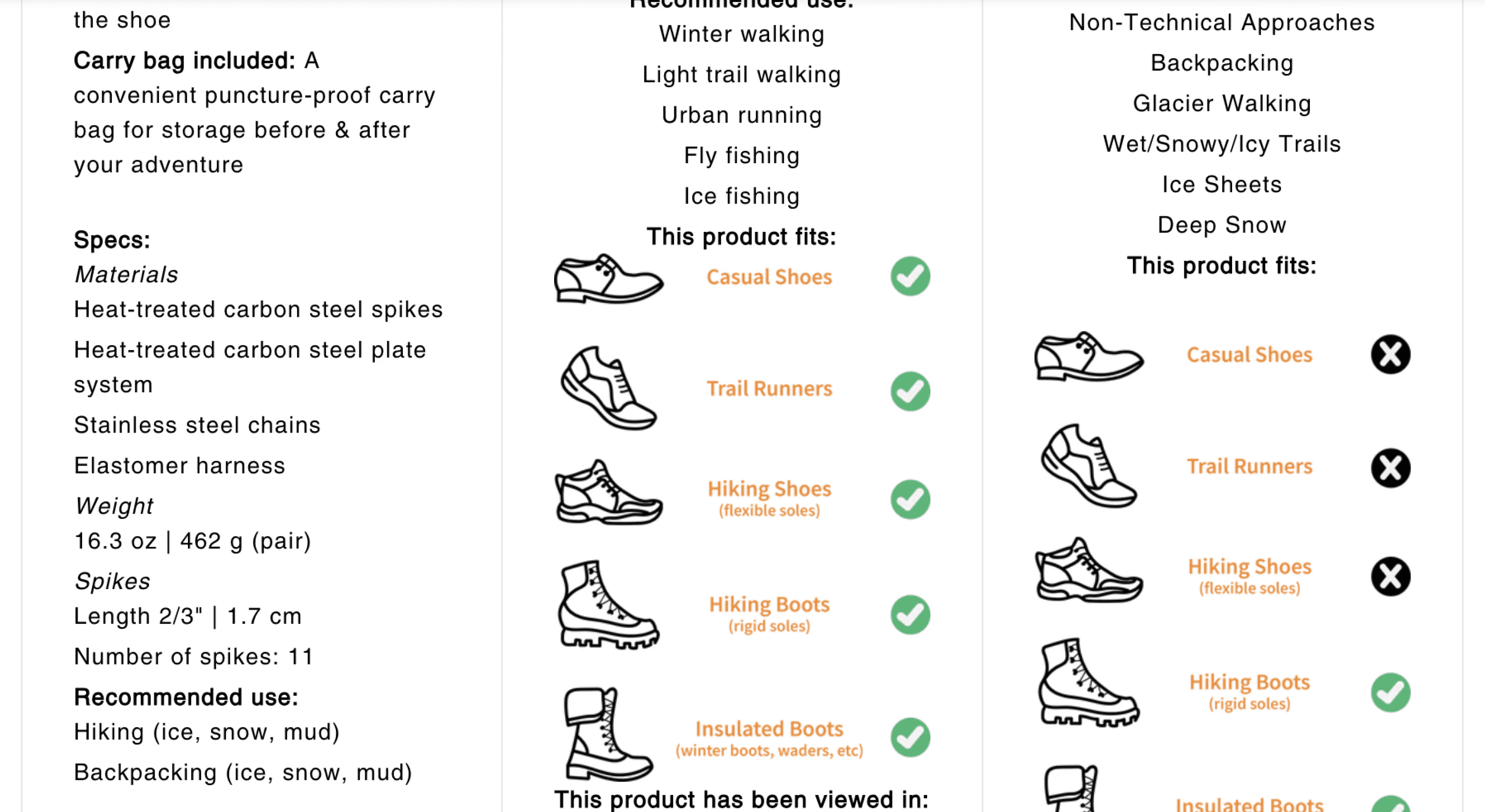
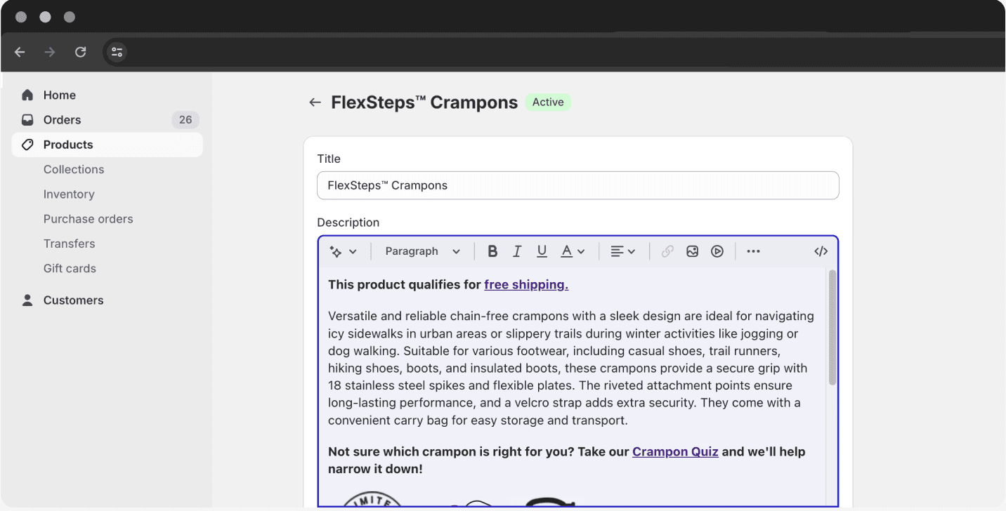
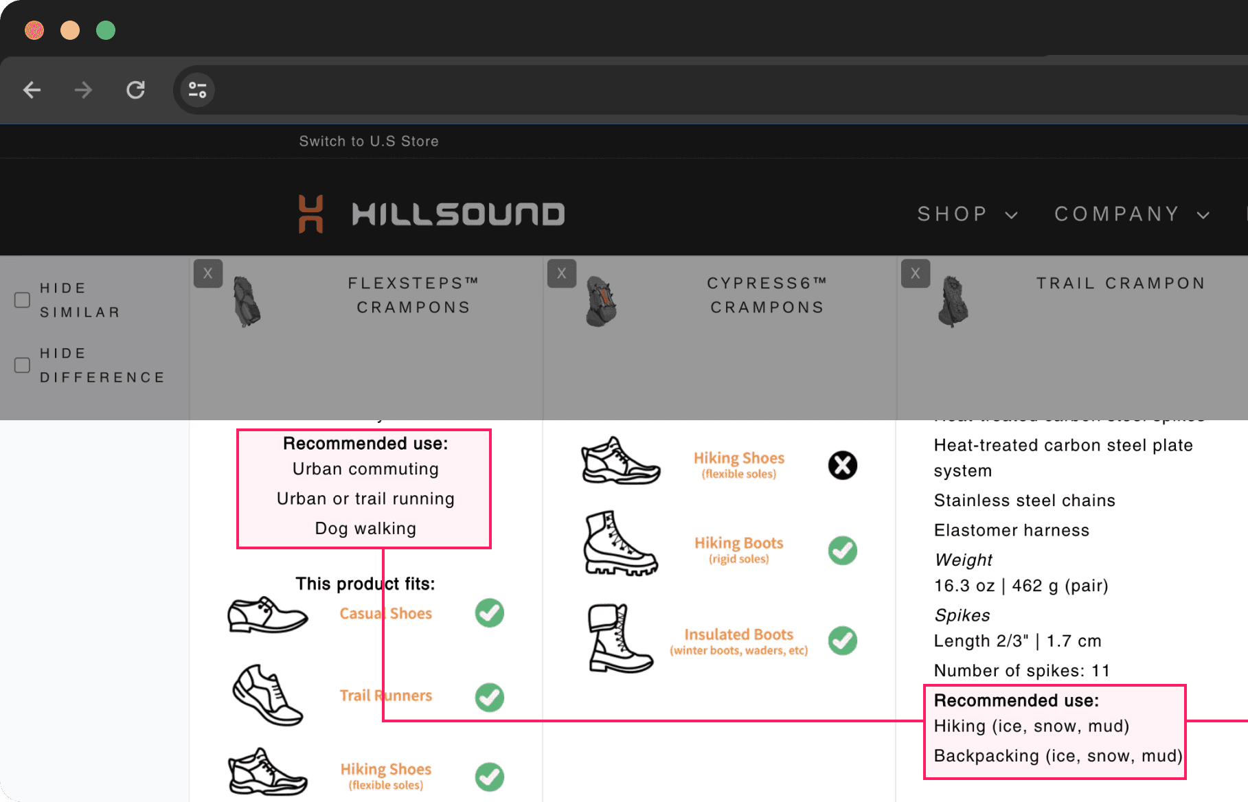
The 'Shoe Compatibility' content for all products aren't aligned due to missing rows.
1
'Shoe Compatibility' is missing from viewport.
1
No rows: Missing specification from viewport.
There are no clear rows in this table. Therefore, each specification for each product was misaligned, making it difficult for easy comparison.
2
Confusion product data: Inconsistent information.
Both products have 'backpacking' as a recommended use, but one is one specified in parentheses while the other one isn't. How does one compare with this kind of information?
Design Referencing
How are others doing it?
Given the niche-specific nature of the products, I aimed to better understand how competitors supported product comparison. To do this, I analyzed the websites of 8 outdoor equipment brands to identify features designed to facilitate comparisons.
Here are some key highlights from my findings:
1
2
Research Takeaways
Customers asked of product comparison specifically based on an activity AND terrain.
The presentation and content of Hillsound's product specification was fairly unclear, therefore, hindering the usability of the product.
In order for product comparison to work, clear information, rows and hierarchy is crucial, which was what Hillsound's current product comparison feature lacked.
The High-level Goals
What are we going to focus on?
We need: A working table + comparable product data.
Based on the research findings and takeaways, the following are the higher level goals I hope to achieve with the project.
A Working Table
Compare the product specifications stress-free.
Comparable Product Data
Platform Deep-dive: Looking into Goal A
Why wasn't there a working table?
-> There was a need for a better understanding of the platform.
There are many product specifications for a single product, especially technical products.
However in this case, the product information was all put under one specific category, "Description".
This meant that when the software was displaying information, it was not able to pick up any other specific information and configure tables for comparisons.
The reason why the existing comparison feature didn't have the right tables was because of how the product data was stored.
By default, the platform had 1 input field where Hillsound kept all product description written down without a specific order.
Because of this, the platform wasn't able to identify and display the right product information into clear rows for comparison.
All information was put under this 1 input field
Opportunity
How Can We
Compartmentalize Product Specifications
As Hillsound's website was live on Shopify, I needed to find a way to display the product specifications where the platform can understand.
After some digging, I used one of their features called "Metafields". This allowed me to create custom data for the products.
By doing so, Shopify’s system was now able to organize and differentiate product details the way I wanted to.


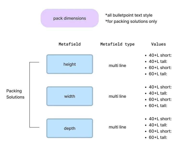
Metafields are basically custom categorization in the Shopify platform. Just like colours or sizes, the industrial designer and I came together to create an exhaustive list of additional Metafields to add for the products.
Information Architecture: Looking into Goal B
What were customers looking for again?
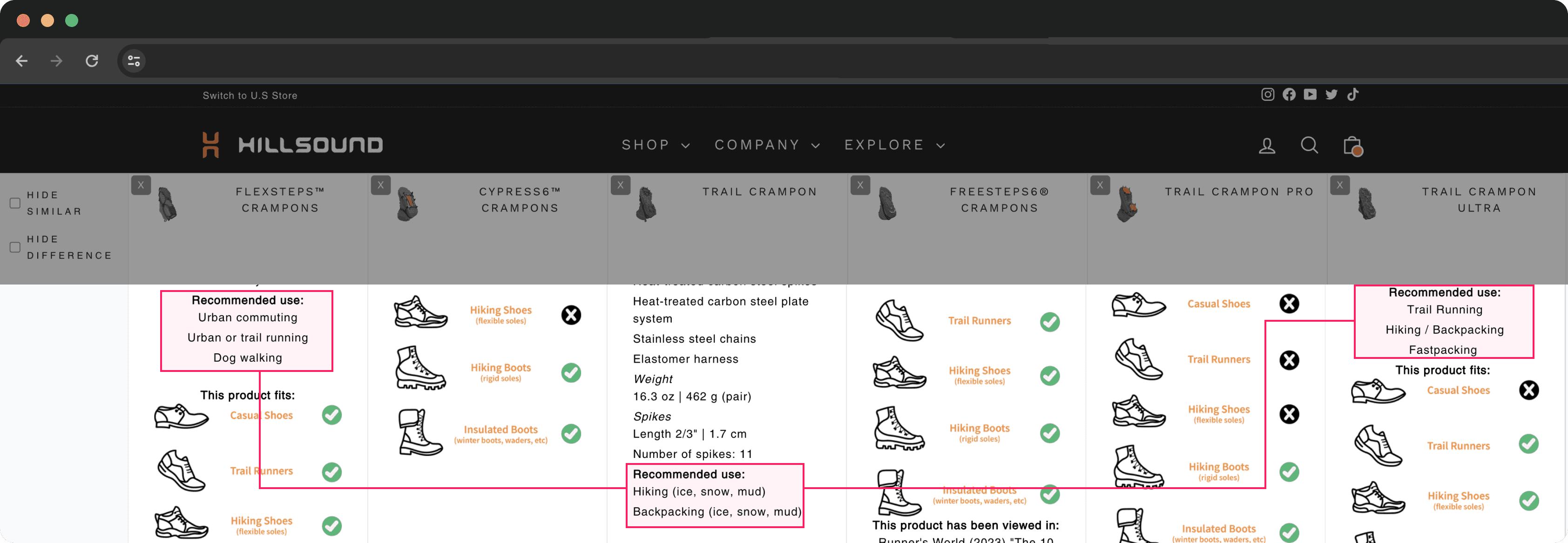
When configuring Metafields, we revisited the key information that customers were keen on comparing in their inquiries: Recommended use for products.
To recap the major insight, it was clear that customers were asking for products' recommended use while mentioning an activity and a specific terrain.
Adding "Terrain" as a standalone specification felt semantically off. According to our team of outdoor enthusiasts, "The environment or terrain could fit under Recommended Use."
To address this, we refined the specifications by splitting "Recommended Use" into two categories: Activity and Terrain. After conducting a quick internal poll, we aligned on these terms to ensure clarity and relevance.
...
...
3
1
2
4
Previous IA (left) and redesigned IA (right).
1
Getting rid of ambiguous terms.
What does “winter walking” mean? Snowy sidewalks? Icy sidewalks? We eventually got rid of ambiguous activities like these.
2
Consistent naming conventions.
Previously Hillsound used parentheses to further describe terrains. We took this away to keep a consistent look and enhance readability.
3
Introducing subcategories.
Specifically, the “Recommended Use” could be further divided into 2 subcategories: Activity and Terrain. The different terrains would complement the use cases(activities) that customers consider when comparing products.
4
Specific terrains and environment.
In addition to specifying the terrain, there were 2 things to consider: where and the condition. Volià! “Icy Sidewalks”!
Requirement Prioritization
How did this all turn out, design-wise?
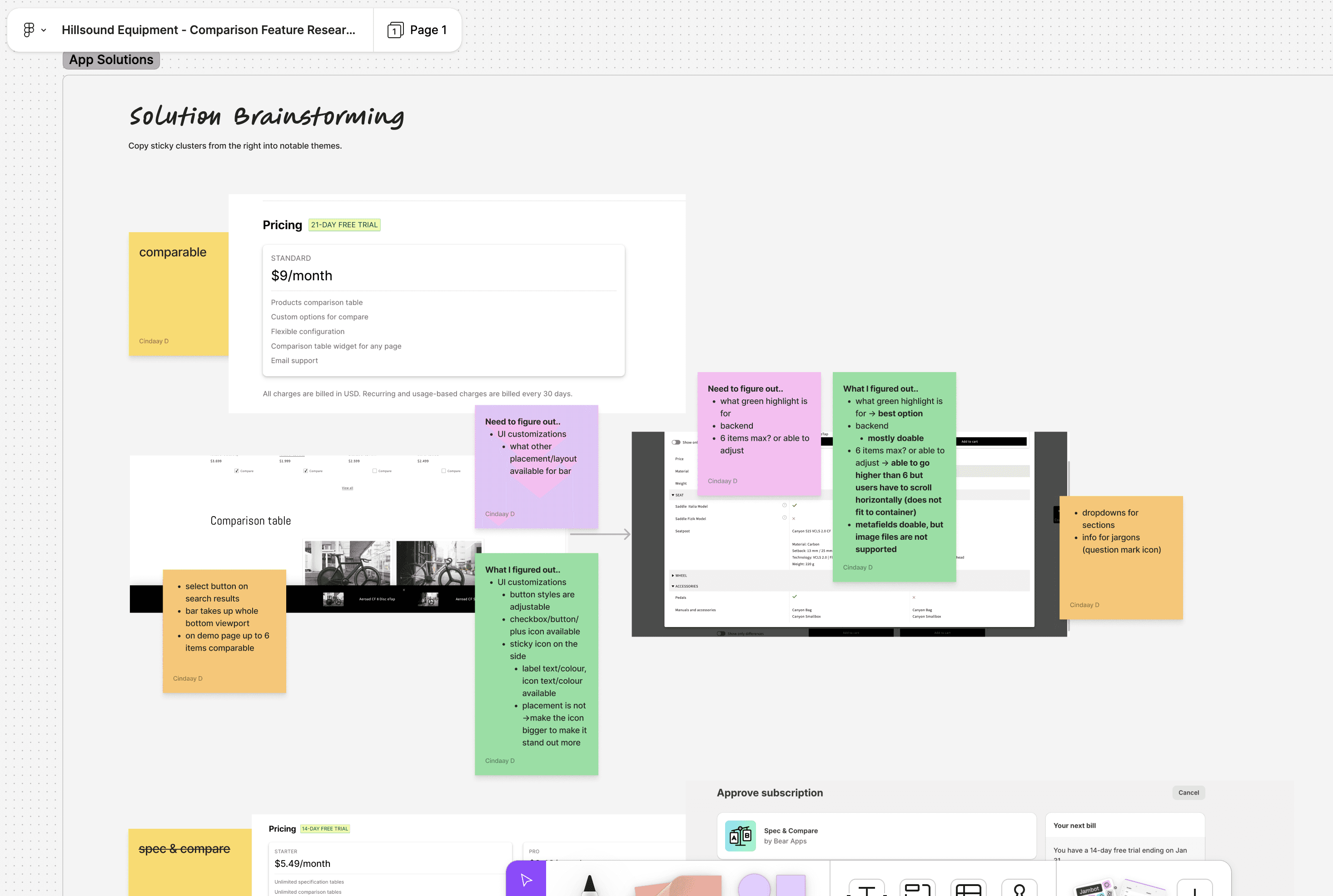
Working around dependencies and the project scope, my approach deviated from conventional design steps.
The following is how this process went in a nutshell:
Comparative Research
:Focusing on features, flows, subscription fees, UI customization.
Prioritization Matrix
:Evaluating functions and features, ensuring the selection of the most suitable app solution.
Proposals and Revisions
:Communicating with client regarding findings and decisions.
Ultimately, I chose the app Comparable for its superior compatibility with:
Metafields integration
Category hierarchy grouping
Why? The key requirement for this project was seamless and flexible integration with Metafields, given Hillsound’s extensive product variants and option values that directly impact the number of Metafields.
Where are the wireframes and sketches?
Final Designs
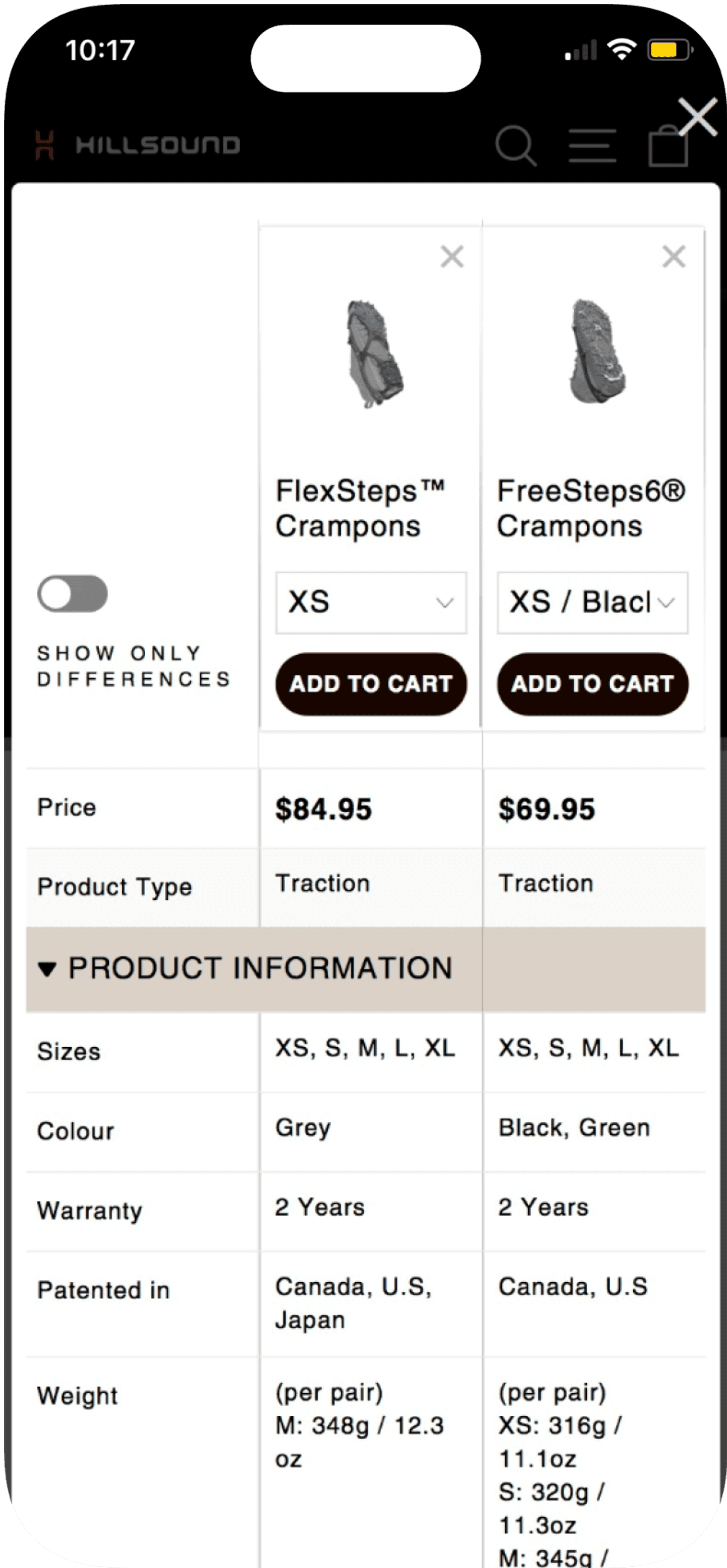
A New Look, a New Feature


Before


Recommended use has now 2 subcategories, Activity and Terrain
Comparison tables before (top) and after (bottom).
The previous comparison app's UI elements lacked visual and brand consistency. While customization options were limited, I prioritized aligning the UI elements with the brand's design assets to create a cohesive experience.
Highlighted Changes:
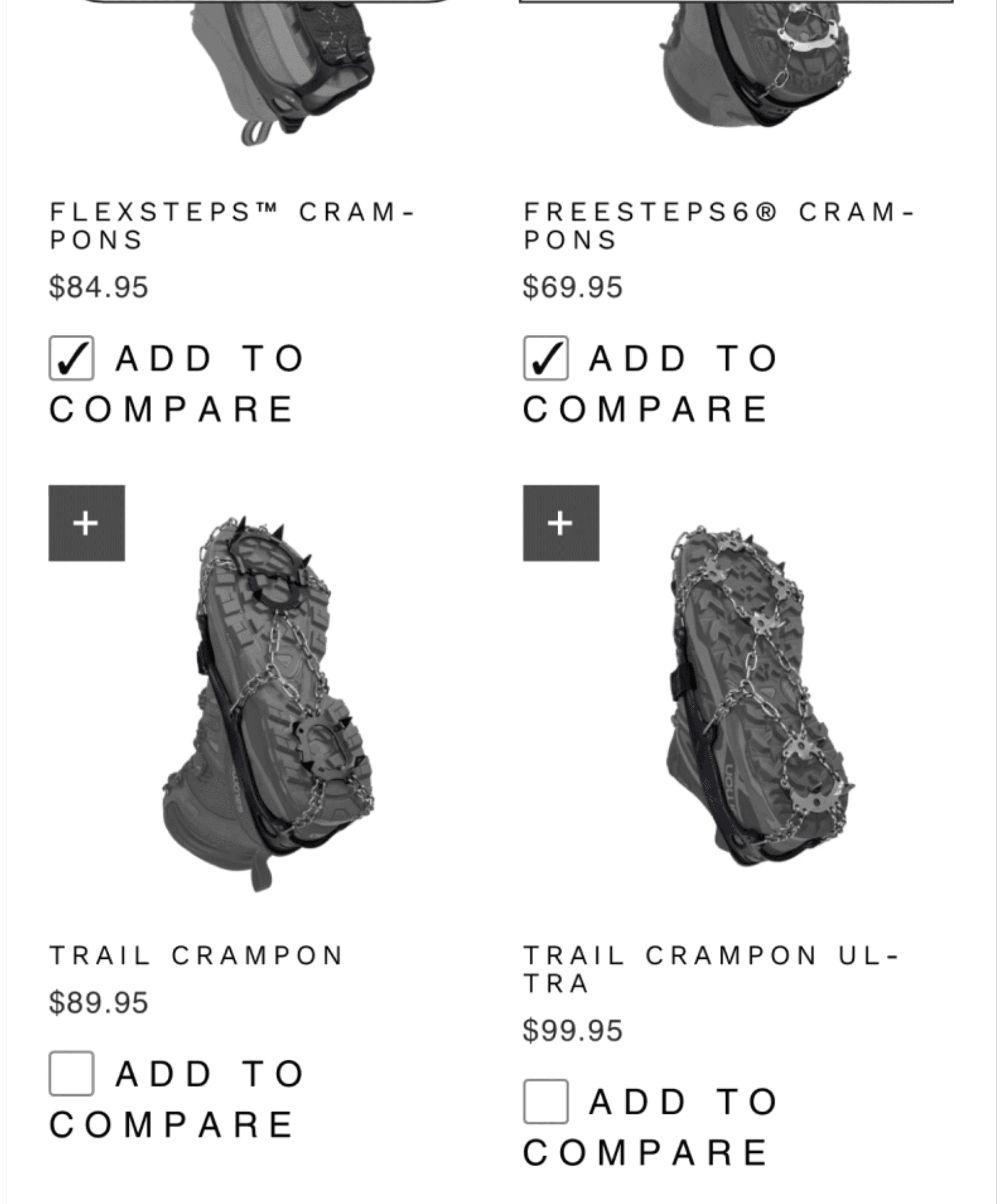
Icon Logo
Comparison Bar


2
Compare
2
Black icon hinders prominence
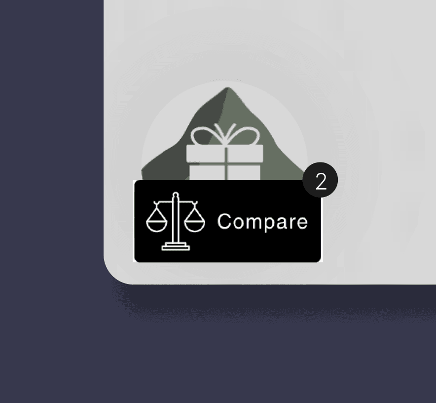
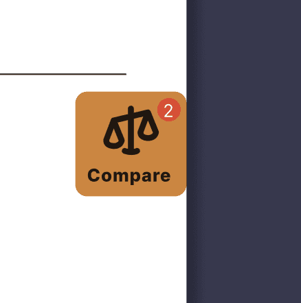
Reinforced logo visibility and consistency with brand colour(D88133)
Numbers are more visible

Bar that shows selected items for comparison from before (left) and after (right).
Outcomes and Metrics
How did it go?
Hillsound's primary objectives for this project were:
Reducing the number of inquiries on Remark
Cutting costs associated with responding to inquiries
Did we achieve these goals? Absolutely.
Before the launch, 76% of total inquiries were related to product recommendations and comparisons. Following the launch, this was reduced by 25%.
Of these inquiries, 58% specifically focused on recommended use. Post-launch, this number dropped by 17%, from 58% to 41%.
This measurable improvement reflects the success of the project in addressing Hillsound's goals.
-25%
12/14/23
01/08/24
30 days
02/24/24
01/30/24
(Launch)
30 days
Reflections
In hindsight
Was this truly the best design that you could come up with?
1
Customer inquiries were an incredible source of qualitative data.
Due to resource constraints, I conducted user research by analyzing customer inquiries, which served as a rich source of qualitative insights.
This approach revealed a deeper user need: customers wanted not only product comparisons for recommended use cases but also guidance on pairing activities with specific terrains.
By leveraging existing data, I saved time compared to traditional research methods and learned to navigate limitations effectively, delivering impactful results under tight deadlines.
2
30 Days VS 50 Conversations?
By the end of the project, we successfully achieved Hillsound's goal of reducing the number of inquiries. By identifying a key user issue and addressing it effectively, I contributed to this reduction in inquiries.
However, there is one thing I also noticed. I measured performance by tracking the number of inquiries gathered over a consistent 30-day period. In summary, I’m curious how the metrics would compare if they were based on the same number of inquiries as before—specifically 50 conversations.


