Comparable
Comparable
Hillsound Equipment, February 2023
Hillsound Equipment, February 2023
Hillsound Equipment provides a selection of professional outdoor gear for nature enthusiasts. I helped Hillsound improve their product comparison feature, Comparable, for optimal user experience for their customers which led to a 25% decrease in related customer inquiries.
My Role
Lead UX/UI Designer working in a company-wide team of 11
Timeline
8 weeks
Worked with
Marketing Coordinator
Customer Service Representative
Business Management

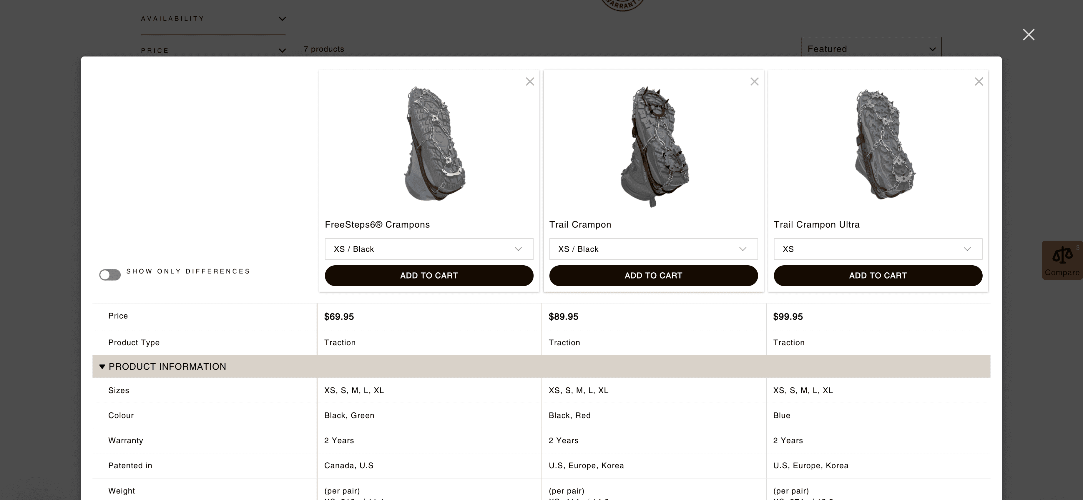
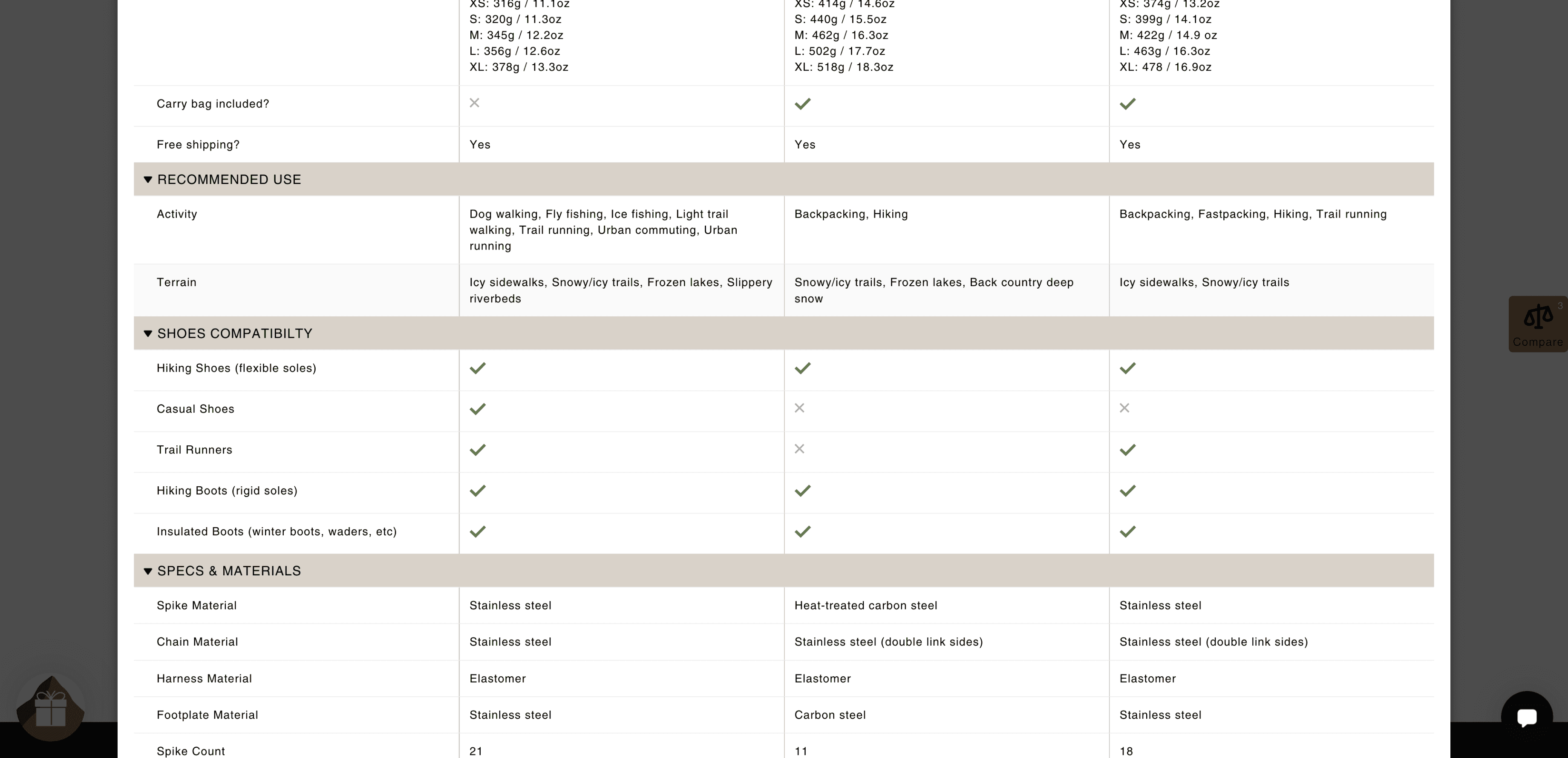
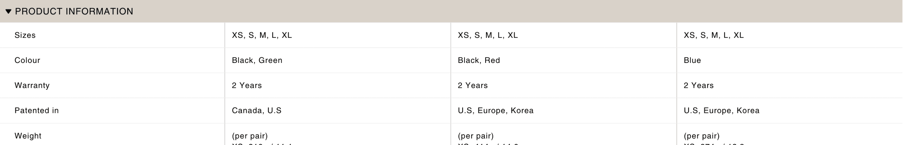
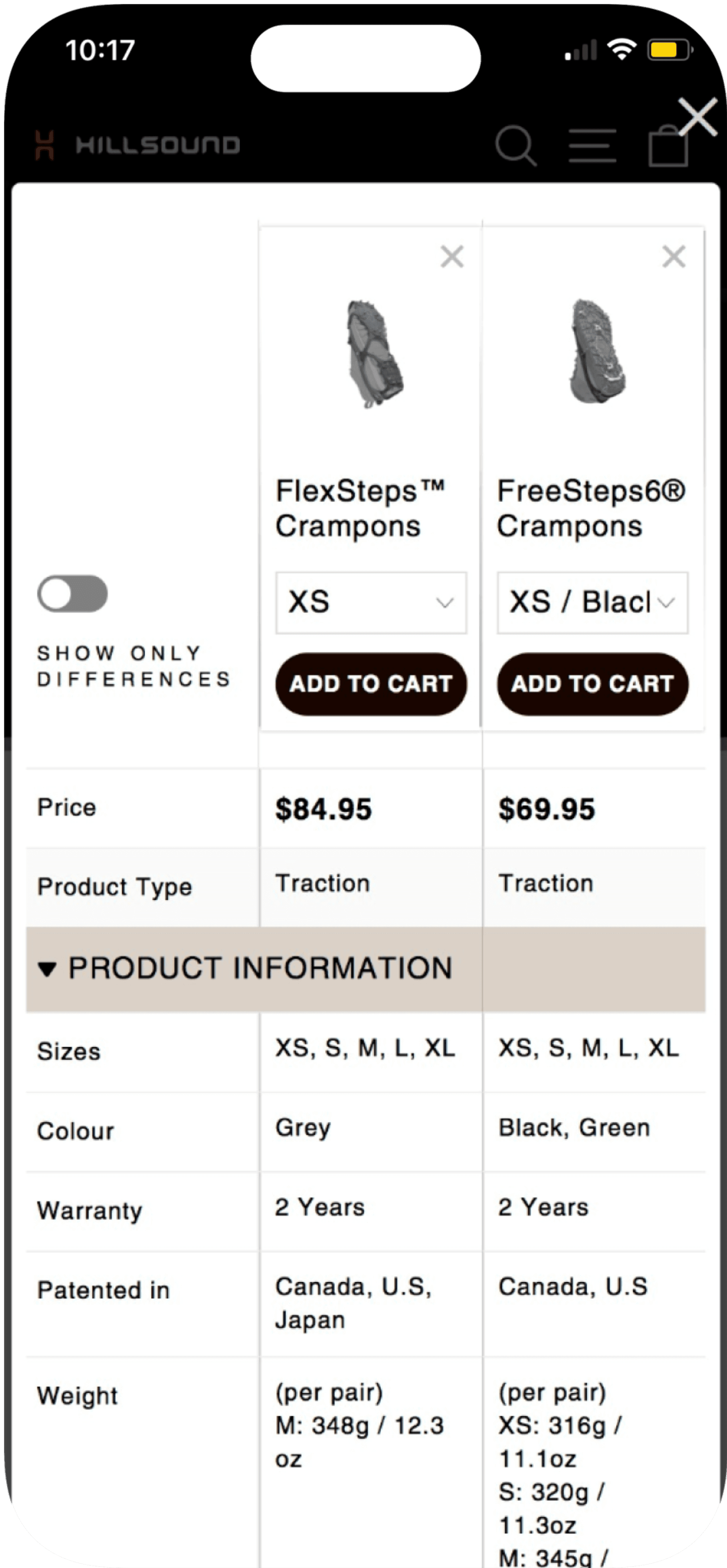
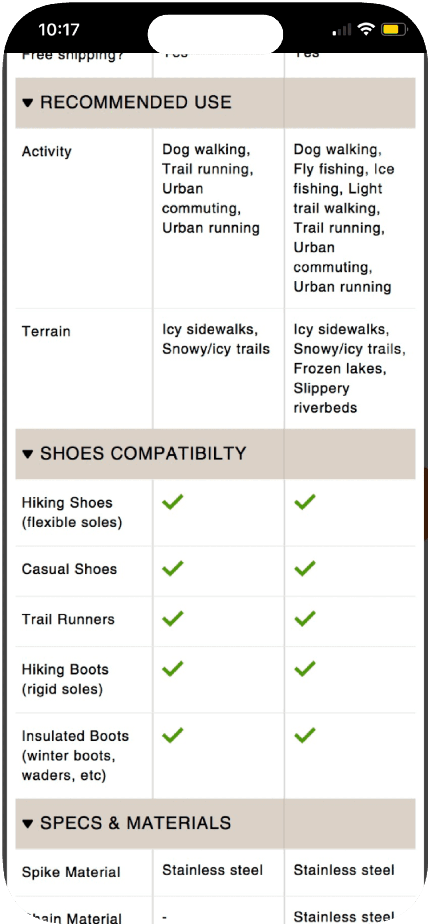
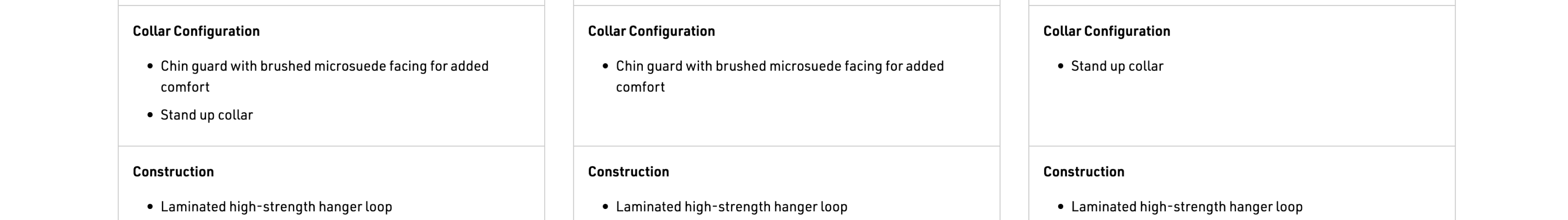
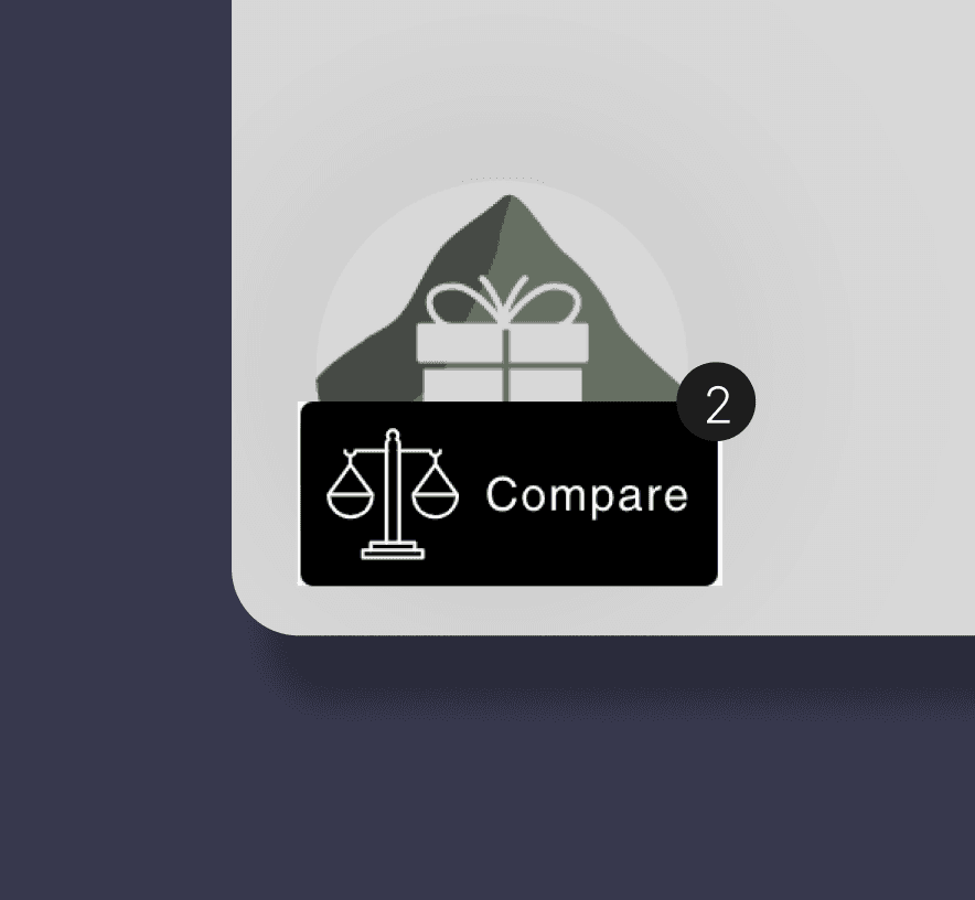
Compare
Compare
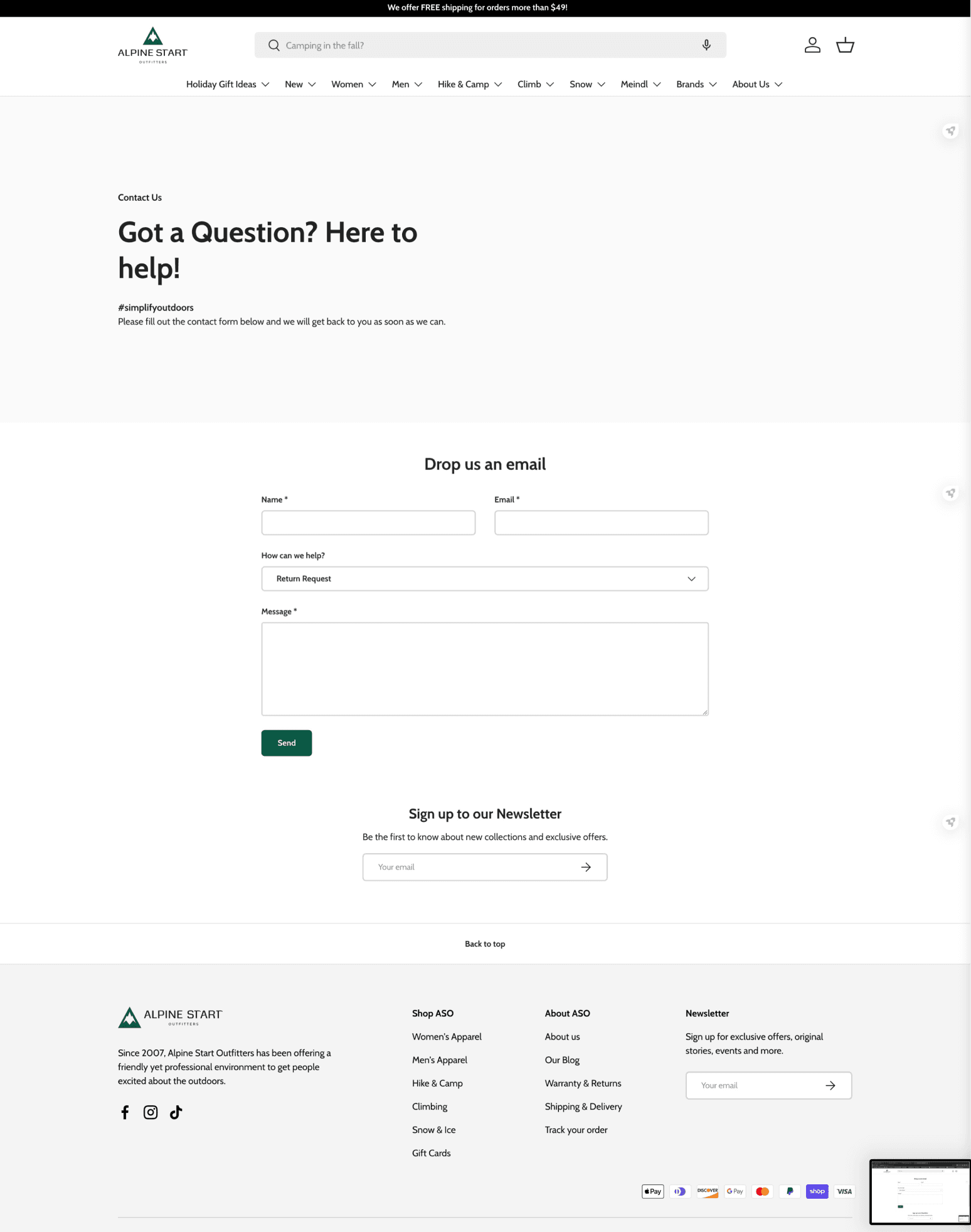
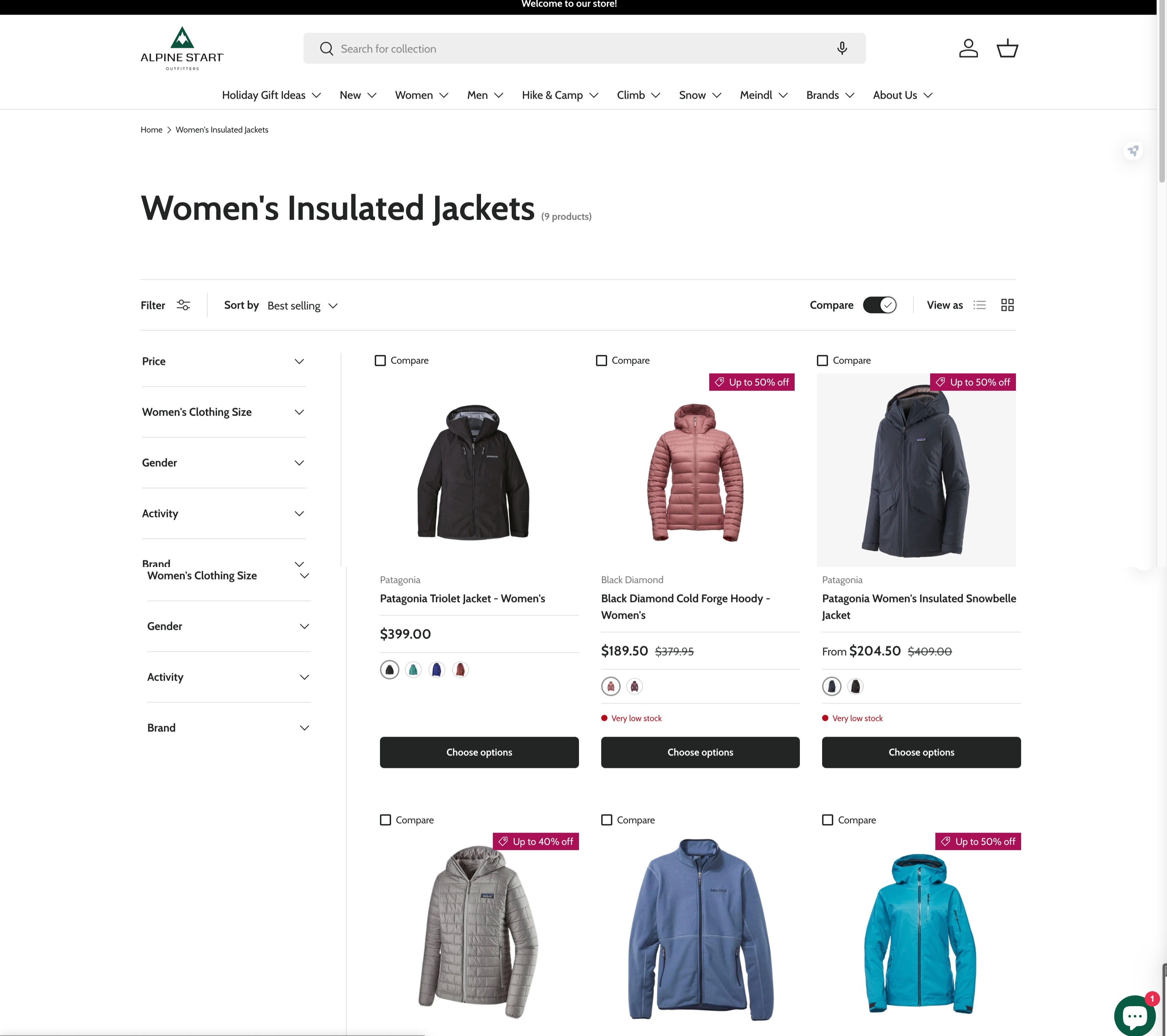
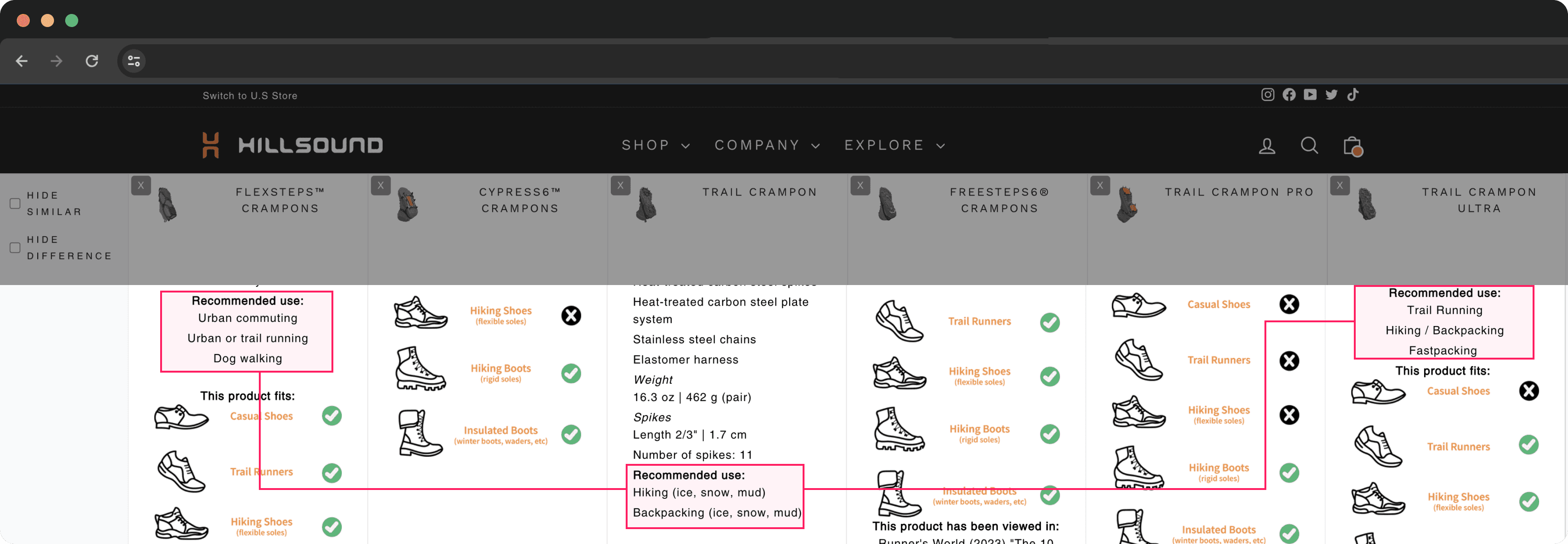
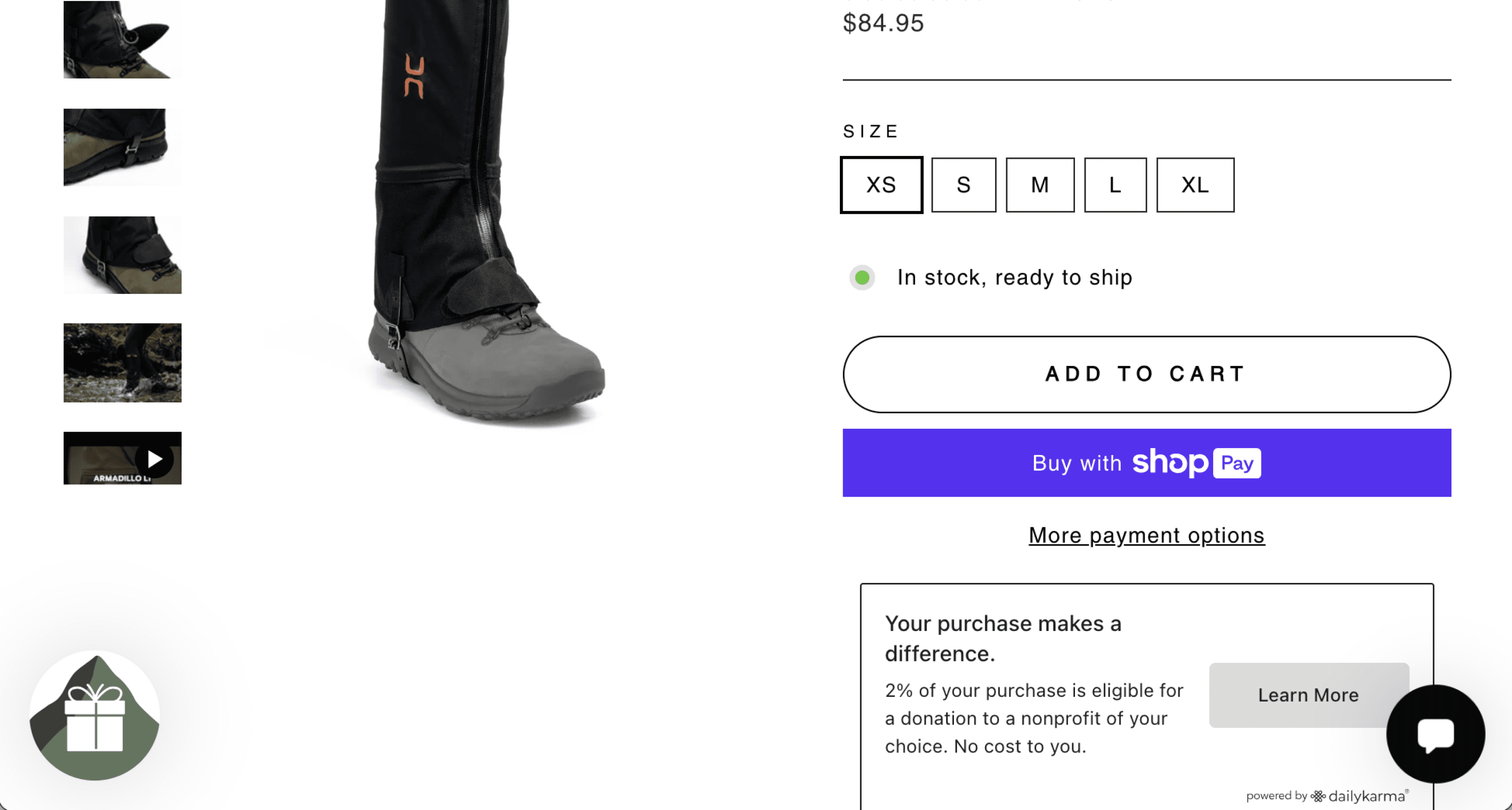
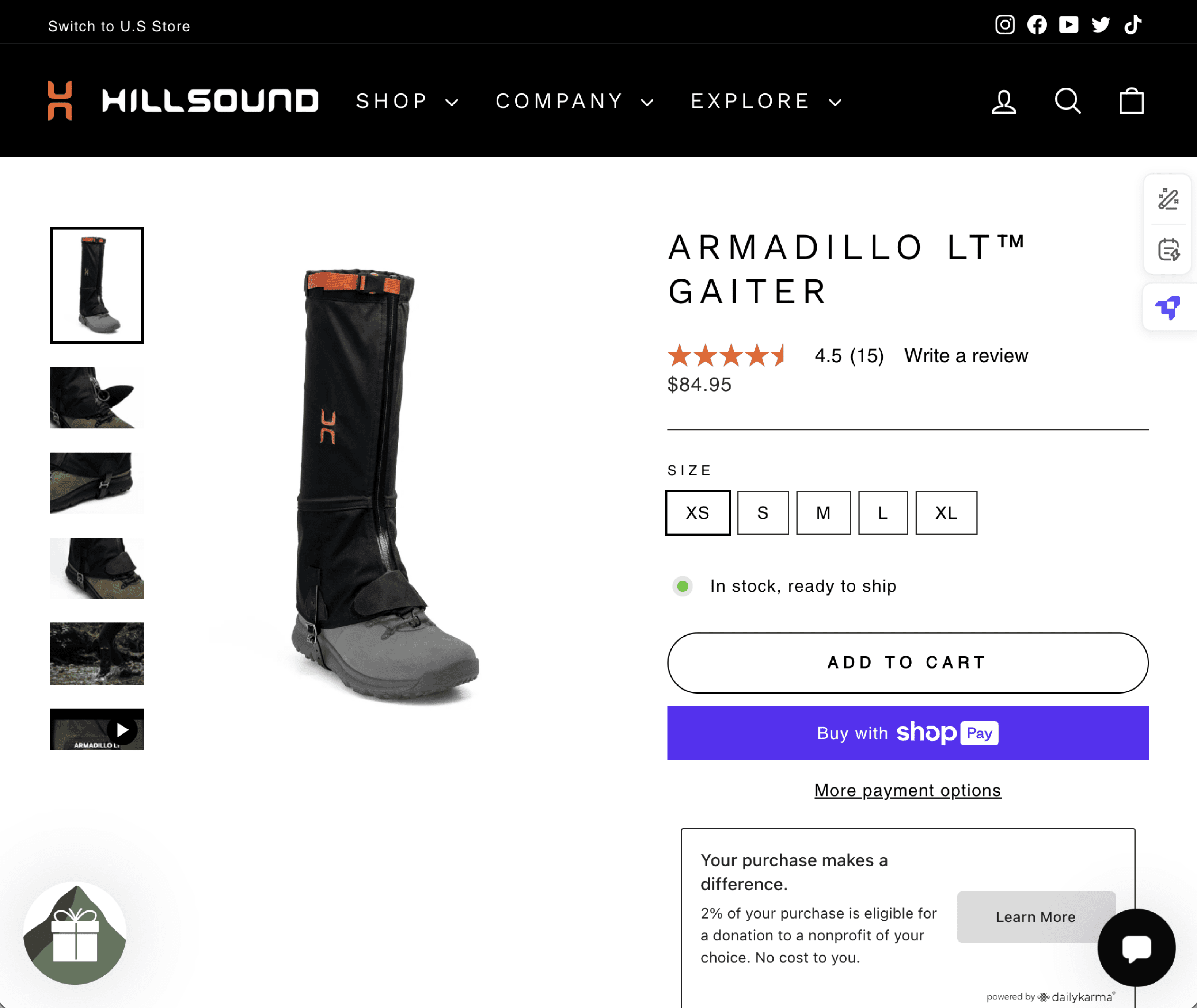
Hillsound's new product comparison tables with enlarged areas and sticky icon.

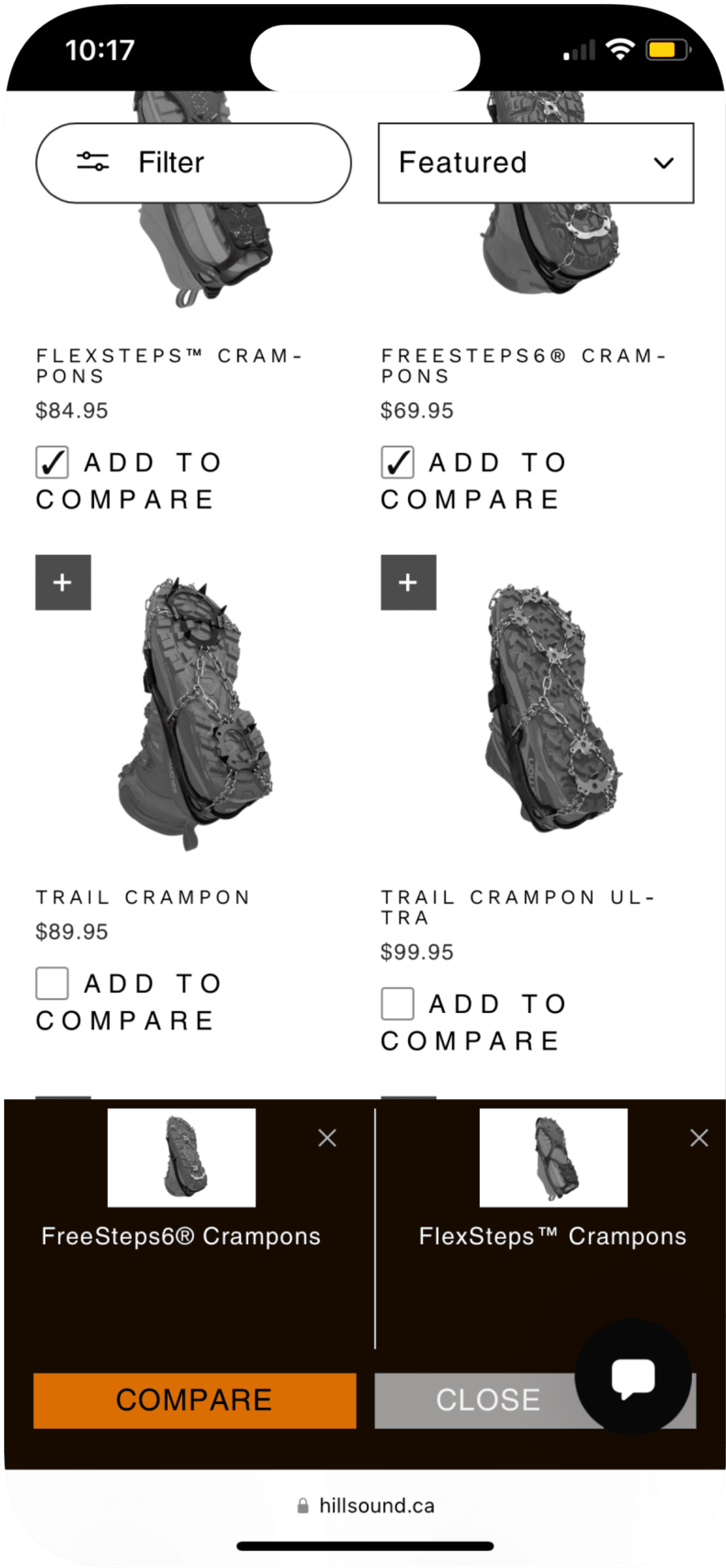
Compare
Key mobile version pages of comparison bar and table.
Hillsound Equipment’s Goals
Audit of current comparison feature
Reduce the number of relevant customer inquiries
The Outcome
THE PRODUCT
I examined and surfaced a deeper user issue that caused comparison inconvenience. This led to a design solution with reinforced product specifications and accessible UI that increased product comparison efficiency.
IMPACT
The redesign and launch of the feature gave a notable positive impact, with a 25% decrease of product recommendation inquiries on the website’s customer service platform.
text
Audit: Customer Service Chats
Audit: Customer Service Chats
WHAT WERE CUSTOMERS ASKING FOR?
WHAT WERE CUSTOMERS ASKING FOR?
Activities coupled with terrain.
Activities coupled with terrain.
After learning that Hillsound had a gear expert chat service live on the website, where users were asking questitons about products, I reached out to the customer service representative to get firsthand customer data.
I delved into 50 of the most recent conversations and discovered a trend:
85% of users were looking for crampons and gaiters based on a specific use case in pairing with a specific terrain.
Detailed Research Analysis
... And is it better on ice? What about deep snow? -Karen
Hi, what are the best crampon for ice but for in town? - Ethan
...snowy and icy trails. Just hiking. - Reuben
They are for my daughter who likes to climb mountains - in the Adirondacks and White Mountains. - Karen
... And is it better on ice? What about deep snow? -Karen
Hi, what are the best crampon for ice but for in town? - Ethan
They are for my daughter who likes to climb mountains - in the Adirondacks and White Mountains. - Karen
Hi, I’m looking for a crampon that will all of my boots. I want a crampon that will be good on deep snow, and some icy terrains. Good for all around. Not like Everest type nor driveway type. - Olivier
Choosing the best gaiter for walking in the bush in snow.
- Melissa
Customer convo compilation from gear chat service, Remark.
Customer convo compilation from gear chat service, Remark.
Audit: Previous Product Comparison App
Audit: Previous Product Comparison App
WHAT WAS HILLSOUND DOING ATM
WHAT WAS HILLSOUND DOING ATM
So much information with so little order.
So much information with so little order.
I needed clarity on what was going on at Hillsound.
Users weren’t able to compare product descriptions/information efficiently. Looking into the compare feature Hillsound had been using, there were major visual design, user-centric design issues right off the bat.
There were so many more, but just to list a few:
1
2
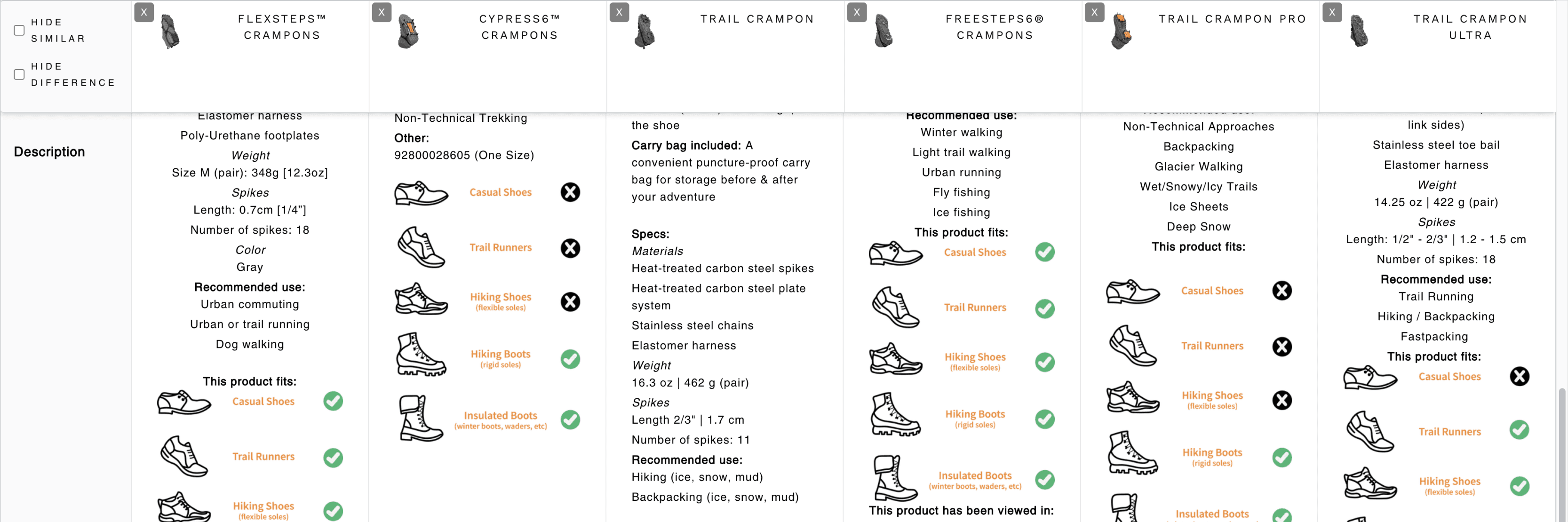
Hillsound’s previous product comparison table.
Hillsound’s previous product comparison table.
1
Missing specification from viewport.
Missing specification from viewport.
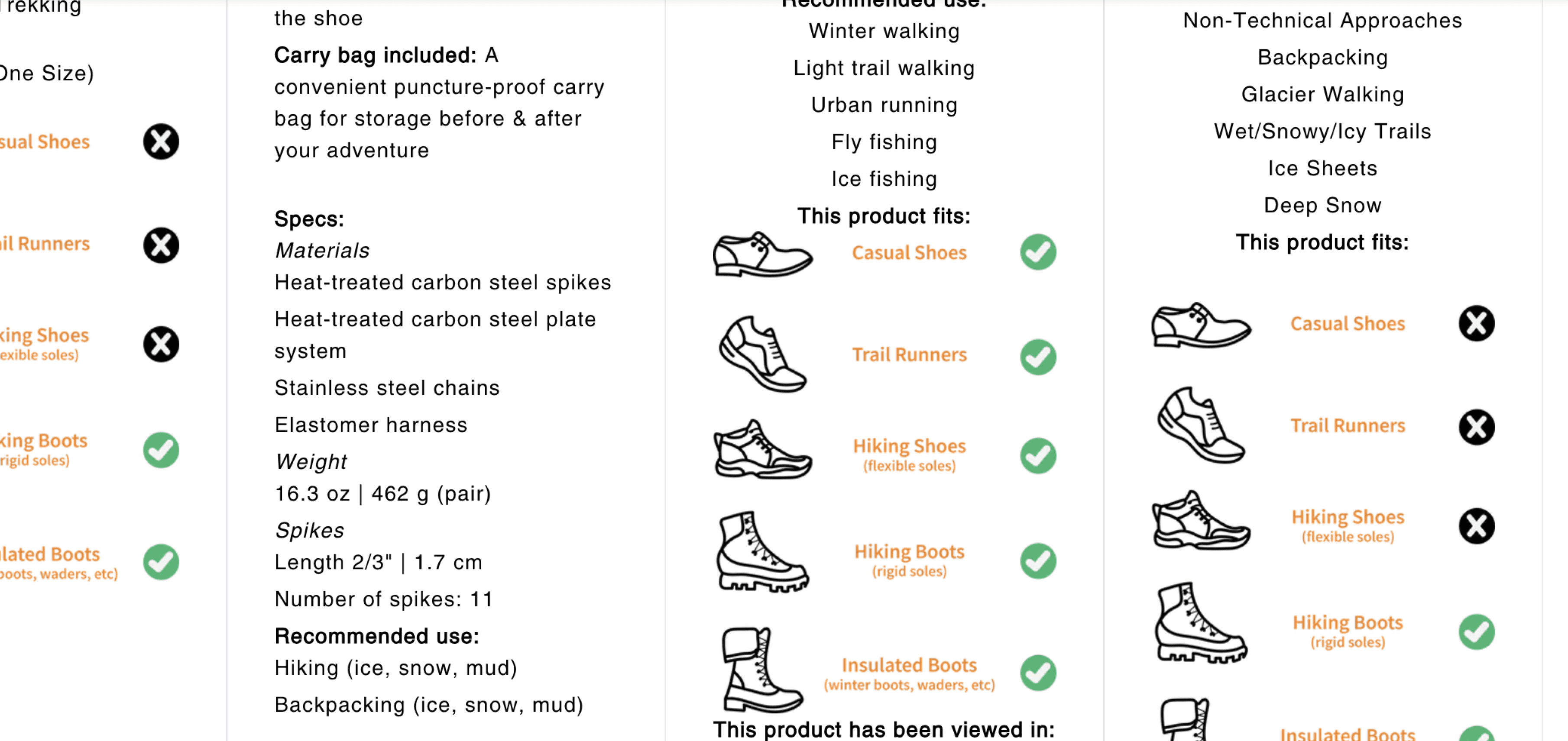
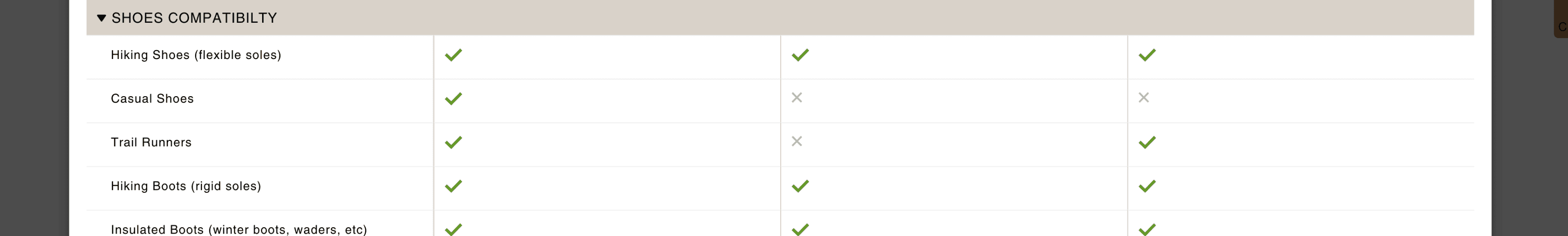
I can't compare the 'Shoe Compatibility' for all products added in the same viewport. See how the 'Shoe Compatibility' is missing for the 'Trail Crampon'.
I can't compare the 'Shoe Compatibility' for all products added in the same viewport. See how the 'Shoe Compatibility' is missing for the 'Trail Crampon'.
2
No rows.
Tiring on the eyes.
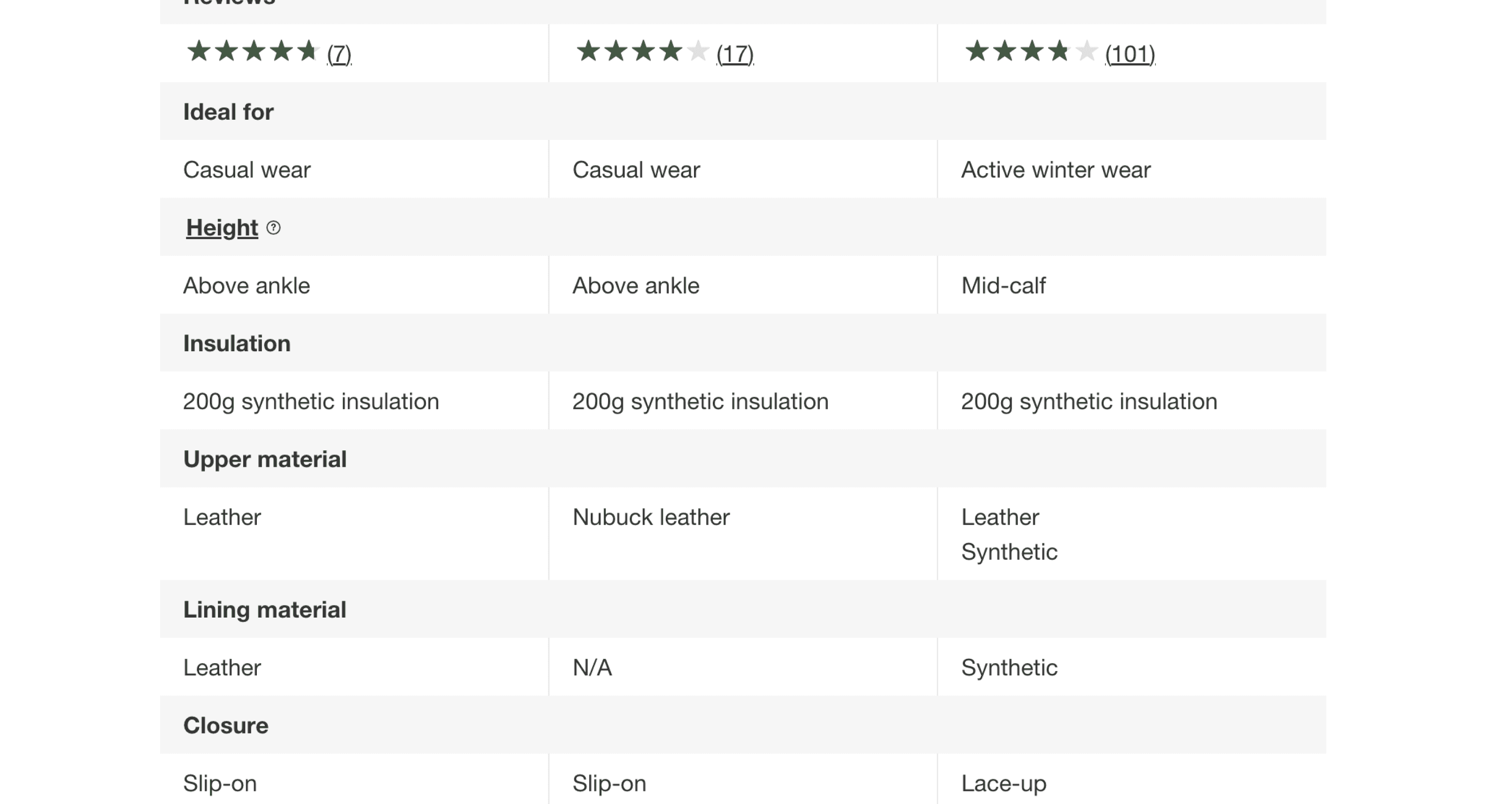
Only 2 products have the same category on the same row. It was safe to say that rows never existed here in the first place.
Not a single product spec on the same row. My eyes are already tired just by trying to spot the rest.
3
Hillsound’s previous product comparison table.
Hillsound’s previous product comparison table.
3
Confusion/Inconsistency in information.
Confusion/Inconsistency in information.
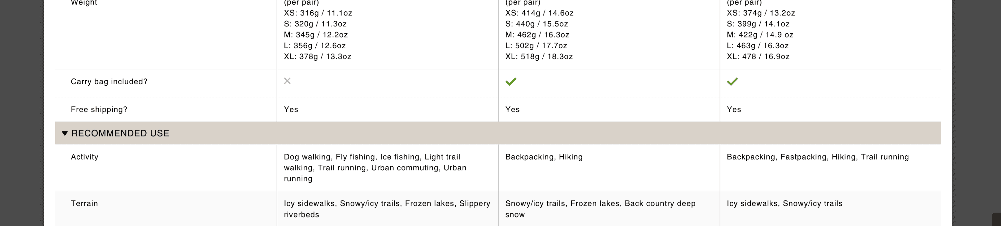
Both products have 'backpacking' as a recommended use, but why is one specified in parentheses? In fact, what does that mean exactly?
Both products have 'backpacking' as a recommended use, but why is one specified in parentheses? In fact, what does that mean exactly?
Comparative Research
Comparative Research
CLEAN ROWS & CLEAR HIERARCHY
CLEAN ROWS & CLEAR HIERARCHY
Taking a glimpse of industry standards.
Taking a glimpse of industry standards.
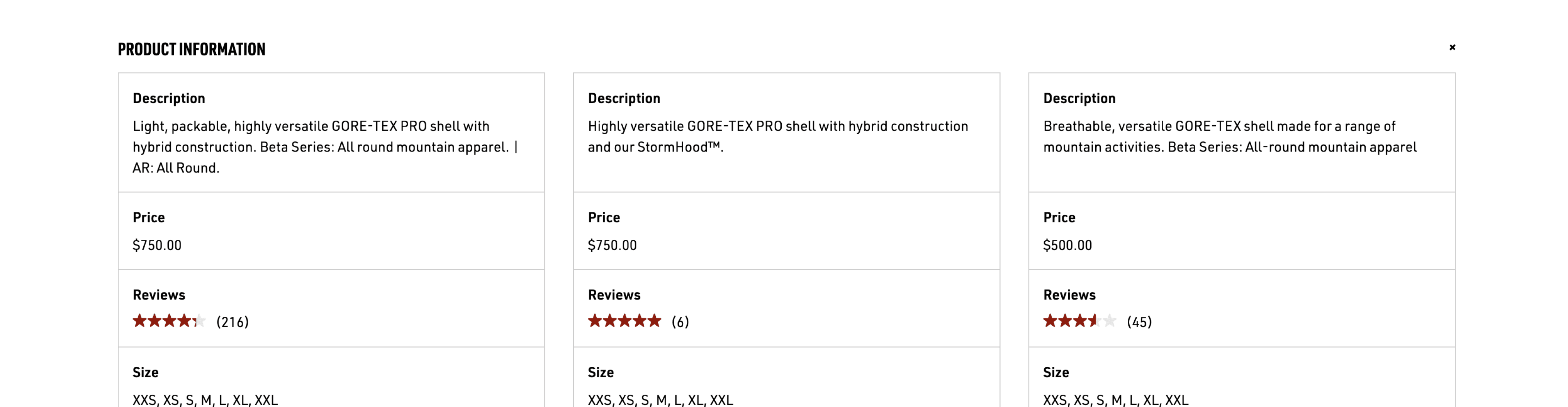
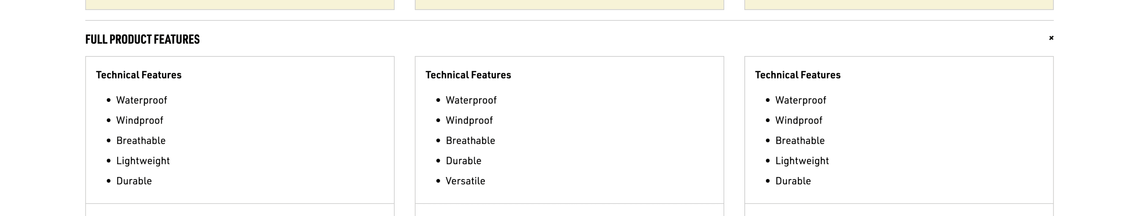
To premise, I looked up 8 outdoor equipment brands’ websites to see what features they use to help users compare their products.
Below are some of the highlights:
To premise, I looked up 8 outdoor equipment brands’ websites to see what features they use to help users compare their products.
Below are some of the highlights:

2
1
1
Product comparison tables from MEC (left) and Arcteryx (right).
Product comparison tables from MEC (top) and Arcteryx (right).
1
Clear Rows.
Clear Rows.
It was a no brainer that all tables intended for product comparison were put into clear rows - whether that be lines, spacing, or differently coloured backgrounds.
It was a no brainer that all tables intended for product comparison were put into clear rows - whether that be lines, spacing, or differently coloured backgrounds.
2
Clear Hierarchy.
Clear Hierarchy.
This page was for products that had a lot of product specification. Headings and subheadings are used to further organize information and enhance visual hierarchy.
This page was for products that had a lot of product specification. Headings and subheadings are used to further organize information and enhance visual hierarchy.
Research Takeaways
Hillsound's current product comparison feature lacked organized tables and accurate product information.
Customers were asking for product recommendations the most, however, more specifically based on desired activity AND terrain.
02 Define
02 Define
High-level goals
High-level goals
DEFINING THE GOALS
DEFINING THE GOALS
Based on the research findings and takeaways, I summarized the higher level goals I hope to achieve with the project.
Based on the research findings and takeaways, I summarized the higher level goals I hope to achieve with the project.
Helping users find and compare product specifications.
Helping users find and compare product specifications.
User Goal
User Goal
User Goal
Find and compare product specifications swiftly and easily.
(e.g. A's weight & B's weight)
Find and compare product specifications swiftly and easily.
(e.g. A's weight & B's weight)
Design Implications
Design Implications
Design Implications
Configuring a readable table with rows and columns. Providing better visual hierarchy.
Configuring a readable table with rows and columns. Providing better visual hierarchy.
1
Providing clear and understandable product information.
Providing clear and understandable product information.
User Goal
User Goal
User Goal
Attain additional and in-depth information they need.
(e.g. Redish-blue & Greenish-blue)
Attain additional and in-depth information they need.
(e.g. Redish-blue & Greenish-blue)
Design Implications
Design Implications
Design Implications
Strengthen IA through different names or perhaps hierarchy.
Strengthen IA through different names or perhaps hierarchy.
2
2 main design goals.
2 main design goals.
Before ideating and brainstorming..!
It was important to take a look at the technical constraints and dependencies before ideating solutions.
03 Constraints/Brainstorming
03 Constraints/Brainstorming
Platform Constraints
Platform Constraints
UNDERSTANDING HOW DATA WORKS ON SHOPIFY
UNDERSTANDING HOW DATA WORKS ON SHOPIFY
Helping users find and compare product specifications.
Why were tables so hard for Hillsound?
You could raise the question (Believe me, I did too),
'Seems like an easy fix, why was a table with straight rows and columns difficult to achieve for Hillsound?'
This is how looking into the platform constraints took off.
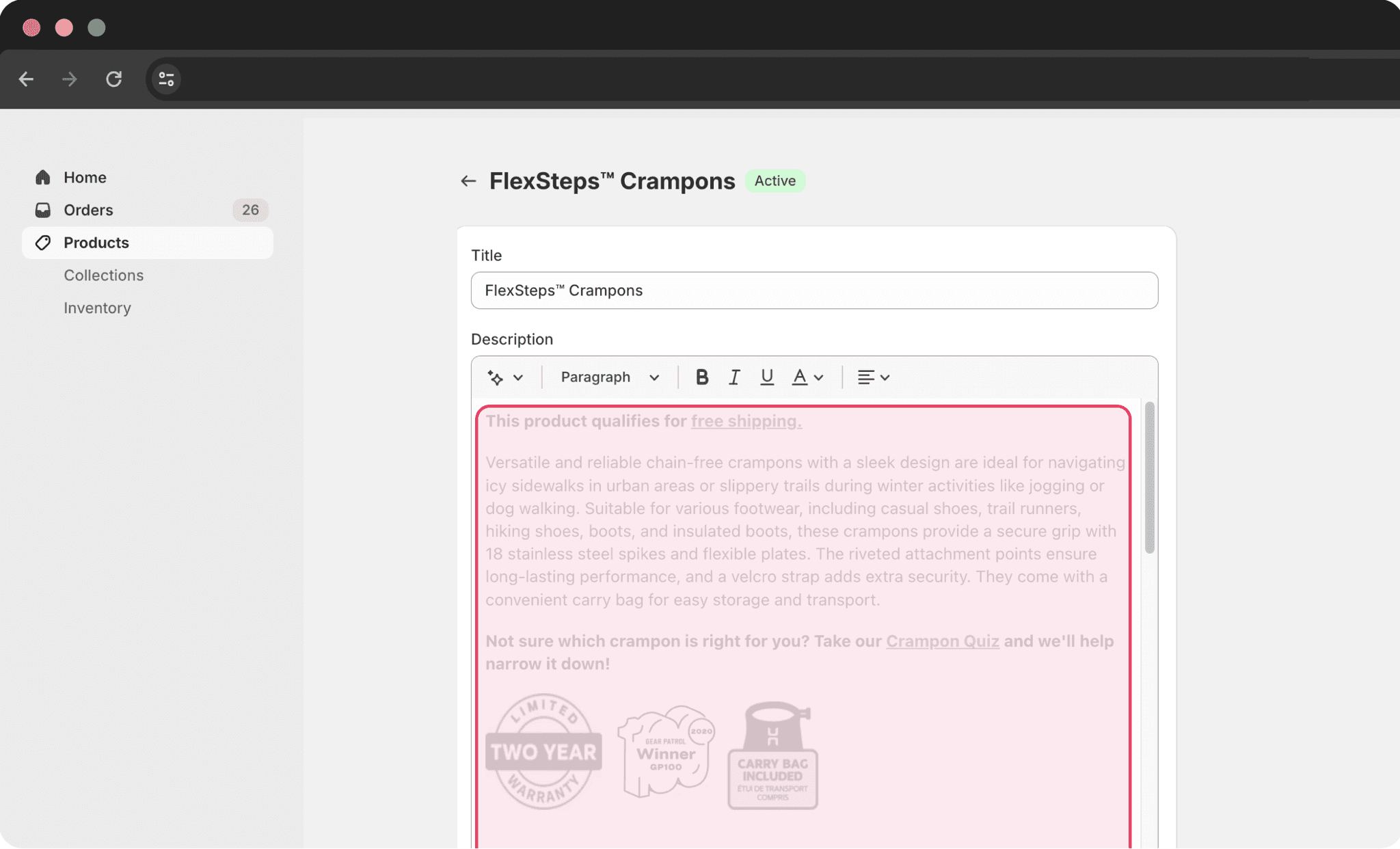
Basically, all product information was managed under each individual product page (as shown below). Here, the product information was written under "Description". Because there were no other tags/identifiers, the software was just merely allowing users to compare "Description"s, hence, the unordered tables.
You could raise the question (Believe me, I did too),
'Seems like an easy fix, why was a table with straight rows and columns difficult to achieve for Hillsound?'
This is how looking into the platform constraints took off.
Basically, all product information was managed under each individual product page (as shown below). Here, the product information was written under "Description". Because there were no other tags/identifiers, the software was just merely allowing users to compare "Description"s, hence, the unordered tables.
Why couldn't I brainstorm options
other than tables?
No categories, just one blob of text/info
No categories, just one blob of text/info
Product page
Product page
Flow to adding/editing product data.
Flow to adding/editing product data.
How might we
How might we
DISCOVERING METAFIELDS
DISCOVERING METAFIELDS
How can we compartmentalize product specifications?
After some research, I discovered a feature within Shopify called “Metafield”s.
These are custom data mechanisms that help online stores customize the functionality and appearance of the Shopify store by letting you save specialized information that isn't usually captured in the Shopify admin.
By adding and implementing Metafields to product specifications, products achieve tags where now Shopify's system is able to differentiate certain information according to their Metafields.
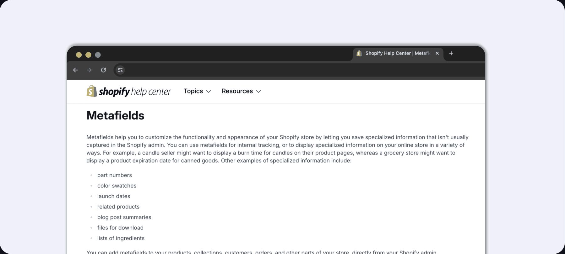
Help Center page dedicated to introducing/explaining Metafields.
Help Center page dedicated to introducing/explaining Metafields.
04 Designing - IA
04 Designing - IA
Reinforcing Information Architecture
Reinforcing Information Architecture
SPECIFYING WHAT CUSTOMERS WERE LOOKING FOR
SPECIFYING WHAT CUSTOMERS WERE LOOKING FOR
Providing clear and understandable product information.
Activities & Terrain.
Activities & Terrain.
Before adding the Metafields, we needed to take another look into the product specification itself. I referred back to what I learned from the customer chats.
People mentioned a specific terrain coupled with an activity when asking for product recommendations.
Adding "Terrain" as another product specification didn't seem right semantically. According to our team who are also avid outdoorsy people, "You could argue the environment or terrain also fits under Recommended Use".
Therefore, we specified the use cases for each product. Recommended Use was split into Activity and Terrain.
Due to time constraints, we quickly did a poll within the internal team and landed on the term, "Activity" and “Terrain”.
Activity
Activity
Backpacking
Beach/surfing
Camping
Cross-country Skiing
Backpacking
Beach/surfing
Camping
Cross-country Skiing
...
Winter walking
Urban running
Hiking (ice, snow, mud)
Backpacking (ice, snow, mud)
Winter walking
Urban running
Hiking (ice, snow, mud)
Backpacking (ice, snow, mud)
Recommended Use
Recommended Use
Recommended Use
Recommended Use
Terrain
Terrain
Icy Sidewalks
Snowy/icy Trails
Frozen Lakes
Glaciers
Icy Sidewalks
Snowy/icy Trails
Frozen Lakes
Glaciers
...
3
1
2
4
After
Before
Previous IA (left) and redesigned IA (right).
Previous IA (top) and redesigned IA (bottom).
1
Getting rid of ambiguous terms.
Getting rid of ambiguous terms.
What does “winter walking” mean? Snowy sidewalks? Icy sidewalks? We eventually got rid of ambiguous activities like these.
What does “winter walking” mean? Snowy sidewalks? Icy sidewalks? We eventually got rid of ambiguous activities like these.
2
Consistent naming conventions.
Consistent naming conventions.
Previously Hillsound used parentheses to further describe terrains. We took this away to keep a consistent look and enhance readability.
Previously Hillsound used parentheses to further describe terrains. We took this away to keep a consistent look and enhance readability.
3
Introducing subcategories.
Introducing subcategories.
Specifically, the “Recommended Use” could be further divided into 2 subcategories: Activity and Terrain. The different terrains would complement the use cases(activities) that customers consider when comparing products.
Specifically, the “Recommended Use” could be further divided into 2 subcategories: Activity and Terrain. The different terrains would complement the use cases(activities) that customers consider when comparing products.
4
Specific terrains and environment.
Specific terrains and environment.
In addition to specifying the terrain, there were 2 things to consider: where and the condition. Volià! “Icy Sidewalks”!
In addition to specifying the terrain, there were 2 things to consider: where and the condition. Volià! “Icy Sidewalks”!
05 Designing - Apps , Implementation
05 Designing - Apps , Implementation
Finding app solutions
Finding app solutions
LANDING ON AN APP SOLUTION THROUGH PRIORITIZATION
LANDING ON AN APP SOLUTION THROUGH PRIORITIZATION
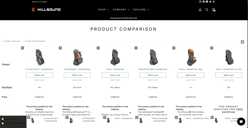
Comparable, the app that best met our needs.
Comparable, the app that best met our needs.
Now that we have taken care of the product data, it was time to figure out how the UI is to be displayed. Or in this project, it was time to implement an app that is capable of showcasing the product information and the comparison function.
Now that we have taken care of the product data, it was time to figure out how the UI is to be displayed. Or in this project, it was time to implement an app that is capable of showcasing the product information and the comparison function.
Where are the wireframes and sketches?
My design process from here was different from those "conventional" steps. I first did a comparative research on the available apps, then created a prioritization matrix of the functions and features to figure out the best app solution.
The most important function to this project is for the app to able to enable smooth and flexible integration with Metafields. It was important to note that Hillsound had a good number of product variants and option values which influence the number of metafields.
Therefore, I landed on the app, Comparable which enabled the best compatability with
Metafields
Grouping for category hierarchy
3
1
5
3
3
2

Flexsteps Crampons
Freesteps6 Crampons
Trail Crampon
Trail Crampon Ultra
Trail Crampon Pro
Cypress6 Crampons
Skikeeper


4
colour
warranty
weight
(per pair) XS: 316g / 11.1oz
Lifetime
Black
Black
Green
Product Information
Sizes
Colour
Warranty
Patented in
XS
black
2 years
Canada
S
M
L
XL
green
U.S
BTS on how metafields and grouping is done with product data.
BTS on how metafields and grouping is done with product data.
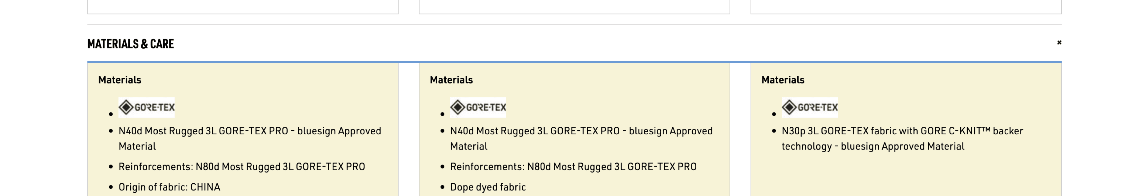
METAFIELD COMPATIBILITY.
METAFIELD COMPATIBILITY.
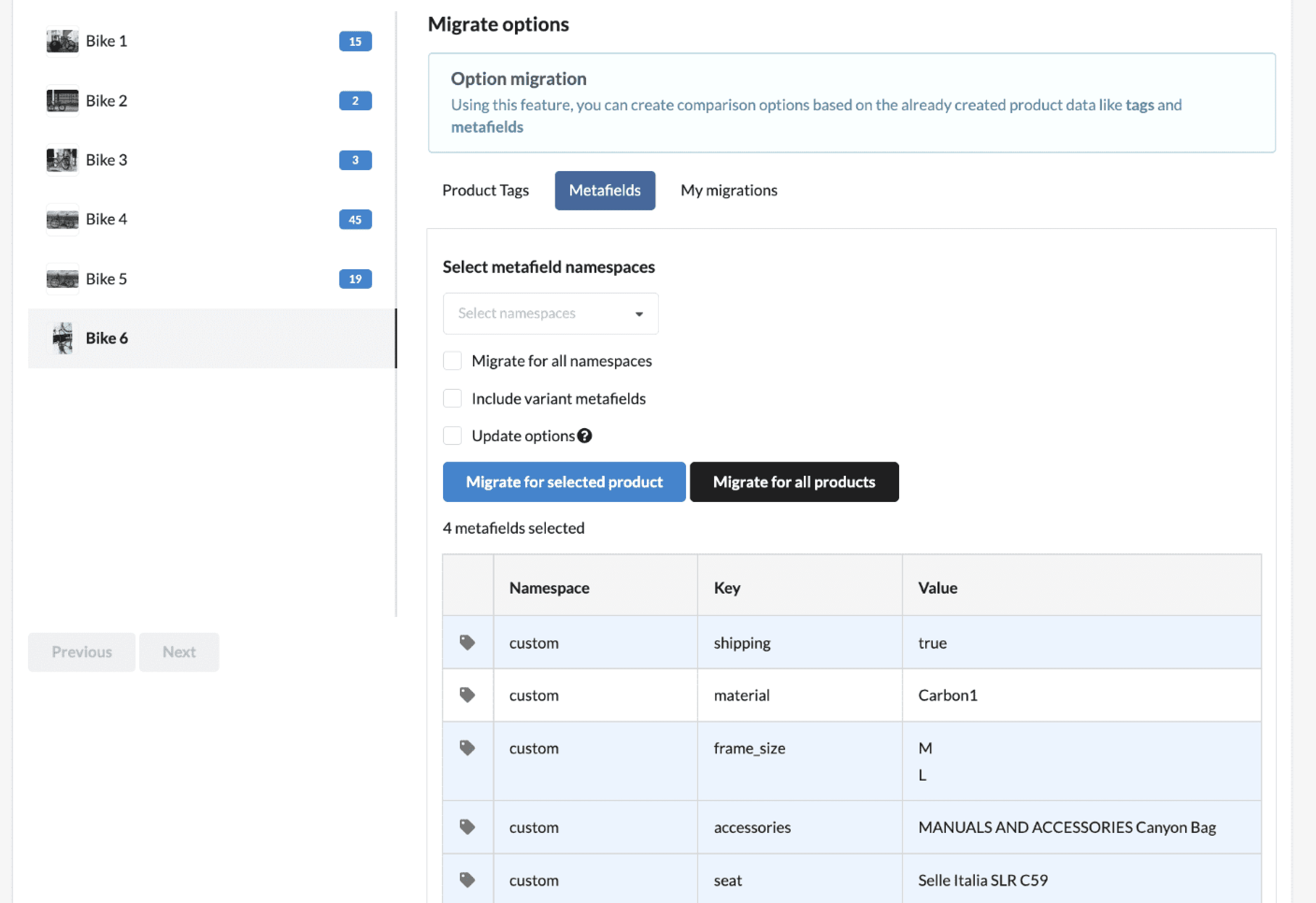
Comparable offered customized and hassle-free migration of the many metafields for Hillsound's products.
Comparable offered customized and hassle-free migration of the many metafields for Hillsound's products.
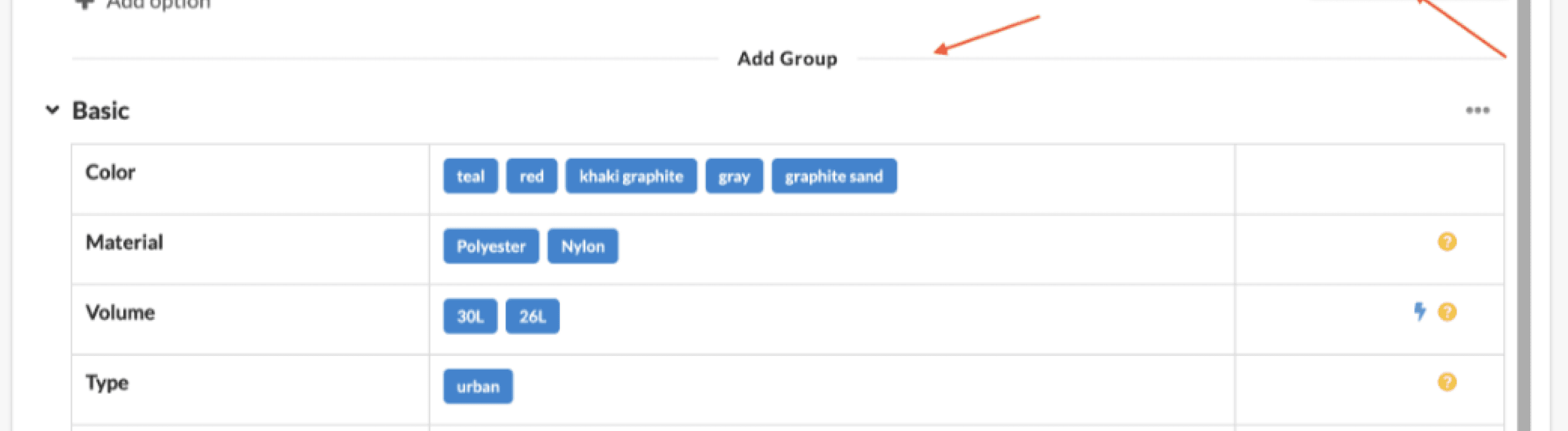
CATEGORY SECTIONS.
CATEGORY SECTIONS.
Further grouping and categorization enable the visual hierarchy which is crucial when comparing products.
Further grouping and categorization enable the visual hierarchy which is crucial when comparing products.
06 Final designs
06 Final designs
Introducing the final product
Introducing the final product
A NEW LOOK, A NEW FEATURE
A NEW LOOK, A NEW FEATURE


After
After
After


Before
Before
Comparison tables before (top) and after (bottom).

One category, “recommended use” with both terrains and activities
One category, “recommended use” with both terrains and activities
One category, “recommended use” with both terrains and activities
Activities mentioned by customers added
Activities mentioned by customers added
Terrains added
Terrains added
Terrains added
Terrains added
Recommended use has now 2 subcategories, Activity and Terrain
Recommended use has now 2 subcategories, Activity and Terrain
Recommended use has now 2 subcategories, Activity and Terrain
After
After
After
Before
Before
Comparison tables before (top) and after (bottom).
Elements that just made more sense.
Elements that just made more sense.
A lot of the UI elements from the previous comparison app lacked visual/brand consistency. Despite the limitations of customization, I focused on adhering to the brand’s design assets for the UI elements.
Below are some highlighted changes that were made: the icon logo and the bar.
A lot of the UI elements from the previous comparison app lacked visual/brand consistency. Despite the limitations of customization, I focused on adhering to the brand’s design assets for the UI elements.
Below are some highlighted changes that were made: the icon logo and the bar.


2
Black icon hinders prominence
Black icon hinders prominence
Black icon hinders prominence
Number of items added to compare isn’t visible enough due to lack of constrast in colour
Number of items added to compare isn’t visible enough due to lack of constrast in colour
Number of items added to compare isn’t visible enough due to lack of constrast in colour
Compare
2
Before
Before
After
After
Compare
2
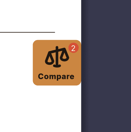
Reinforced logo visibility and consistency with brand colour(D88133)
Reinforced logo visibility and consistency with brand colour(D88133)
Reinforced logo visibility and consistency with brand colour(D88133)
Numbers are more visible
Numbers are more visible
Numbers are more visible
Icon logos from before (left) and after (right).
Icon logos from before (left) and after (right).
COMPARE
CLEAN UP
CLOSE
Trail Crampon Pro
Trail Crampon Ultra
Compare
2
COMPARE
CLEAN UP
CLOSE
Trail Crampon Pro
Trail Crampon Ultra

2
Compare
Clean up
Close
TRAIL CRAMPON PRO
TRAIL CRAMPON ULTRA
Compare
Clean up
Close
TRAIL CRAMPON PRO
TRAIL CRAMPON ULTRA
CTA colour aligned with brand primary colour
Disabled unnecessary all-caps product names.
Disabled unnecessary all-caps product names.
Just #1 task for users is to “compare” not necessarily decide between a yes or a no.
Just #1 task for users is to “compare” not necessarily decide between a yes or a no.
Before
Before
Before
After
After
COMPARE
CLEAN UP
CLOSE
Trail Crampon Pro
Trail Crampon Ultra
Flexsteps Crampon
Trail Crampon
Bar that shows selected items for comparison from before (left) and after (right).
Before(top) and after(bottom) of bar that displays selected products by users.
Was this truly the best design that you could come up with?
07 Metrics
07 Metrics
Outcomes and metrics
Outcomes and metrics
EVALUATING THE PROJECT
EVALUATING THE PROJECT
A 25% drop of enquiries.
A 25% drop of enquiries.
To recap on what Hillsound wanted to achieve from this project were:
To reduce the number of inquiries on Remark
To help customers better compare products
Have we been able to reach Hillsound's goals: YES.
Previously, the percentage of enquiries about product recommendations and comparison was 76% of the total enquiries received. Since the launch, this was reduced by 25%.
Among the 76% of those enquiries, 58% was based on Recommended Use. After launch, we were able to see a 17% decrease, from 58% to 41%.
-25%
-17%
-17%
12/14/23
01/08/24
76%
76%
30 days
58%
58%
02/24/24
01/30/24
(Launch)
51%
51%
30 days
41%
41%
Decline in Product Recommendation Enquiries: Pre- vs. Post-Launch (60 Days)
Decline in Product Recommendation Enquiries: Pre- vs. Post-Launch (60 Days)
Percentage of related product enquiries before launch (left), and after launch (right). Total of 25 pp decrease of product recommendation enquiries, and 17pp decrease based on Recommended Use.
Percentage of related product enquiries before launch (left), and after launch (right). Total of 25 pp decrease of product recommendation enquiries, and 17pp decrease based on Recommended Use.
08 Reflections
08 Reflections
Reflections
Reflections
IN HINDSIGHT...
IN HINDSIGHT...
Here’s what came to mind after wrapping up the project.
Here’s what came to mind after wrapping up the project.
1
Customer enquiries serving as qualitative data
Customer enquiries serving as qualitative data
Due to resource constraints, user research was done through perusing customer enquiries. This turned out to be the golden nugget as it served as important qualitative data.
Having done this, I was able to surface a more underlying user problem. I was able to understand that not only did customers want product comparison in recommended use cases, but more specifically activities coupled with the terrain.
In sum, not only did this research save me time in doing the "conventional" methods, I've learned to work around constraints by utilizing given data resources in such a time crunch.
2
30 Days VS 50 Conversations?
30 Days VS 50 Conversations?
Ultimately, we were able to reach Hillsound's goal by the end of the project which was to reduce the amount of enquiries. Specifically pinpointing a key user issue, I was able to tackle that issue also leading to to decrease of enquiries.
However, there is one thing I also noticed. My metrics were based on the enquiries collected during the same amount of time which was 30 days. In short, I wonder what the metrics would look like if it was based on the same number of enquiries as collected before (50 conversations).