TutorS
Capstone project, November 2022
Despite the rising demand for online tutoring during the Covid-19 pandemic, teachers and tutors faced challenges in finding students. By uncovering key user insights, I designed an MVP app, TutorS, a platform that matches tutors with students. Through user testing, I achieved a 36% increase in usability by the end of the project timeline.
Despite the rising demand for online tutoring during the Covid-19 pandemic, teachers and tutors faced challenges in finding students. By uncovering key user insights, I designed an MVP app, TutorS, a platform that matches tutors with students. Through user testing, I achieved a 36% increase in usability by the end of the project timeline.
My Role
Lead UX/UI Designer
Timeline
80-hour time constraint
Technical Constraints
Conceptual capstone project
Product constrainted to MVP

Splash screen to main login page.
Splash screen.
Key pages for the main flow.
Background: Addressing the Online Tutoring Challenge in South Korea
South Korea has a large audience of education enthusiasts, with tutoring being one of the most popular forms of education among parents and students.
However, despite the growing demand for online tutoring since the Covid-19 pandemic, many of my co-workers lost their tutoring jobs due to the outbreak. This sparked my decision to investigate the underlying user problem and design a solution to address it.
Overview
— Identifying and Solving the Tutoring Challenge —
Through a combination of market research, secondary research, and user interviews, I identified a key problem:
Teachers were struggling to match their teaching styles with students' learning preferences due to the limited job opportunities and the influence of personal connections, like mom-networking.
To address this issue, I designed an app solution, TutorS, which allows tutors to connect with and reach out to their ideal clients directly.
— User Testing and Improvement of Usability —
Due to time constraints, I conducted just one round of user testing, which revealed key user problems on the first day. After addressing these issues, the usability score, which started at less than 35%, improved to 68% by the final day of testing.
Due to time constraints, I conducted just one round of user testing, which revealed key user problems on the first day. After addressing these issues, the usability score, which started at less than 35%, improved to 68% by the final day of testing.
01 Product Discovery
01 Product Discovery
01 Product Discovery
01 Product Discovery
Secondary Research
Secondary Research
VALIDATING FIRST ASSUMPTIONS
VALIDATING FIRST ASSUMPTIONS
A blue ocean in the tutoring/education industry in South Korea.
A blue ocean in the tutoring/education industry in South Korea.
I began with secondary research to investigate the growing demand for online tutor matching platforms. Numerous articles highlighted the rapid expansion of this industry in South Korea, confirming its rising popularity and potential.
I began with secondary research to investigate the growing demand for online tutor matching platforms. Numerous articles highlighted the rapid expansion of this industry in South Korea, confirming its rising popularity and potential.


“Increasing Number of Video Tutoring Matching Platforms Amid the COVID-19 Pandemic”
“Increasing Number of Video Tutoring Matching Platforms Amid the COVID-19 Pandemic”
“As a result, "Kim Tutors" showed a growth in monthly transactions from 1 billion won in 2019 to 2 billion won in the second half of 2020. The number of users of the tutoring service”Seoltab” has also increased significantly, with the number of new students more than doubling since June 2020.”
“As a result, "Kim Tutors" showed a growth in monthly transactions from 1 billion won in 2019 to 2 billion won in the second half of 2020. The number of users of the tutoring service”Seoltab” has also increased significantly, with the number of new students more than doubling since June 2020.”

An article written by Kookmin University - Korean/original (left) and English/translated (right).
An article written by Kookmin University - Korean/original (left) and English/translated (right).
Comparative Research
Comparative Research
TAKING A LOOK AT THE MARKET
TAKING A LOOK AT THE MARKET
Despite the number of apps, none of them were the same.
Despite the number of apps, none of them were the same.
The growing interest in online tutor matching platforms also brought significant competition to the industry. To better understand the landscape, I analyzed four tutoring app services specifically based in South Korea.
Key Findings:
Most platforms primarily focused on pairing tutors and students for offline tutoring.
Platforms dedicated entirely to online tutoring lacked a focus on specialized matching between tutors and students.
Below is a detailed breakdown of my findings for each platform during the research.
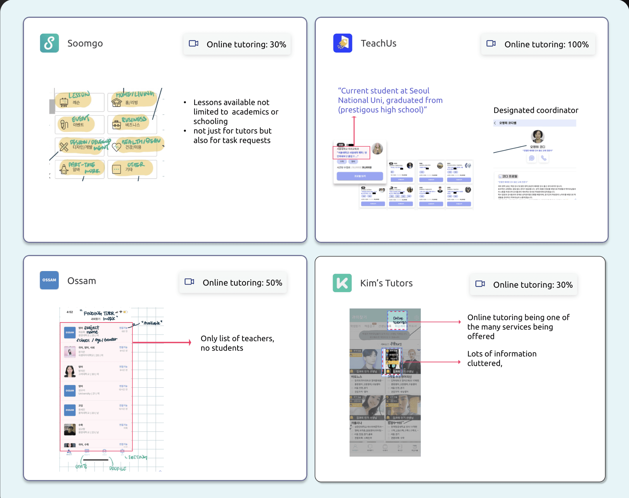
Competitive research notes. Highlights the amount of focus on online tutoring in the platform as well as notable points for each service.
Competitive research notes. Highlights the amount of focus on online tutoring in the platform as well as notable points for each service.
1
Soomgo.
Incredible amount of options of services.
Incredible amount of options of services.
Extensive, but online learning was not the main priority.
Extensive, but online learning was not the main priority.
2
TeachUs.
Assigns students with a designated coordinator who helps with scheduling etc.
Assigns students with a designated coordinator who helps with scheduling etc.
Teachers need to be “hired” and only except students from top elite schools.
Teachers need to be “hired” and only except students from top elite schools.
3
Ossam.
Kept their service to the bare minimum - the business model and their platform interface.
Kept their service to the bare minimum - the business model and their platform interface.
No way of teachers reaching out to clients.
No way of teachers reaching out to clients.
4
Kim Tutors.
Online tutoring is introduced as one of its subcategories.
Online tutoring is introduced as one of its subcategories.
Cluttered UI.
Cluttered UI.
User Interviews
User Interviews
TALKING TO THE DECISION-MAKERS
TALKING TO THE DECISION-MAKERS
Teachers AND parents.
Teachers AND parents.
Conducting interviews was a crucial step in this project to understand firsthand user experiences and identify trends and patterns in how tutors find work.
I focused on two key user groups:
Teachers with tutoring or teaching experience – to understand their challenges and processes in finding tutoring opportunities.
Parents who have hired tutors for their children – because they play a pivotal role in networking and decision-making when selecting tutors.
Through a messenger app, KakaoTalk, I went through sessions on audio calls & video calls.
Through a messenger app, KakaoTalk, I went through sessions on audio calls & video calls.
02 Synthesis
02 Synthesis
02 Synthesis
02 Synthesis
Data Synthesis and Analysis
Data Synthesis and Analysis
TEACHERS HAVE IT HARD MAKING DISCREET DECISIONS
TEACHERS HAVE IT HARD MAKING DISCREET DECISIONS
THEME 1: POWERLESS TEACHERS
THEME 1: POWERLESS TEACHERS
Networking Reliance: 5 out of 6 teachers stated that they primarily find tutoring jobs through close connections or mom-networking.
Scarcity of Opportunities: Teachers noted that these opportunities are relatively "scarce and rare" compared to those available through broker platforms.
High Acceptance Rate: All interviewed teachers reported accepting any offers they received, highlighting the limited availability of opportunities.


Quotes from teachers’ replies.
Quotes from teachers’ replies.
THEME 2: THE HOW AND THE LEARNING STYLES
THEME 2: THE HOW AND THE LEARNING STYLES
Curriculum as a Priority: Both teachers and parents emphasized that initial or pre-sessions primarily focus on curriculum-related information.
Teaching-Learning Style Mismatch: 84% of participants reported encountering issues in tutoring due to mismatches between teaching styles and students’ learning styles.
Struggled due to lack of understanding of student’s learning styles/needs.
Struggled due to lack of understanding of student’s learning styles/needs.

Wished to have understood the personalities and learning styles prior to committing to full sessions.
Wished to have understood the personalities and learning styles prior to committing to full sessions.

Struggled due to lack of understanding of student’s learning styles/needs.


Wished to have understood the personalities and learning styles prior to committing to full sessions.


Struggled due to lack of understanding of student’s learning styles/needs.
Wished to have understood the personalities and learning styles prior to committing to full sessions.
Struggled due to lack of understanding of student’s learning styles/needs.
Wished to have understood the personalities and learning styles prior to committing to full sessions.
Patterns discovered and clustered from replies.
Patterns discovered and clustered from replies.
03 Define
03 Define
03 Define
03 Define
Key User Problem
Key User Problem
PROBLEM: INSUFFICIENT COMMUNICATION
PROBLEM: INSUFFICIENT COMMUNICATION
Theme 2 leading to theme 1.
Theme 2 leading to theme 1.
After synthesizing data above, there was a question that was raised from theme 2.
This question helped me gain further clarity on one user problem to focus on.
After synthesizing data above, there was a question that was raised from theme 2.
This question helped me gain further clarity on one user problem to focus on.
The question:
Couldn’t they have communicated ’Theme 2 (The how and learning styles)’ before committing to sessions?
The question:
Couldn’t they have communicated ’Theme 2 (The how and learning styles)’ before committing to sessions?
Short answer: no.
It was important to note that this ties back to theme 1 where teachers often have less control in deciding whether to commit to sessions.
Short answer: no.
It was important to note that this ties back to theme 1 where teachers often have less control in deciding whether to commit to sessions.
KEY USER PROBLEM:
Teachers struggled to align their teaching styles with students’ learning styles due to a limited availability of job opportunities and an overreliance on personal connections, such as mom-networking.
KEY USER PROBLEM:
Teachers struggled to align their teaching styles with students’ learning styles due to a limited availability of job opportunities and an overreliance on personal connections, such as mom-networking.
04 Brainstorming
04 Brainstorming
04 Brainstorming
04 Brainstorming
Main Task flow
Main Task flow
BRAINSTORMING A SOLUTION
BRAINSTORMING A SOLUTION
Enable teachers to go first!
Enable teachers to go first!
To address the identified problem, I explored various user flows with a key focus on communication. The primary question was:
What shape or form should this “communication” take?
Initially, I felt stuck, as direct messages (DMs) and text-based communication seemed like the only viable options.
Then, I reframed the challenge: “If this approach is inevitable, how can it be improved or tailored to better meet user needs?” This shift in perspective opened the door to refining the solution.
Teachers choose!
Teachers choose!
2
Sending quotes
Sending quotes
Sending DMs
Sending DMs
Tutor
Tutor
Student
Student
Flow A
Flow A:
OR
Tutor
Tutor
Parent
Parent
Student
Student
Flow B
Flow B:
1
Simplified diagrams of how communication would be achieved in matching process. Direction of communication (top A and B). Methods of communication (bottom diagram).
Simplified diagrams of how communication would be achieved in matching process. Direction of communication (top A and B). Methods of communication (bottom diagram).
1
Tutors first!
Tutors first!
Whether talking to parents or the students themselves, communication starts with the tutors. This way, tutors are to seek & consider their options without having the pressure to committing to every single offer.
Whether talking to parents or the students themselves, communication starts with the tutors. This way, tutors are to seek & consider their options without having the pressure to committing to every single offer.
2
A more formatted form - quotes.
A more formatted form - quotes.
It went from DMs and text messages to forms, or quotes. This gives a clearer way of communicating additional details such as the non-academic information.
It went from DMs and text messages to forms, or quotes. This gives a clearer way of communicating additional details such as the non-academic information.
Fleshing out the flow.
Fleshing out the flow.
Now was time to figure out the precise flow of how these quotes would be sent. Drawing inspiration from the apps I had researched earlier, I designed a streamlined flow that made the most sense.
Now was time to figure out the precise flow of how these quotes would be sent. Drawing inspiration from the apps I had researched earlier, I designed a streamlined flow that made the most sense.
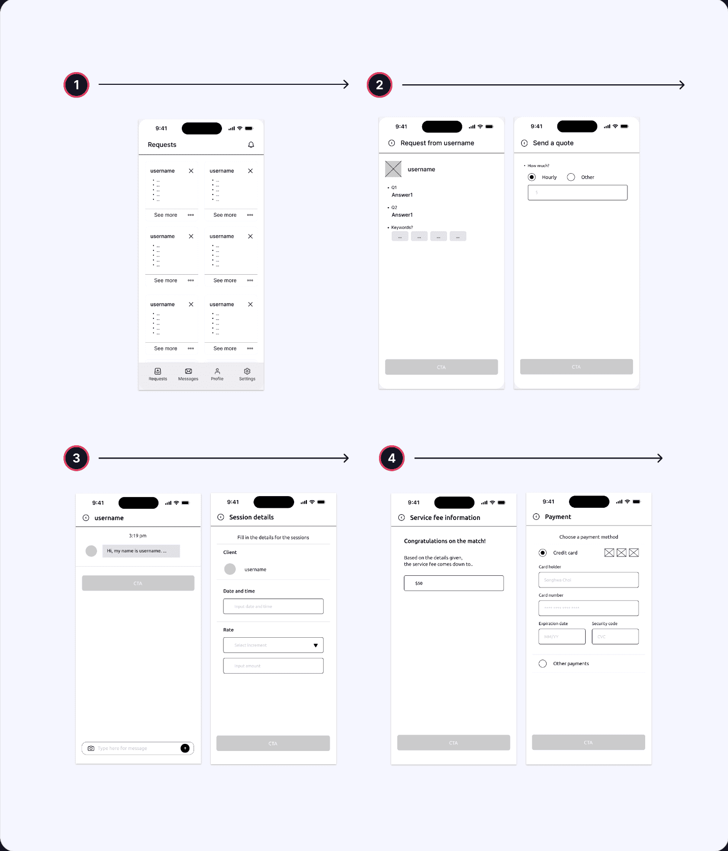
Task flow.
Task flow.
1
Landing on the page of “request”s.
Landing on the page of “request”s.
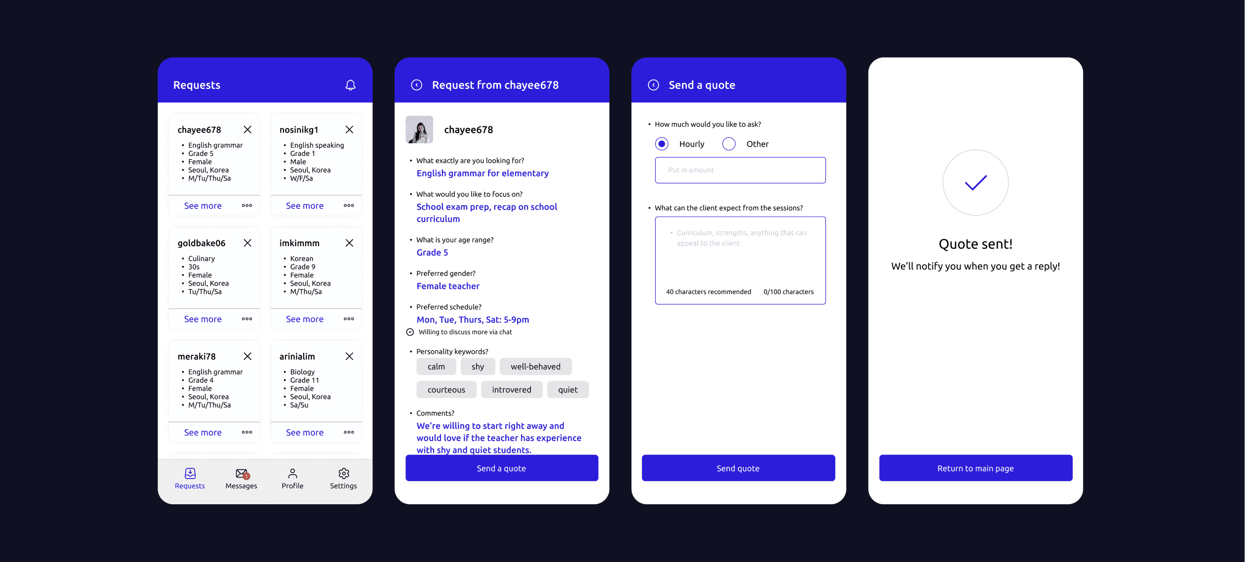
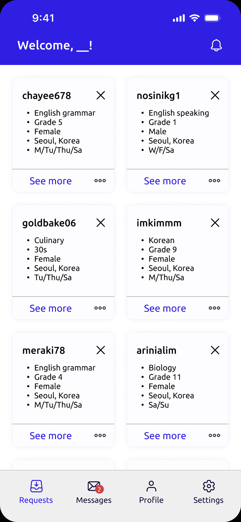
Here, teachers are given the advantage to pick and choose which clients to choose from at their own pace. Once signed-up, teachers land on a page where students upload their "requests" on the platform.
Here, teachers are given the advantage to pick and choose which clients to choose from at their own pace. Once signed-up, teachers land on a page where students upload their "requests" on the platform.
2
Sending quotes to kick-start the interaction.
Sending quotes to kick-start the interaction.
This stemmed from the thought of who gets to see the options first and starts the interaction.
The teachers are able to take a look at a summary of the client’s needs and decide whether they want to teach the student. IA point to note was who gets to see the options first and start the interaction.
This stemmed from the thought of who gets to see the options first and starts the interaction.
The teachers are able to take a look at a summary of the client’s needs and decide whether they want to teach the student. IA point to note was who gets to see the options first and start the interaction.
3
Engage and report.
Engage and report.
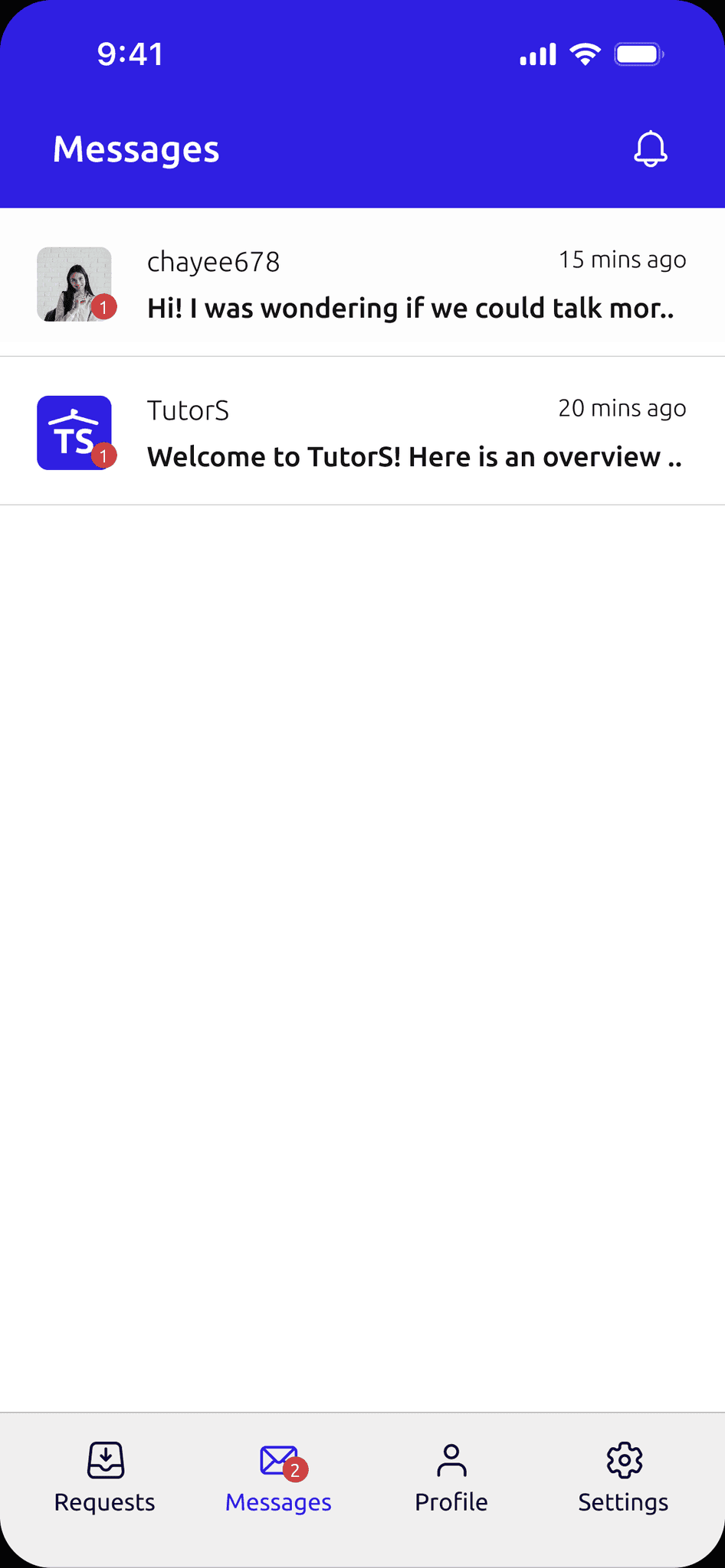
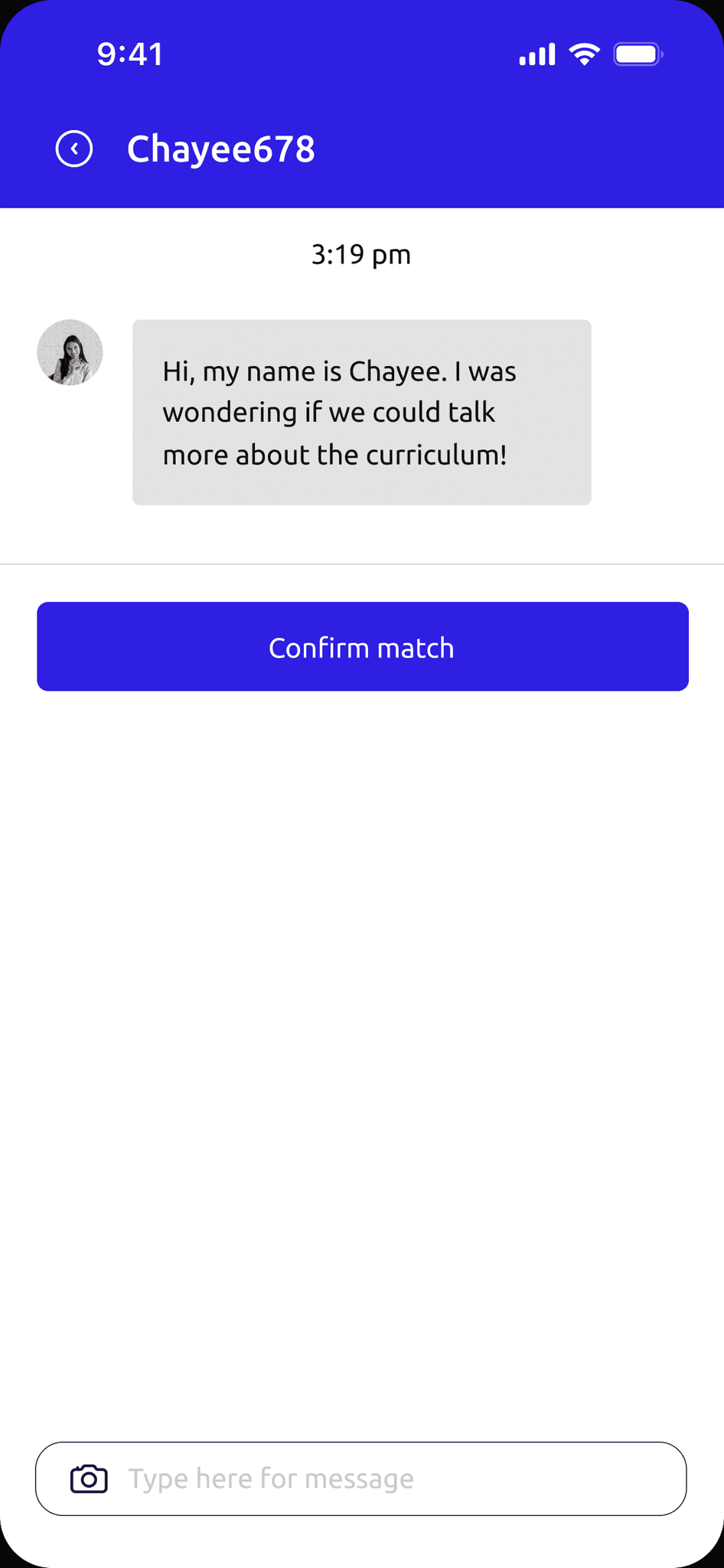
When the client further details, both parties can discuss through a chat function and once settled, the teacher reports session details in the platform.
When the client further details, both parties can discuss through a chat function and once settled, the teacher reports session details in the platform.
4
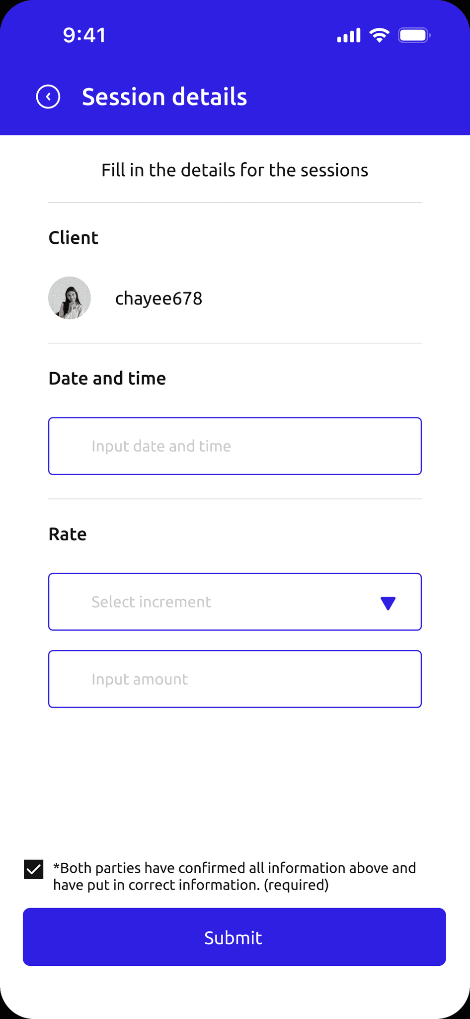
Finalizing the match.
Finalizing the match.
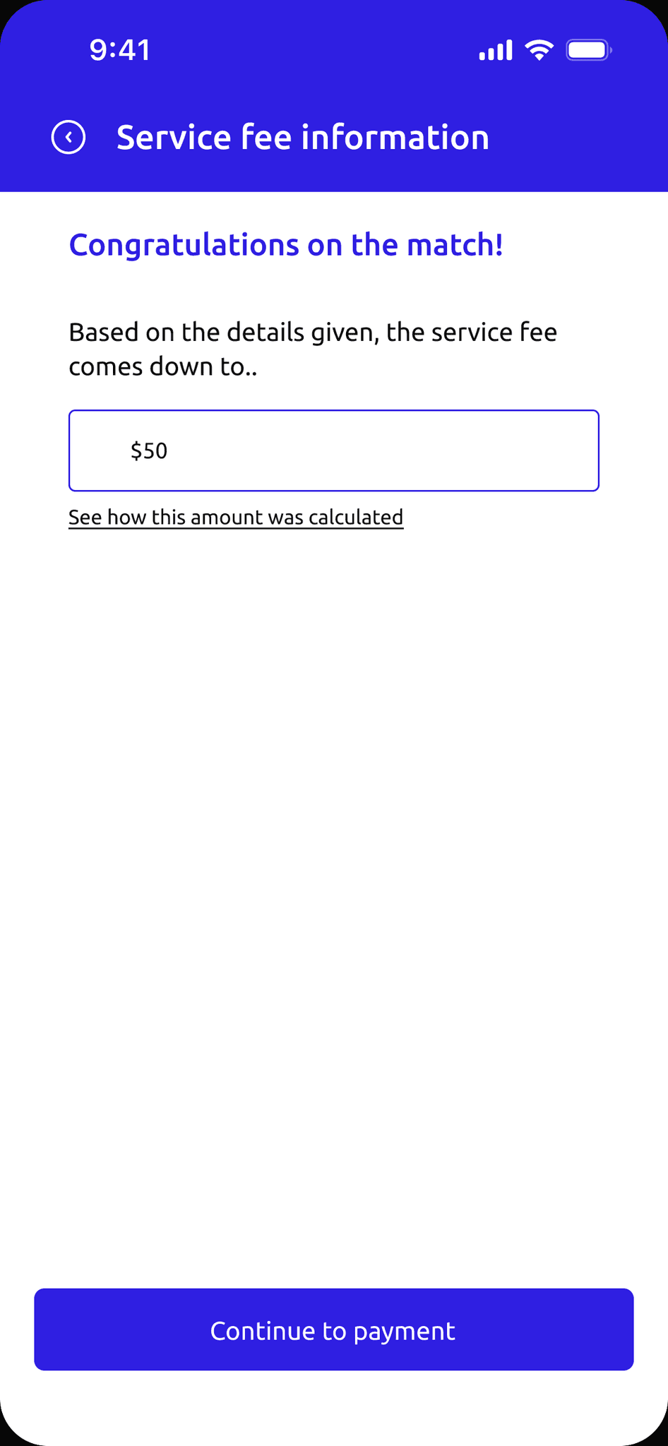
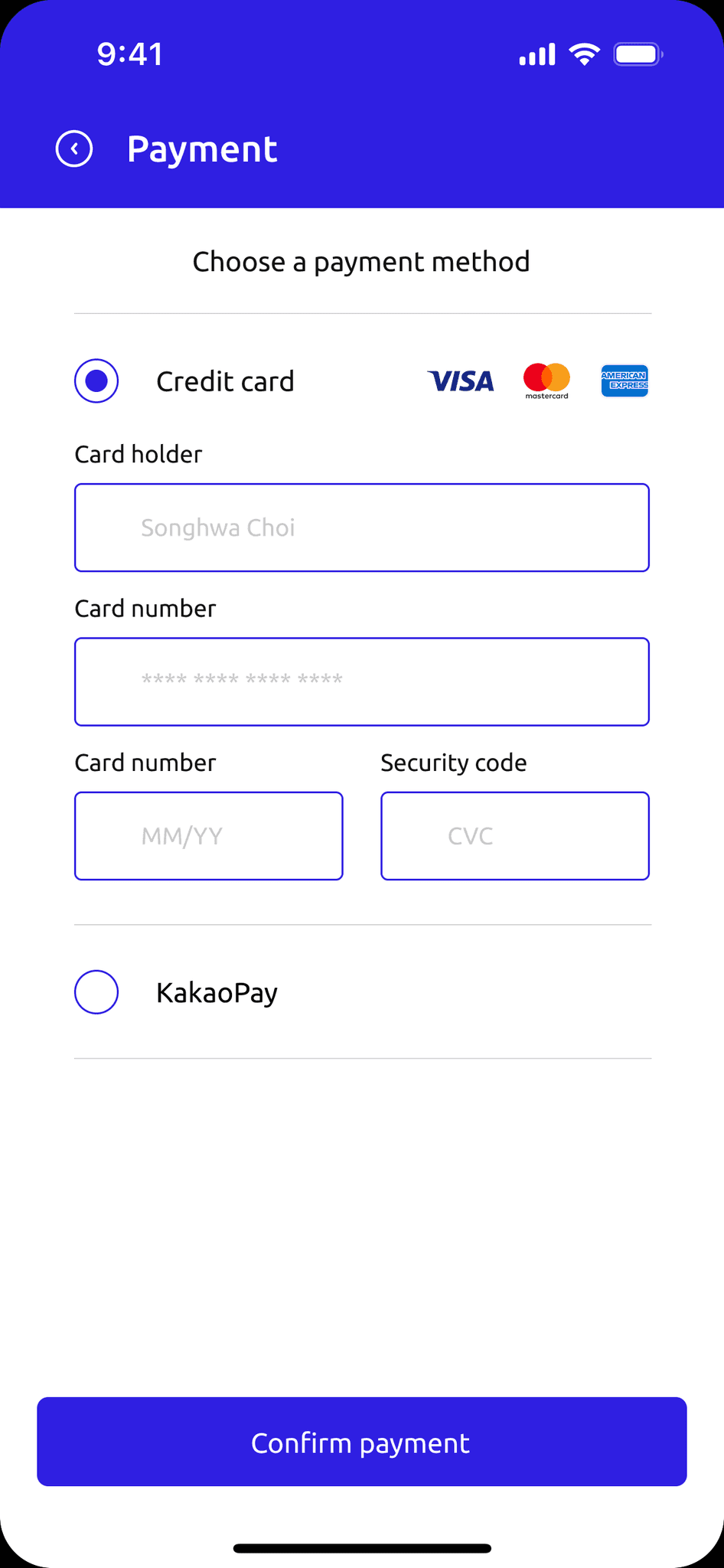
According to the recorded data, a service fee is calculated and the matching process is complete.
According to the recorded data, a service fee is calculated and the matching process is complete.
05 Branding + UI
05 Branding + UI
05 Branding + UI
05 Branding + UI
UI Design
BRAINSTORMING FOR VISUALS
BRAINSTORMING FOR VISUALS
Let’s start with the name for this app.
Let’s start with the name for this app.
This platform is to provide learning services online but more importantly, to focus on the perspective of tutors and their matching. In this sense, I wanted to go with a name that was straightforward and one that sends the users the message right away: TutorS.
This platform is to provide learning services online but more importantly, to focus on the perspective of tutors and their matching. In this sense, I wanted to go with a name that was straightforward and one that sends the users the message right away: TutorS.
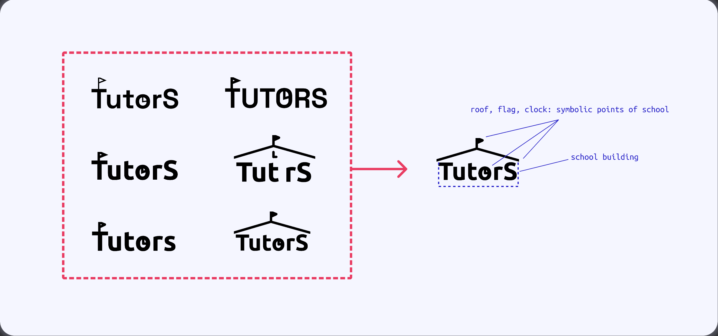
Sketches considered and anatomy of the final ‘TutorS’ logo
Sketches considered and anatomy of the final ‘TutorS’ logo
Thoughtful Branding, Done Efficiently
I chose a deep blue color (2F1FE2) which gives the brand a meaning of trust, inspiration and intelligence.
Although the logos were personally designed, most of the icons were used from utilizing pre-made icon packs from the Figma Community to save extra time and abide by the time constraint.
I chose a deep blue color (2F1FE2) which gives the brand a meaning of trust, inspiration and intelligence.
Although the logos were personally designed, most of the icons were used from utilizing pre-made icon packs from the Figma Community to save extra time and abide by the time constraint.
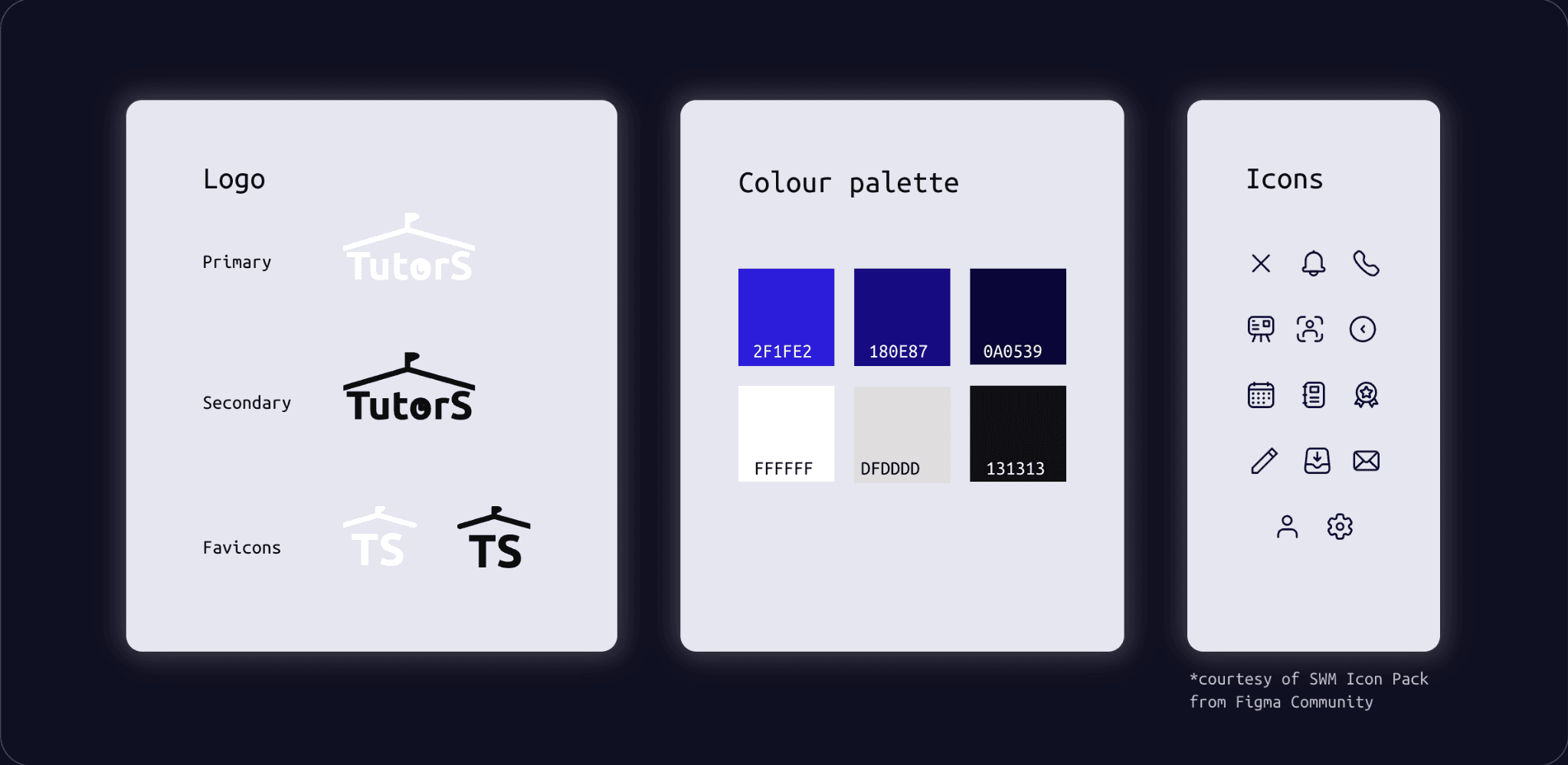
UI kit. Consists of variations of logo, colour palette and icons.
UI kit. Consists of variations of logo, colour palette and icons.
Thought Designing, Done Efficiently
I decided to keep the strokes and lines of the overall UI minimal.
I put more emphasis on design specs to design components as clean and crisp as possible, paying attention to how the designs would be communicated for potential implementation.
I decided to keep the strokes and lines of the overall UI minimal.
I put more emphasis on design specs to design components as clean and crisp as possible, paying attention to how the designs would be communicated for potential implementation.
Buttons
Buttons
Buttons
CTA
CTA
CTA
CTA
CTA
CTA
Normal
Normal
Selected
Selected
Selected
Selected
Non- selected
Non- selected
Non- selected
Non- selected
CTA buttons
CTA buttons
Radio buttons
Radio buttons
Checkboxes
Checkboxes
Clicked
Clicked
Disabled
Disabled
Typography
Typography
Typography
Ubuntu, Medium, 20
Ubuntu, Medium, 16
Ubuntu, Regular, 13
Ubuntu, Regular, 15
Questions, input guides
Message texts
Page headings
Request answers
20px
20px
20px
20px
chayee678
English grammar
Grade 5
Female
Seoul, Korea
M/Tu/Thu/Sa
See more
goldbake06
Culinary
30s
Female
Seoul, Korea
Tu/Thu/Sa
See more
meraki78
English grammar
Grade 4
Female
Seoul, Korea
M/Tu/Thu/Sa
See more
meraki78
English grammar
Grade 4
Female
Seoul, Korea
M/Tu/Thu/Sa
See more
nosinikg1
English speaking
Grade 1
Male
Seoul, Korea
W/F/Sa
See more
imkimmm
Korean
Grade 9
Female
Seoul, Korea
M/Thu/Sa
See more
arinialim
Biology
Grade 11
Female
Seoul, Korea
Sa/Su
See more
arinialim
Biology
Grade 11
Female
Seoul, Korea
Sa/Su
See more

Requests
9:41
Requests
Messages
Profile
Settings
1
20px
16px
20px
20px
20px

We’re going to need some details to get you started!
Sign up
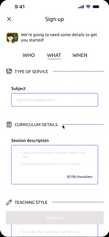
WHAT
WHEN
Continue
9:41
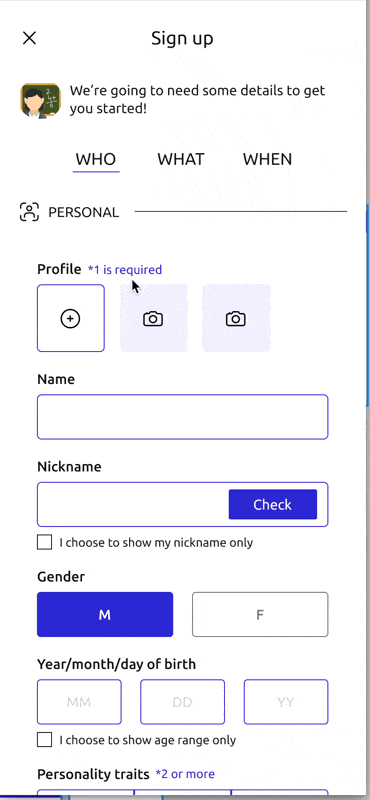
Profile
*1 is required
Name
Nickname
I choose to show my nickname only
Gender
M
F
Year/month/day of birth
MM
DD
YY
I choose to show age range only
Personality traits
*2 or more
Introverted
Extroverted
Critical
Calm
Humorous
Challenging
Warm
Bubbly
Earnest
Positive
Encouraging
Attentive
Check
Phone number
*contact info will be used when retrieving lost password
Based in
Time zone
CREDENTIALS
*This will help increase the chance of match
School
Campus
Major
Licenses/certificates
Other mentions
0/40 characters
20px
12px
8px
20px
32px
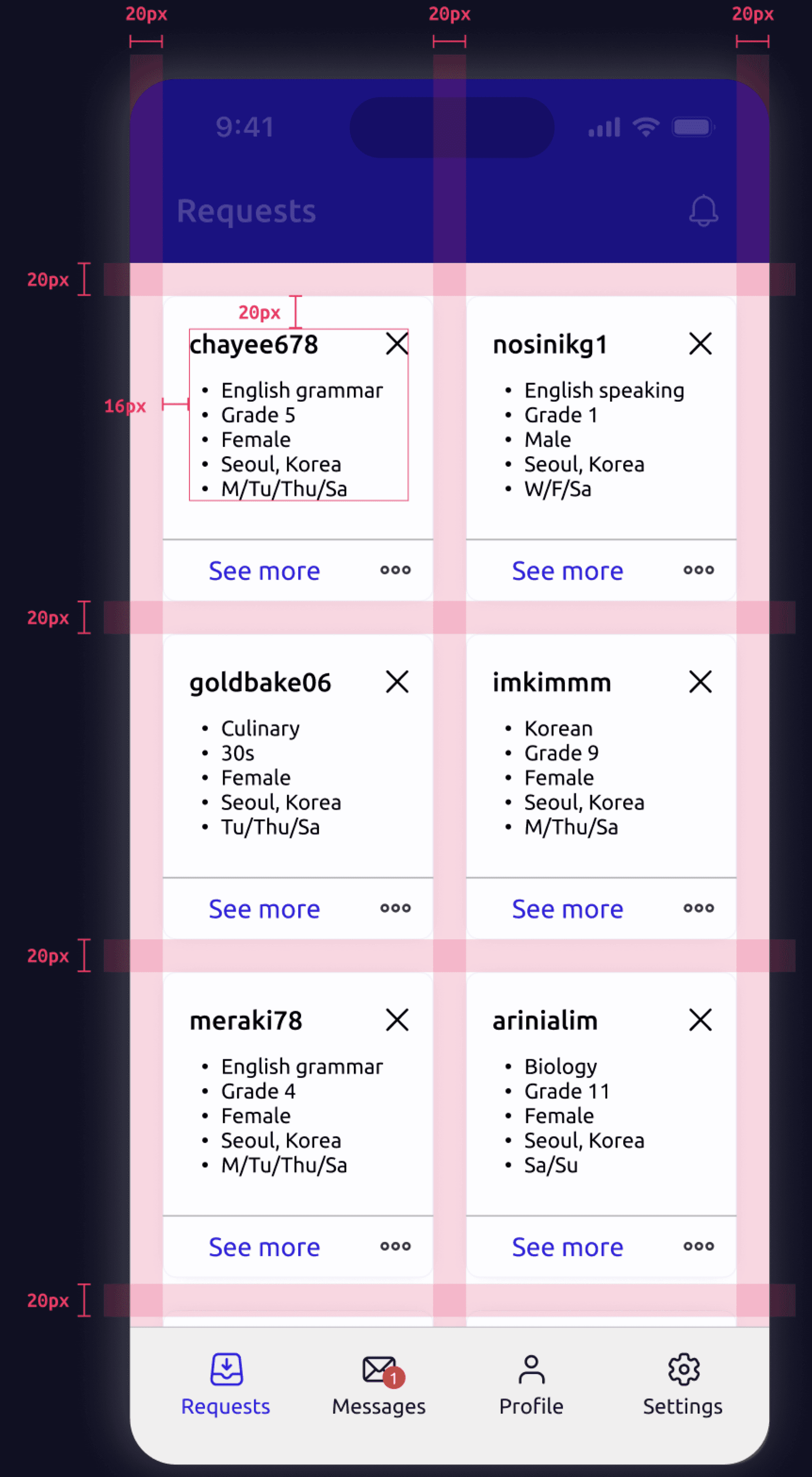
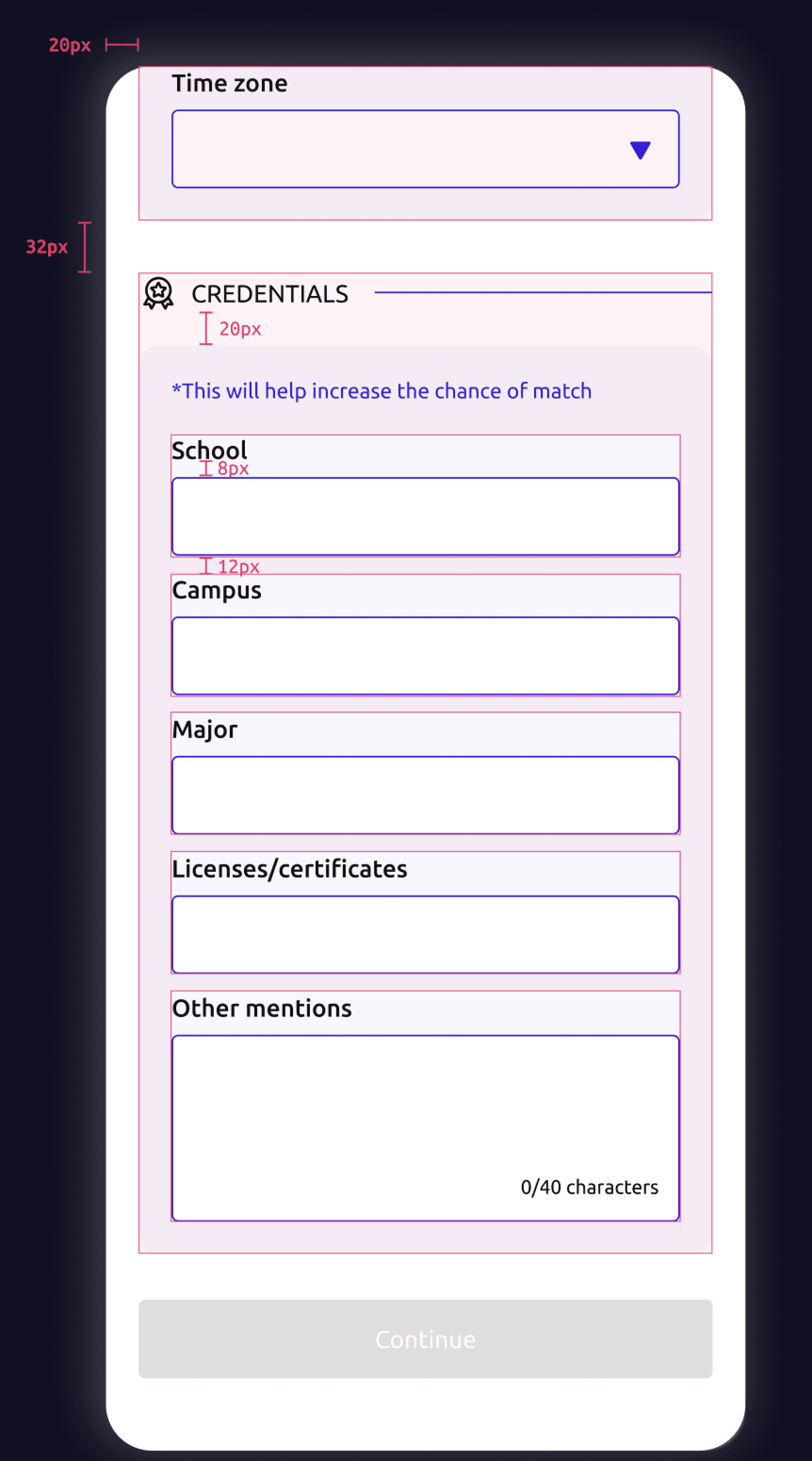
Variations of buttons and typography as well as a few screens to highlight design specs between elements. Gutters and paddings in multiples of 4px.
Variations of buttons and typography as well as a few screens to highlight design specs between elements. Gutters and paddings in multiples of 4px.
06 Testings
06 Testings
06 Testings
06 Testings
Testing out the product
Testing out the product
LEARNING TO COPE WITH UNEXPECTED OCCURRENCES
LEARNING TO COPE WITH UNEXPECTED OCCURRENCES
A brutal number of people that gave up.
A brutal number of people that gave up.
I utilized the platform, Maze, to gather more extensive analytics as well as garner more people to interact with my product.
To first share the final results...
FINAL RESULTS
19 responses (20 were asked, and 1 wasn’t able to participate due to scheduling issues)
About 68% were able to go through the process (direct/indirect),
the other 32% gave up.
To show you how I got to these figures, let’s dive deeper into the process.
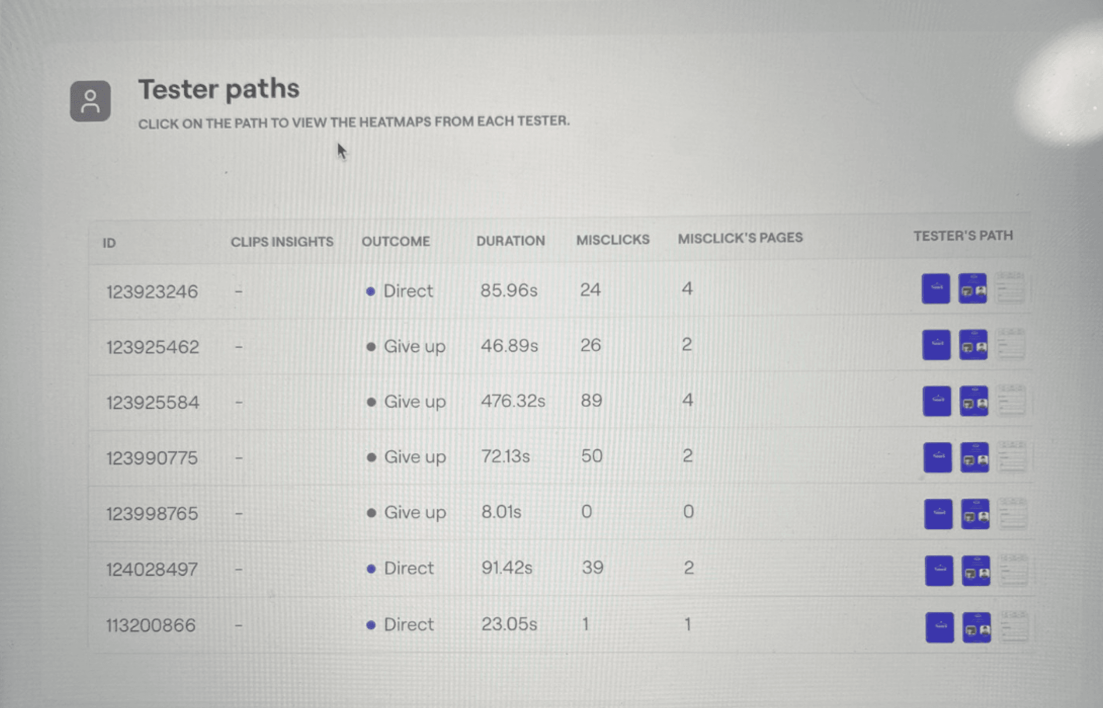
The first 7 responses out of 19. 4 give ups and 3 completions.
The first 7 responses out of 19. 4 give ups and 3 completions.
A more proactive monitoring was needed.
A more proactive monitoring was needed.
During the beginning of the testing period, it was clear that something was up, and I looked into why people were having such a hard time with the testings. I contacted some of those participants to find out what the problem was.
INSIGHTS
Found out that from the first 6 tests, more than half of the results came back "give up/bounce".
It turned out that they weren't paying close attention to the instructions for each "mission" and had a hard time getting around the prototype.
... I thought I had to fill out the form but it didn't let me. Did I have to?
... I thought I had to fill out the form but it didn't let me. Did I have to?
Hi Sophia, just wanted to ask about the testings - were you able to complete the task all the way? ...
Hi Sophia, just wanted to ask about the testings - were you able to complete the task all the way? ...
Excerpt from one follow-up with a participant.
Excerpt from one follow-up with a participant.
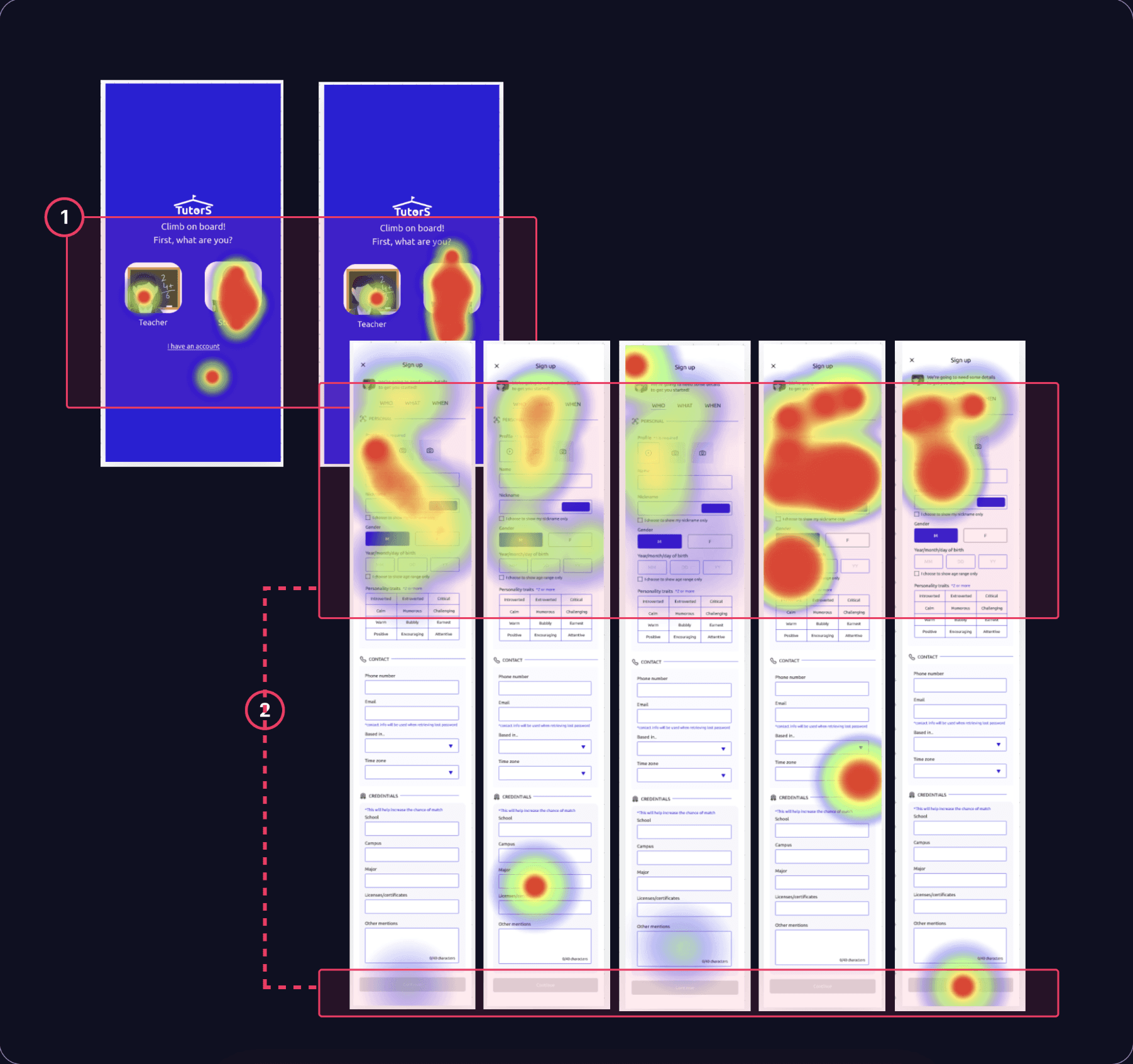
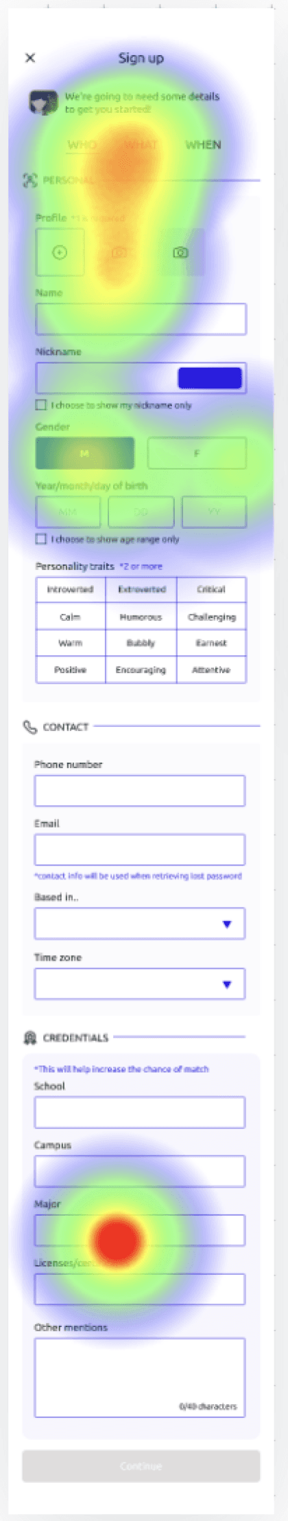
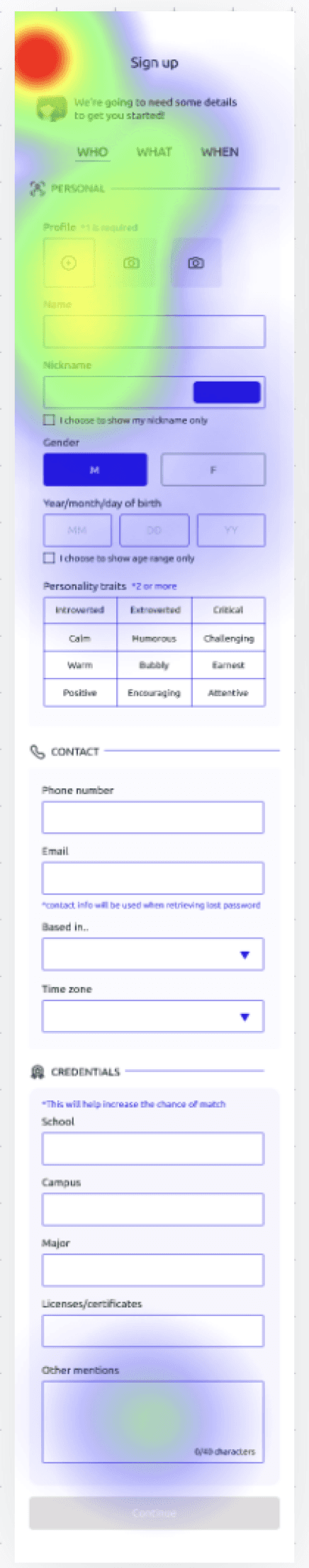
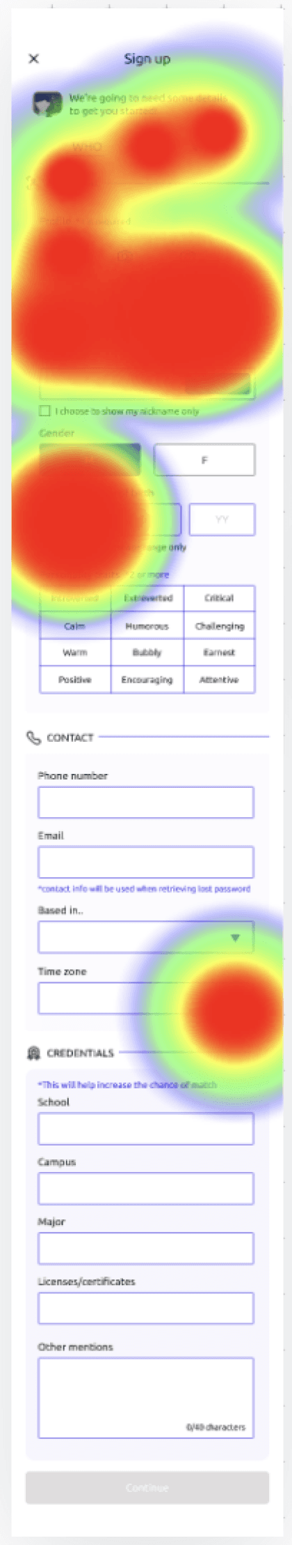
Heatmaps screenshots from sign up flows (type of user on left and form fields on right).
Heatmaps screenshots from sign up flows (type of user on left and form fields on right).
1
Clicked on wrong user.
Clicked on wrong user.
Participants(who gave up/bounced) were clicking on 'STUDENT' when the mission was to sign up as a 'TEACHER'.
Participants(who gave up/bounced) were clicking on 'STUDENT' when the mission was to sign up as a 'TEACHER'.
2
Clicked on other buttons instead of CTA.
Clicked on other buttons instead of CTA.
Many were clicking on input fields instead of the CTA button when they were instructed to just browse the input fields. (Mentioned in text before starting the tests.)
Many were clicking on input fields instead of the CTA button when they were instructed to just browse the input fields. (Mentioned in text before starting the tests.)
From less than 35% to 68%.
From less than 35% to 68%.
With the insights above, I had 2 options.
Redo Test OR Carry On
Although I would have to compromise varying test results, with the time constraint in mind, I addressed the problem by carrying on with letting participants know of the instructions once more.
Having addressed the problem, what showed less than 35% of usability score on the first day of testing was able to reach 68% on the last day.
Screenshots of further instructions sent to participants who have yet to complete the task.
Screenshots of further instructions sent to participants who have yet to complete the task.
Utilizing what surfaced earlier to iterate
Utilizing what surfaced earlier to iterate
THE LACK OF INTERACTION IN CTAs
THE LACK OF INTERACTION IN CTAs
Interactions matter.
Interactions matter.
One of the problems I came across during testings was when users weren’t able to get pass the sign up form fields. The expected flow was for them to browse the form and eventually find the CTA to proceed to the next screen.
I initally thought this was primarily due to the user error of them not understanding the instructions. This was true to some extent, but I also discovered one crucial flaw in the prototype.
What prototype resulted in heatmaps
* wait ‘till the end!
What prototype resulted in heatmaps
* wait ‘till the end!
Very little clicks on CTAs
Very little clicks on CTAs
Majority of clicks were in first viewport - users trying to click on what looked like clickable buttons
Majority of clicks were in first viewport - users trying to click on what looked like clickable buttons
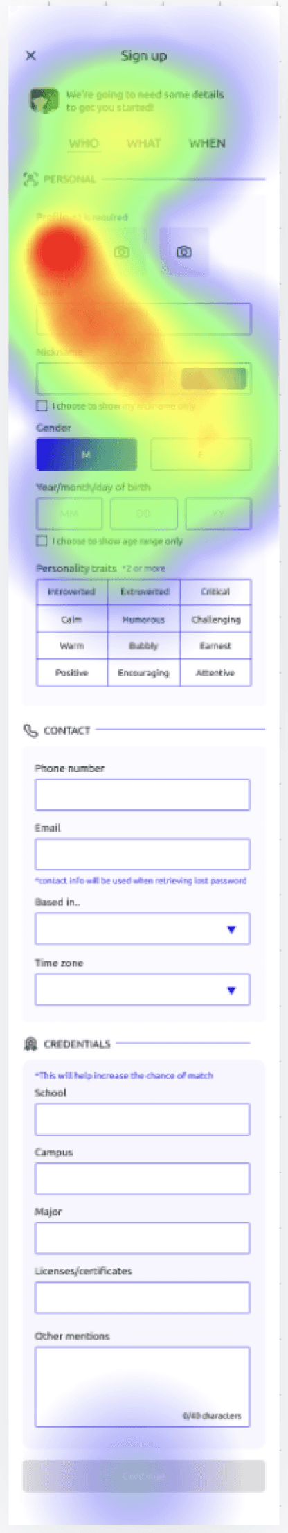
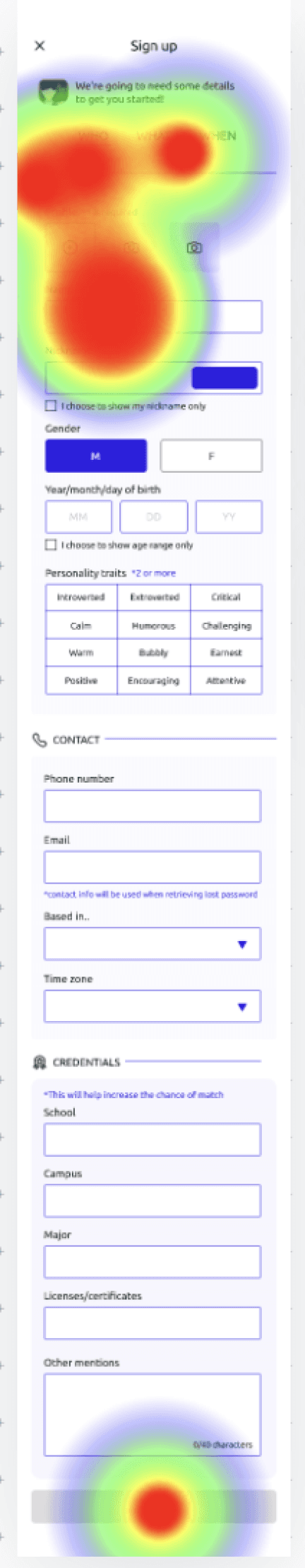
What prototyped used in testings resulted in heatmap analysis.
What prototyped used in testings resulted in heatmap analysis.
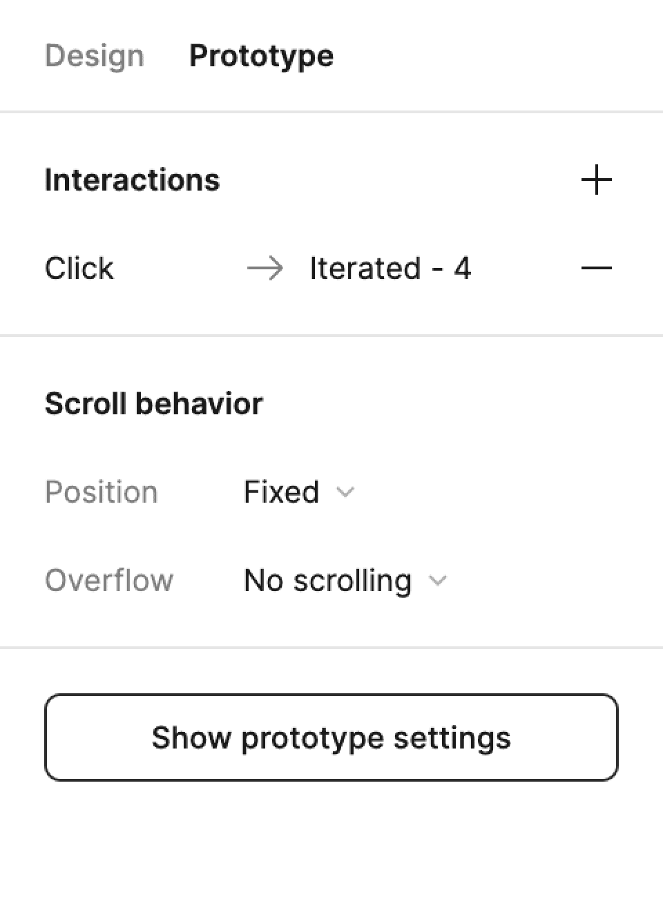
Fixed buttons in viewports.
Fixed buttons in viewports.
In hindsight, this was a no-brainer. However, I was happy to see that test results resulted in discoveries of these mistakes. I definitely learned a lesson.
The CTA button that was at the bottom of the viewport was fixed in prototype settings so that users are able to view the “main” click point instead of panically clicking on other buttons.
Before
Before
After (Iterated)
After (Iterated)
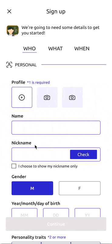
CTA button is fixed to bottom of frame
CTA button is fixed to bottom of frame
CTA button is fixed to bottom of frame
Prototype settings
Before (left), after (middle) and prototype settings in Figma (right).
Before (left), after (middle) and prototype settings in Figma (right).
07 Final designs
07 Final designs
07 Final designs
07 Final designs
Showcasing final designs!
Showcasing final designs!
A TUTORING MATCHING PLATFORM FOR TUTORS
A TUTORING MATCHING PLATFORM FOR TUTORS
Signing up on the platform as a teacher.

Sign up forms as a tutor.
08 Reflections
08 Reflections
08 Reflections
08 Reflections
Reflections
Reflections
IN HINDSIGHT...
IN HINDSIGHT...
Here’s what came to mind after wrapping up the project.
Here’s what came to mind after wrapping up the project.
Another user testing session needed!
Another user testing session needed!
Although I got a mini-panic attack with the first user testing results, it was very interesting how that shaped the way I had to think after the “release” of the product. Similarly, I would love to see what different results the iterated prototype reveals.
Although I got a mini-panic attack with the first user testing results, it was very interesting how that shaped the way I had to think after the “release” of the product. Similarly, I would love to see what different results the iterated prototype reveals.
Different country, different research?
Different country, different research?
During the majority of time I spent on this project, I was in South Korea and hence, the user research was mainly catered to those living in the country. Towards the end of the project, I am also keen to see how my designs would turn out if research was done in Canada or in a different country.
During the majority of time I spent on this project, I was in South Korea and hence, the user research was mainly catered to those living in the country. Towards the end of the project, I am also keen to see how my designs would turn out if research was done in Canada or in a different country.
Next up:
Next up:


Compare
Compare
Comparable
Comparable
Scratching users’ itches for product comparison.
Scratching users’ itches for product comparison.


Alpine Start Outfitters 2.0
Alpine Start Outfitters 2.0
Redesigning a e-commerce hub for outdoor goods and apparel.
Redesigning a e-commerce hub for outdoor goods and apparel.